I am new to logo design with no formal training of logo and graphic design. I have been creating practice logos so that i can not only improve my skill of software but the logo design process on a whole. So i will be posting some of my designs for critique.
This logo is for a company called Hungry Belly. The company provides healthy prep meals delivered to your door. They want to target individuals who dont always have time to prepare healthy food for themselves. The owner wanted to convey home cooked healthy food delivered to your door. Please critique. I have created 2 concepts.
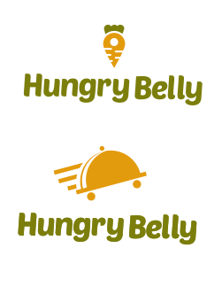
A stylized carrot and the sort of serving tray associated with an expensive restaurant? If your goal is a reference to healthy, home-cooked food, those might not be objects that necessarily come to mind — especially when paired with a very informal name, like Belly. A carrot might be on the right track, but a stylized carrot in isolation from other healthy vegetables doesn’t really convey the scope of what healthy, home-cooking is — at least to me.
Bottom line: I think your choice of icons could be better matched with your stated goal and the name of the company.
This looks like icon, font and color choices you get out of any number of low end online softwares for instalogos. Drag and drop clip art like crap that cannot be used professionally for any number of trademark reasons.
thanks i appreciate it… here is my thought process.. the icon represented delivery of healthy food to your door. while i understand and agree single out 1 healthy vegetable but i was thinking simplicity and as well because map location pin came up in my mind mapping process.. i just thought it was clever to combine the carrot + map locaiton pin to represent that. Yes i know the name is informal its actually for a friend of mine as practise. I dont think personally the name of the company is inline with what she wants her business to represent but you cant tell a client to change their name in real world so i just stuck with it
ok thanks. but as i mentioned i am in the process of learning and while i am open to all comments. the whole point of me posting is to get feedback but also guidance to what i am doing wrong and to feedback to teach..feel free to expand a bit more please
Well, that’s usually the case with an established company, but sometimes a discussion on initial branding for a new company leads into proposing name changes. At its best design isn’t just about doing what the client thinks they want; it’s about interpreting what the client needs based on a discussion with them and an analysis of what you uncovered that they might not have initially mentioned. I’ve found that there’s usually an unspoken objective that clients don’t typically mention at first.
It’s a case-by-case situation, but when a client approaches me and says they need a brochure, for example, I’ll typically ask them why they think that. Their answer is often along the lines of wanting to increase sales or exposure or that sort of thing. That being the case, the best solution might not be the brochure the client asked for but might be a billboard or a better social media presence.
Thanks so much for your word of advice. Its actually a company she had started doing business but halted and wants to reboot.. her current logo was just somebody typed out a script font and added a clip art chef hat… so if this were u..not asking u to think for me but i want to get into mind of a professional what approach would have you used, what key words or icon elements would come to your mind
I like the brightness of it and the simpleness makes it stand out. But, you mention that the the owner wanted to convey “home cooked”, “healthy food” and “delivered to your door”.
What you have produced doesn’t really convey, the home cooked messages, the health message or even the delivery message.
For home cooked, I’d expect to see something that looks more natural, like maybe with a hand written font? The font you have used kind of looks like that, but it doesn’t go all the way. Same with the message of health: The colours have something of health aspect, but it’s not strong.
I think because you are trying to convey 3 messages, you should experiment with lots of different concepts. If you have no formal training, I would start by googling for existing logos (especially well known logos) and put them in a scrap book (read: a file on your computer). Have a look at them and try to understand why they convey messages like health or home made. What emotions do they trigger?
Then when you’ve done, make a few different concepts and try not to reuse elements between them. (With the two concepts you have made, they are essentially different variations of the same core idea) Instead really experiment. Once you’ve done that, you’ll be in a much stronger position to make a concept.
At the moment, I think you are in the right direction, but you need to do more research to make it clearer in your mind.
its little dull around the colors but dont get confused by the good pro’graphical responses above, all they are rushing to some trend, I’ll say when one rush for big market then its understandable to think what design conveys what message to broader audience, while for local businesses my experience is that as much mindboggling You are as much noticeable You are becomimng mids all the 2.0 crowded jam, so Your Design in this case think is Good maybe from time to time with seasons changing color coz in its simplicity that is doable, now the left breeze could be leveled more logical, and overall the idea is good, what will make the same to get memorized tho is some nice small animated youtube commercial for local purposes where eg. an ufo will morph in your logo that will be hijacked by hungry hitchhikers …
Although those are important, that’s not where I typically begin. I usually turn down clients who just want logos because I’d rather think in terms of a broader brand identity.
As I mentioned, I’d do lots of research and have conversations with clients. Those conversations veer off in all kinds of directions not specifically related to the subject at hand. But they provide me with information that adds up to what the organization is about, what they want to be, what clients they want to have, who their competitors are, and those sorts of things that, in one way or another, factor into the design.
Initially, I’m not so concerned about objects, pictures, and slogans. Instead, I usually try to focus down on an emotional quality or a personality that epitomizes what the organization wants to be and how they see themselves. Then I’ll try to impart those qualities into the branding in a way that resonates with the target audience.
btw try another font or slim this one little, tho I’ll go with something more than simply flushed out of sleeve … meditate together with the client, maybe tomorrow they would need to apply it as food’art etc. anyway try to stand out from all the local crowd, what by true design terms would mean simple memorable symbol that dont pretend to be idol but ringing bell …
It took your pointing it out, but the carrot/map pin does seem like a good starting point for a concept, since it hits both the ideas of delivery and healthy - though the fact that it took you pointing it out means there’s still room to refine and clarify it. I’d set that one aside to come back to later, and, like others have suggested, rough out a few more different concepts to play around with. That one could take you somewhere, but you should see if there are any better directions before you commit to it.
The racing serving tray, though, is generic as they come. The reason for that is that it’s very functional, but it’s also going to do diddly squat for making the company distinct and recognizable. Personally, I’d drop it.
I’d also second recommending a name change - all the name does is tell me food, and “belly” comes across as kind of…playful, or immature, which doesn’t vibe with the messages you’re trying to hit in the design. And on that note, I personally prefer to wait till I have a strong icon concept before I try to work any type into the design. I find I get better results when I work any words around a graphic, rather than vice-versa.
A compliment to end off, though, is that if these are your own personal vector creations, you’ve done a good job on the rendering. Just take a couple steps back, and focus on nailing the basics down first.
I am glad I found this forum I honestly did not expect the amount of responses. you guys are great. I am still learning software as Maybe the rendering of the carrot and pin combo needs more work to make it recognize I work on that. To be honest I did not like the racing tray icon I do honestly feel it’s to generic however where we live it’s a small island. I did a research of her competitors and basically none of the logos were professionally done. Company name typed in text so in that instsnse even a generic logo in your part of the world can work it would already stand out…
I’m here to get better so I will revisit my mind map and try to extract other ideas.
Actually I found getting type first easier for me cause I feel in creating a mark I can burrow inspiration from the type so it all feels cohesive but as I am still learning I am not married to any one way of doing things
Oh I also agree about name change but it seems like that is not an option. I do agree nothing about the name signifies healthy and it’s not in same comparison as apple has nothing to do with tech but I think fact hungry is apart of the name she is already locking herself down to food industry..her actual logo is just the company name written in script with a clip art chef hat in pink and I felt it was not appropriate on all levels based on what she wants her brand to be
That’s a fair stance - using a font as a sort of ground level to work your style around isn’t a bad idea, especially if you’re still getting the hang of things. The reason I set type aside for last is that the way the type is set is much more flexible than any icon structure. Specifically, I mean the layout: If you start with your type set, whether it’s a full name or just initials, on one line or two, wide or narrow, tight or loose, horizontally or vertically oriented, you might find yourself working around that setup, which can restrict your concepts to what works with how you have it set already. On the other hand, all those variables can be tweaked to better suit an icon that’s already existing fairly easily, and be adjusted to work as website banners, app icons, social media profile pictures, and whatever else is needed as it’s needed.
If you’re willing to try shaking your process up, try setting the type to the side while you work on the icon, where you can see it for a style reference but the structure itself doesn’t interfere with your design. It’s fine to use the font style as support, but don’t let it trap you in a box!
This was the first thing I noticed. The yellow/gold might be fine but the green to me is a little too close to seasick color for me to feel enticed to think about food. Play around with it more. If you like moving forward w it h the carrot/map pin then play it up more! As a thumbnail I didn’t notice it as a carrot. Try vibrant orange with your current yellow and something else for the text. I do like that you stuck with just a few colors.
For additional practice, you could try other color combos and quantities for fun. Like pretend the business only delivers pizza, another hypothetical is the business only has an app that shows people where local farms and markets are, etc.
I think a common mistake new designers make is trying to cram all of their ideas into one mark in a very litteral way. A brand is more about a feeling or something that is implied.
You don’t have to show healthy, home cooked food and delivery all in one mark, in fact you don’t necessarily have show any of this.
I challenge you to go one layer deeper and to search for the feeling you’re trying to convey and let that guide your design decisions.
And if you’re struggling to know what this is, maybe you need to go back to your client and spend some time understanding them, their personality, their business goals, their competitors and their clients.
Thanks for your comments, i plan to try and go that level deeper. This is just a practise logo for a friend i known for over 20 years. Maybe one of the hiccups is she is not to clear on what she wants her brand to be
i will definitely try to push myself more.. As i am new im sure all of you can attest to when you started first and you just got stuck on clichés and trying to push pass that level. Well i think that is where i am. As its just for practice i will spend sometime away form this and then come back with a new pair of ideas and eyes and hopefully i can upload an amendment soon.. thanks for your feedback