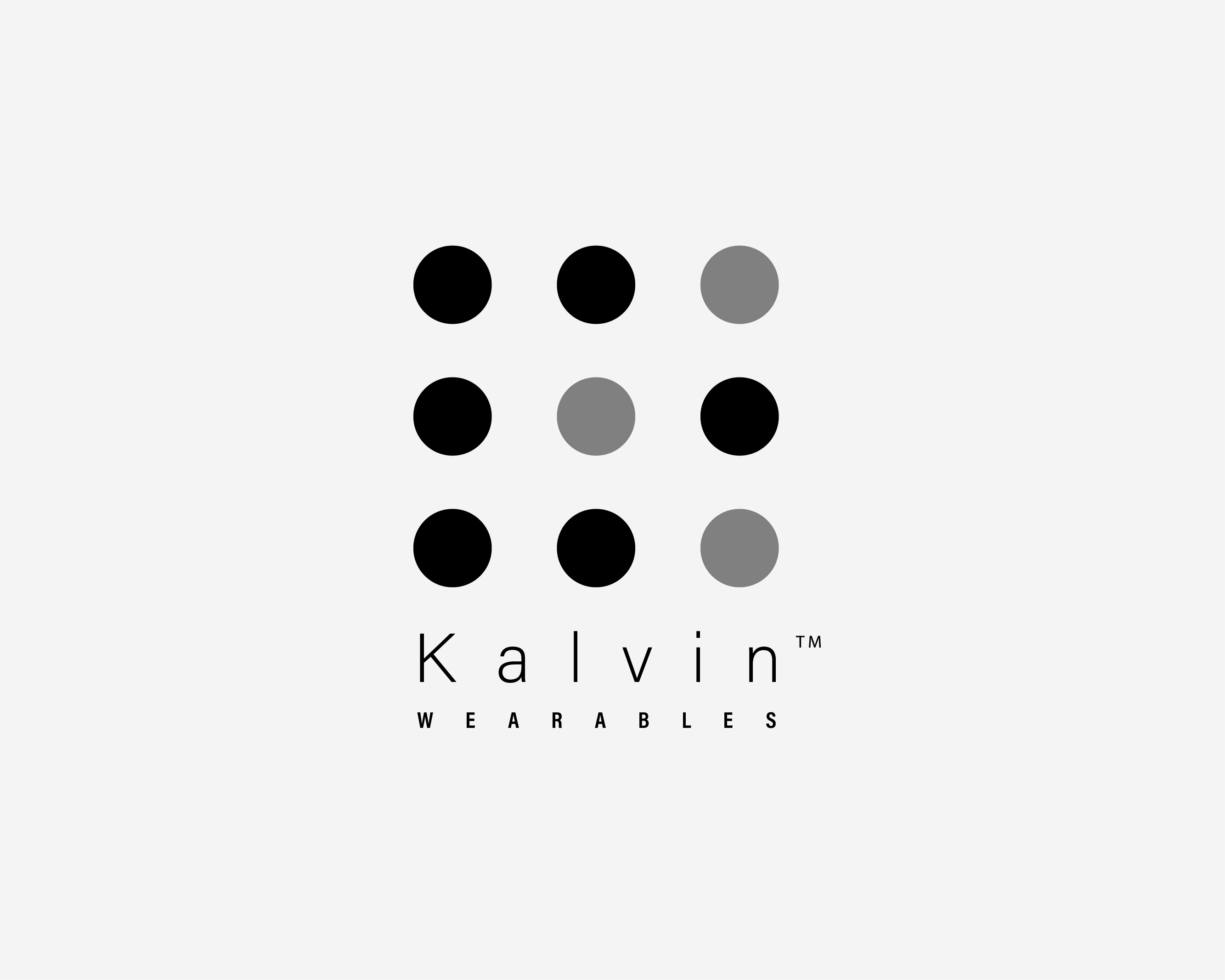
I approached a client and offered him my services as a graphic designer. The project included a logo and a style guide. I prepared a logo as an initial proposal but I am not sure about balance and color selection. The client is a wearables start up. Please include your critique.
Hi Luca — nice minimalist direction here, and the monochrome palette is a smart choice for a wearables brand that will live on tiny screens, packaging, and hardware. A few thoughts:
-
Give the dots a job. Right now the 3x3 grid reads as a decorative pattern rather than a mark with meaning, and the mix of black and grey dots feels a little arbitrary. Could the dots form a subtle “K”, or echo a wearable like a smartwatch face or sensor LEDs? A mark with a story sticks in people’s minds.
-
Wordmark legibility. The ultra-light, widely tracked “Kalvin” looks elegant at this size, but thin strokes at wide tracking can fall apart when embroidered, debossed, or shrunk down to an app icon. Test it at 16px and in single color before finalizing.
-
Consider one accent color. Wearables means tech, and tech brands usually carry a bit of energy — a single electric accent (teal, lime) in one dot or the wordmark could give this personality without losing the minimal feel.
Overall a clean foundation. Push the mark so it says “wearable tech” at a glance and you’ll be there.
Hi hello
I have seen may of you post on different subjects, like luca_anastasio may be been you an AI o are Bot too ?, I don’t know but many of your post on many places at the same time seems to me very suspicious …..
The two forum members are posting from entirely different parts of the world. They’re not the same person. As for AI, it’s difficult to say anymore.
1 Like
I’ll do it into AI to just straighten my points out and maybe elongate them. But I’d never post anything I didn’t review and fully agree with. Most of the time I just write it out in the points I want to make then AI can reword it to make it make better sense and structure than my original. A lot of the time I don’t want to type out paragraphs and paragraphs of content due to time or maybe crossing the same points or completely missing the point. So AI helps me reword and structure.
As long as I don’t just copy the question and ask AI and then paste the answer. That’s not really cool. But genuinely the ideas are mine just AI is so handy right in the browser as I type.
the AI version
I’ll use AI to straighten out my points, reword them and sometimes expand on them a bit, but I’d never post something I hadn’t read through and fully agreed with.
Most of the time I already know exactly what I want to say. I’ll write out the main points, and AI just helps me structure them better and make them clearer than my original wording.
Sometimes I simply don’t have the time to type out paragraphs and paragraphs, or I’ll find myself repeating the same point, going off on a tangent or not explaining something as clearly as I intended. That’s where I find AI really useful — as an editing and structuring tool.
There’s a big difference, in my opinion, between doing that and simply copying someone’s question into AI, asking it to generate a response, and pasting the answer without really engaging with it. I wouldn’t be comfortable doing that.
The ideas and opinions I post are still mine. AI is just incredibly handy for helping me put them into words, especially when it’s sitting right there in the browser while I’m typing.
1 Like
Thanks to both of you, I was curious since both persons were answered so many times on different posts.
I would increase the brightness so the grey circles are brighter. Since everything is in B&W. I’d reposition the Kalvin to the top and put the wearables halfway between the dots.