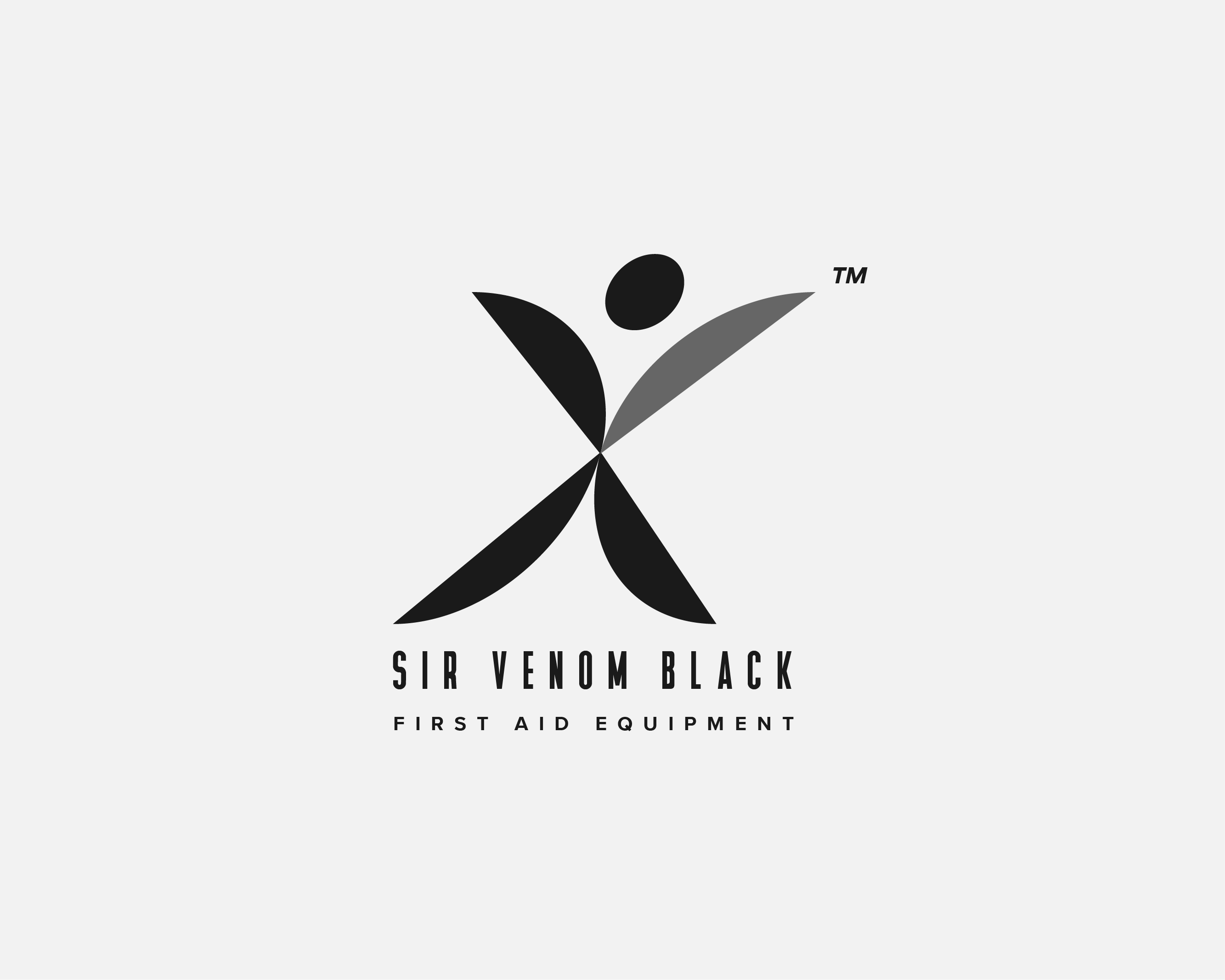
Hello dear Graphic Design Forum members, an organization approached me recently to create an alternative Logo design for their brand style guide so how fits to design guidelines of that vendor. Some back and forth correspondence later I came up with that artifact and require your opinion to go forth with next steps. To satisfy the brief curiosity and engagement of viewers is required. The company targets multiple target audiences and requires also, which is a follow-up project coming up, creative guidance regarding a brand awareness campaign.
Thanks for sharing this, Luca! Since your brief calls for curiosity and engagement — and an awareness campaign down the road — I’ll critique it through that lens.
What’s working:
- The mark is genuinely memorable. The humanoid/X hybrid is distinctive and reads instantly at large sizes, which is exactly what an awareness campaign needs as its anchor.
- It works in a single color, a big practical plus for first-aid equipment — think packaging, labels, uniforms, even embossing on cases.
- The wide-tracked typeface gives it a clinical, established feel that suits the category.
Things I’d flag:
-
The name fights the product. “Venom” means poison — for a first aid brand, that’s a real trust problem, and a mark can’t fully fix a naming disconnect. If the name is locked in, the visuals need to work extra hard to reassure (soft shapes, safety cues). Right now the sharp, blade-like shapes lean into the danger reading instead of countering it.
-
The figure’s mood may be off-category. Arms raised reads as joyful or dancing — great for curiosity and engagement, but for first aid, a worried customer expects care, protection, and competence. Ask yourself: does this reassure someone reaching for a first-aid kit? The curiosity is there, but the emotional tone might pull the wrong way for the category.
-
Check scalability. The tagline “FIRST AID EQUIPMENT” is small with very wide tracking — it will vanish at favicon or label sizes. And the gray arm against the black shapes will likely merge into one blob when shrunk. The classic test: print it at 1 cm and see what survives.
-
The TM is floating. It sits detached at the top right of the mark. Snug it against the wordmark instead, where it belongs both legally and visually.
On the awareness campaign: the humanoid has real campaign potential — it could become a flexible character across ads and packaging. But settle the tone question first (danger vs. care), because a campaign will amplify whichever reading people land on.
Good luck with the next steps — I’d love to see how this evolves!