Looking for some critique on a logo I’m in the process of designing.
I’m rebranding my personal design company and I chose the Zebra to represent being unique, confident, and true to oneself - all qualities I believe are important to a brand.
I’m feeling quite stuck with this design and I’m definitely not happy with it.
Should I toss it and start over or continue to tweak?
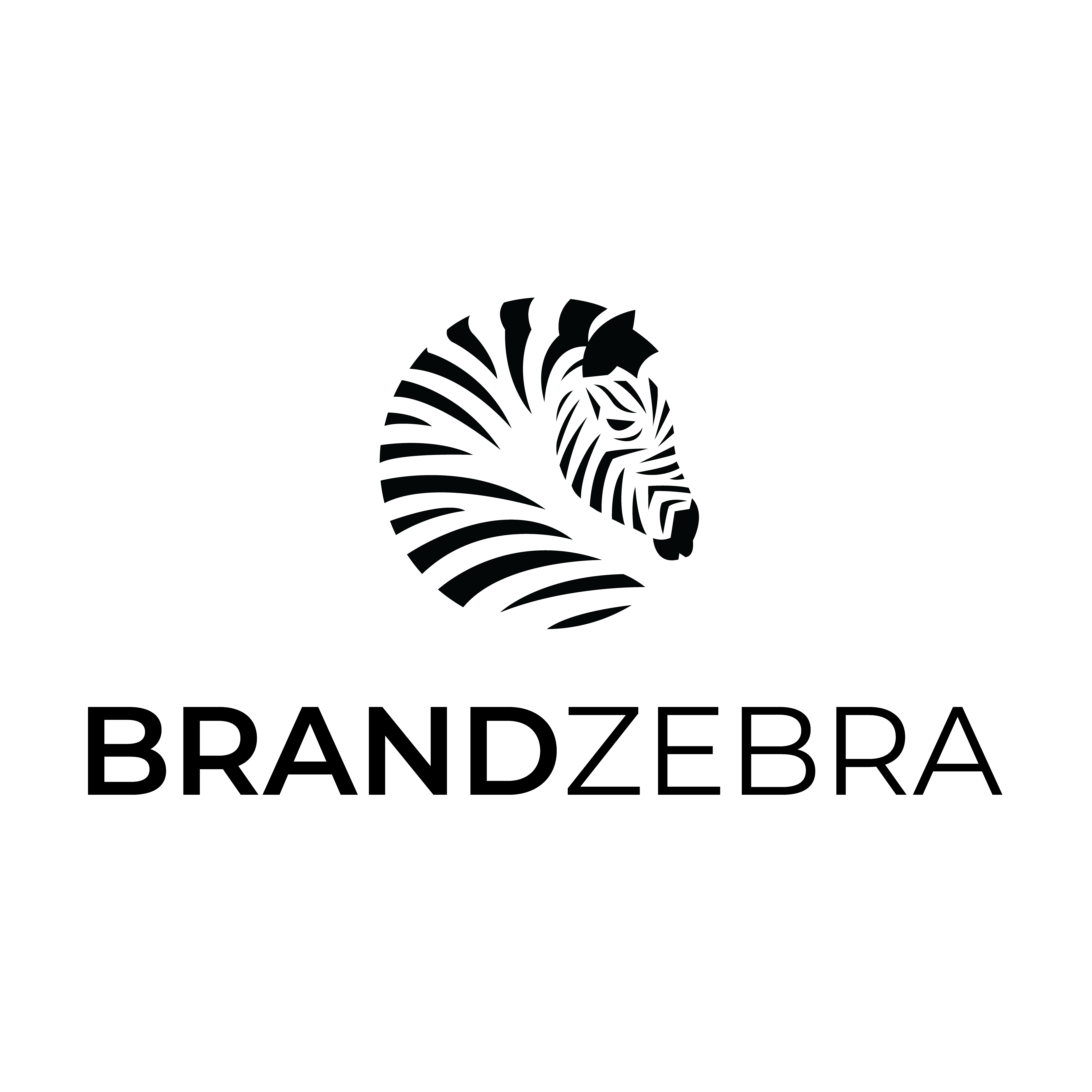
Thank you! The name of the company is The Brand Zebra, so I wasn’t sure if eliminating the word “The” would be misleading or inaccurate, but I agree, it is more visually appealing without it. I sincerely appreciate your feedback.
I agree with order and chaos, remove the, the and .com.
The zebra is great, although my eye keeps getting drawn to the two stripes which connect near the ear.. something off about that for me but not sure how you would work around it.
I like it better without the THE and the .com. As already noted, they were not needed.
I also like the zebra. Fitting it into a circle is really nice. Perhaps you’ve been looking at it too long and have lost some of your objectivity.
I have two comments about it, though.
The stripes on the head abruptly end at the edges as though they were just cut off, when on an actual zebra they would be foreshortened as they disappeared around a curved edge. It might help to hint at that curvature. Also, I think the stripes might run vertically on a zebra’s face/nose between the muzzle and the forehead.
Similarly, I’m not entirely sure the stripes on the body convincingly portray the structure and musculature of a zebra. I know that the edge cuts off at the middle of the back along the spine, and that’s obvious and fine. I’m really referring more to the way the stripes curve around the body on the inside.
For example, there’s a muscular bulge between the withers and the shoulder where the neck flares out to connect with the body. The stripes don’t convincingly allude to or help define this feature or the the body’s curvature as the stripes disappear as they wrap around the neck and body. Unfortunately, unless you’re intimately familiar with horses (or zebras), it would be difficult to get it right without looking at a horse from above in a similar position. My family owns a few horses, but it’s a little difficult to get any of them to turn their heads like that (unless they’re biting horseflies off their backs ).
Really though, it’s good, and I’m just being overly picky and mentioning little issues that might or might not make a difference. I really do like it.
The only point I can’t visually see is the head stripes being abruptly cut off - in my mind they still continue to wrap around the head to the other side in the same way they are being illustrated on this side.
I think the body definitely needs help but I wasn’t sure if I wanted to try to keep things more balanced and less looking perfectly like a zebra or less balanced and looking more like a zebra, if that makes any sense. I kind of wanted this to be an abstract illustration so that all of the lines seemed to keep the same curvature, rather than getting too detailed, but I could be way off with what I was trying to accomplish.
I will definitely take all of these notes into consideration.