I’ve been working on a logo for a little while and have just been so bogged down with designer’s block/self doubt that I really need some feedback and direction from others.
This is a logo for myself, based on fantasy and video game costumes I’ve done as well as some other less detailed stuff (everything from funny meme costumes to pin-up and then super casual stuff), and I want it to have an exciting, CLEAN fantasy-based feel without being too cheesy, while still being relatively warm, not TOO formal, but also not too casual, either. Something with good balance for both the serious costumes I do, and everything else.
I also am aiming for it to have a relatively unisex feel as well.
I’m primarily stuck right now on choosing typefaces - I tried doing some handwritten stuff and just am so stuck that I can’t even experiment right now with a pen or brush. I’d LOVE some pointers from people on what to try out, or even some typefaces that some of you may feel would be a nice match for the type. Pretty much any other critique is welcome; I really want this to be nice and work cross-platform for all of my stuff.
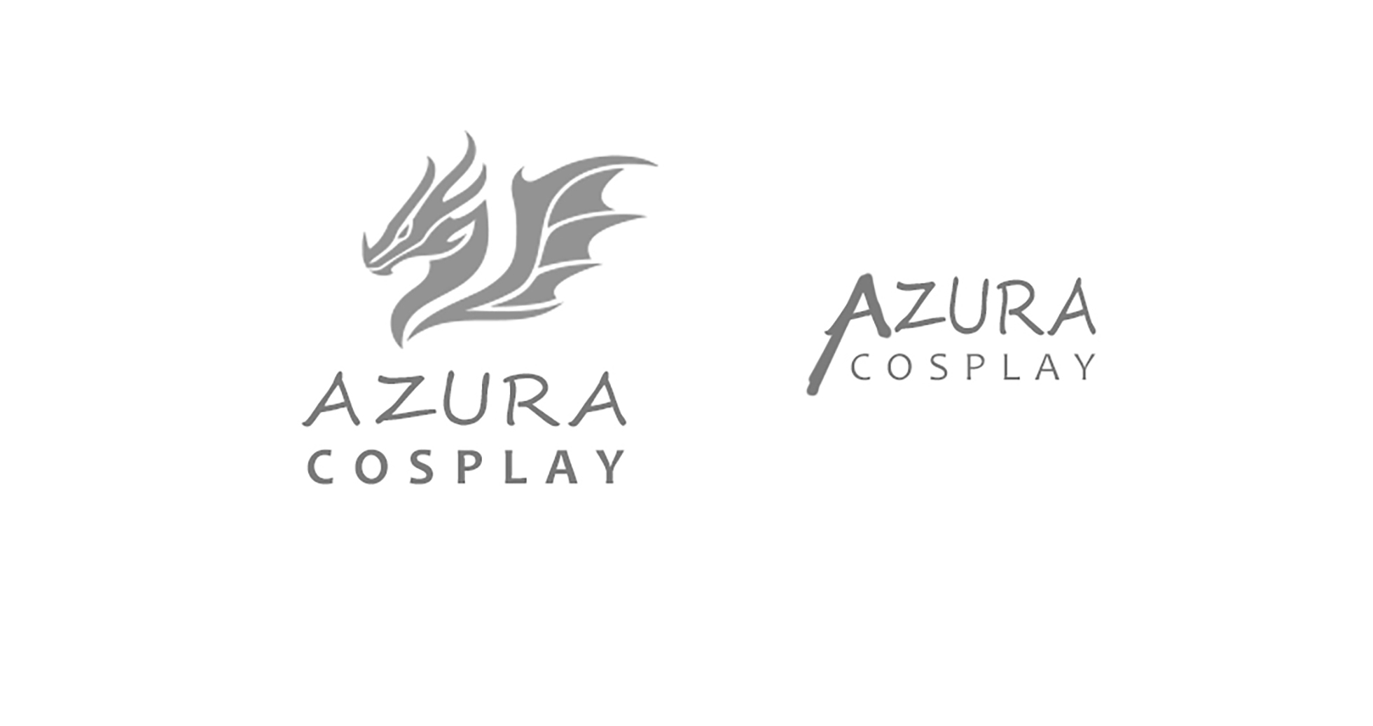
Logo below (with placement fonts, and ignore misalignment - I’m just throwing things on for right now), along with last-second placement idea experiment.
Color-blocking suggestions also welcome. I’m very much a one-color-logo type and wish NOT to be. lol
Let’s just take the first logo. There are three entirely different things and different styles taking place. There’s the elaborately stylized dragon, there’s the ultra-casual handwriting and there’s the sans-serif typeface beneath it.
These three styles just don’t complement each other. They look like they’re from different universes and created by entirely different people.
use part of the dragon head or a image of cos-play that no one else has created.
originality should get more attention that cut and paste.
maybe have the design protrude from the A
First off, I really dig the dragon illustration. Great work on that.
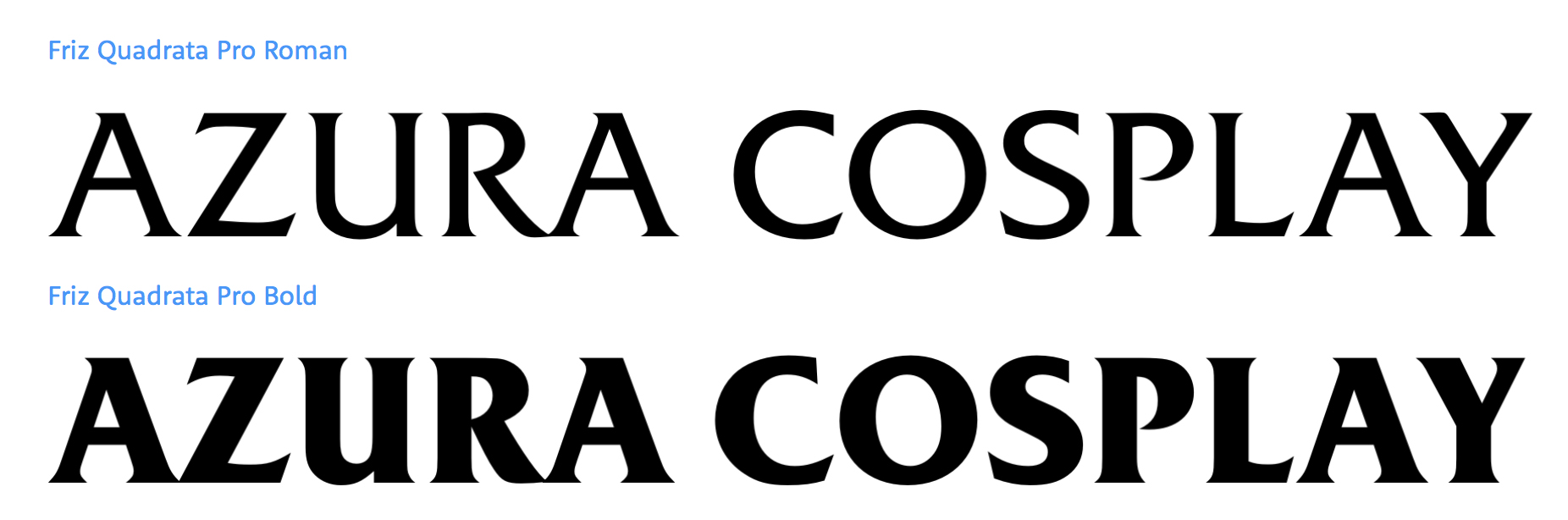
As for the type, I’d go for a commercially available face that has some personality, but not so much personality that it detracts from the dragon. Friz Quadrata came to mind pretty quickly, but I think there are many choices out there that would be a nice complement to the illustration.
I designed the logo mark myself. Can you please let me know what you’re referring to if you’ve seen something similar? I obviously do not want my work looking like someone else’s and will need to tweak it if so.
It’s my own design. If anyone’s seen something similar, please of course let me know, since I don’t want to have something too similar to anything out there that’s already been created.
That’s fine, lol, but I did say in the original post that the typefaces in the post above are JUST placement holders, and that I’m actually looking for direction on where to go with the fonts. If you have any suggestions, I’d love to know.
I see what you mean with the fonts. I like the dragon. Now how to make it all “feel” right.
Since I’m not good with font choices let me throw something else at you. How about making the information into a coat-of-arms? You don’t need a shield shape per se, but that might help you break the mental barrier.
btw: I have a bunch of friends in the SCA who get together and beat the crap out of each other with rattan swords. It’s fun as heck to watch.
Yeah, but you also mentioned you’d been experimenting with handwriting and, assuming your placeholders were examples of that, my not-quite-directly stated opinion was to give up on that idea because it’s not working.
But I think I understand where you’re coming from now. So with that in mind…
I’m finding myself agreeing with Steve_O on way too many things lately. So once again, yeah, Friz Quadrata is a great match. You might want to look at Korinna too, but for this, I like Friz Quadrata better.
As I see it, I’d be inclined to either use a matching typeface or something so neutral and straight-forward as not to clash with the dragon art. A simple, generic sans-serif, like Proxima Nova or Montserrat might work for that.
Gotcha! Haha. I’ll definitely take a look at them. I was a little worried anyways that anything truly “handwritten” in style would just be too busy with a more complex logo/completely running in the opposite direction with the style, so this pretty much confirms those concerns. Thanks! (This is why I posted on here - I knew you guys would give it to me straight!)
That’s awesome! I haven’t delved into SCA or any sort of LARPing, but it is damn fun to watch! Would love to try my hand at it one day, especially since I’ve got a fencing and archery background.
EDIT: I did tweak the dragon design (same general aesthetic), but because of concerns brought up that it looks similar to things out there, I figured it was safest to alter it. Now really just looking for typeface direction and even overall logo treatment.
P.S. Thank you to everyone who’s helped so far! I’m taking all advice and really thinking about what I can do to 1) get out of this block, and 2) apply some new ideas to my design-in-progress.
second response for ya - I poked around and I’m seeing some stuff that concerns me in this aspect as well, so I’ve tweaked the logo. Last thing I ever want is to feel creative with my work and then find out it’s just another version of something else out there, whether I made my stuff first or not. Not worth it, haha.
At a glance, I’m not getting the dress-up part of the company from your logo. How can you incorporate the idea of costume + fantasy into your icon? Dress up the dragon? Make the dragon as if it’s a costume? Consider making your craft more front and center over the theme.
The only difference between LARP and SCA is, LARP is all playful. It’s harmless. They use beanbags for “magic missiles” lol.
SCA actually does it’s best to present an actual historical era. Though the materials are different (the armor is mainly made out of thick plastic rain barrels and the sword/weapons are heavy wood) those idiots beat the sh*t out of each other. My buddy had a weekend long Medieval Wedding. Drank a bunch of mead and roasted a “whole” pig over the fire.