Hey designers. Some of you saw that I was looking for this font the other day. Here’s the reason: Client wants a new logo made up with the image of a roll of labels included. I was about to send them over these four similar ideas when I decided to get some opinions from fellow designers first. I have my thoughts on which I think works the best but wanted to hear from you all.
Client wants the roll of labels in the design including a peeling corner. They want Burgundy as the primary color. Fonts can’t change. Light me up
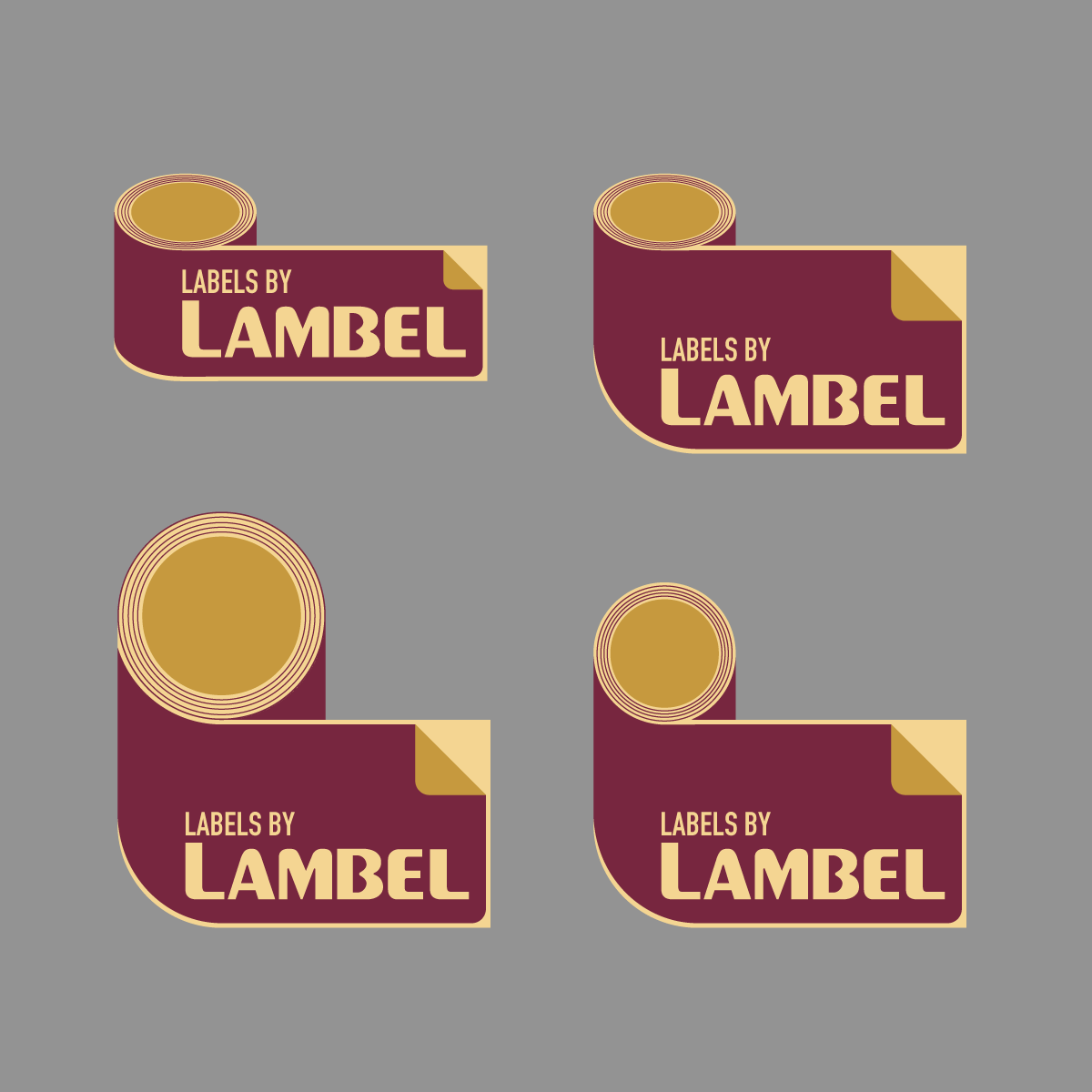
Top left makes the most sense because, for the other three, the left end of the logo does not follow the contour of the roll. Besides, the extended label seems to come out of nowhere from the roll.
As for the design itself, I do not see anything earth-shattering.
We all get placed in the situation of being torn between what clients might want and what those same clients might really need. Lots of clients think of us as rented hands with the skills to implement their visions.
It takes some skill and experience to redefine those preconceived roles. Instead of them seeing us as short-order cooks, its to their advantage to see us as experts who will help them achieve their goals rather than simply being order takers who implement their ideas. Sometimes this is possible. Sometimes, for various reasons, it’s not.
So with that said, the uninspired and literal depiction of a roll of labels being used as the logo for a printer that makes rolls of labels is pretty awful. This might be what they’ve asked for, but this is not what they need. They need something that defies expectations and separates them from their competitors. They definitely won’t benefit from a logo that simply says, we’re just another average, run-of-the-mill label printer.
If this is for a crowdsourcing project, well, good luck with that because crowdsourcing is a short-order cook process. On the other hand, if you have an actual client with whom you can discuss the pros and cons of various ideas, I’ll suggest trying to talk the client into a better idea that will better server their objectives.
The client is doing themselves a disservice in dictating elements “roll of labels and peeling corner”, color and font. It leaves you no room to provide guidance on how they could best update their logo.
As they are, the fine lines will get lost in the roll. You’ve basically executed their demands, but IMO, it all seems a little hokey and dark. Mainly due to what they’ve asked of you
I agree with B’s advice. This is not a successful solution for the good of the business. It’s a solution for the ego of the owner. When I am faced with such restrictions I always show an alternative solution that addresses the success of the company. Show them what you can really do along with their demands.