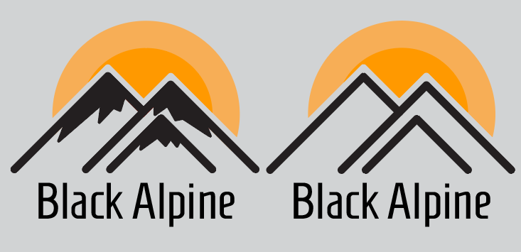
Which do you prefer? company name is Balck Alpine they want to utilize the color yellow. feedback would be greatly appreciated.
You haven’t told us what Black Alpine is, what they do, or why you feel your logos are appropriate for their needs. Without sufficient insight into the company, it’s not possible to judge a logo beyond aesthetics.
From an aesthetic point of view, I’ve seen versions of snow-capped mountain peaks with the sun or clouds in the sky dozens of times.
I’m not necessarily suggesting giving up on the mountains, but I would suggest coming up with a different take on it instead of going with a cliche.
3 Likes
Good point, it’s just a mock client I’m working on. Here’s a copy of the brief. Thank you.
I went with the mountains as I think they represent strength and it goes with the company’s name. Same goes for the sun and I don’t have to worry about using the color yellow. I get that it’s simple and lacks innovation. I’ll try to think of something more creative. Thank you