Hiya,
I am a bit confuse between two choices of design concept for a logo related to audio or recording.
It needs a dove pictorial mark there ![]()
Which one do you think would do best?
Thanks!!
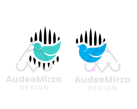
Hiya,
I am a bit confuse between two choices of design concept for a logo related to audio or recording.
It needs a dove pictorial mark there ![]()
Which one do you think would do best?
Thanks!!
There’s not much difference
Without the description, I’d have no idea what it is.
I wouldn’t have said it was a dove.
Normally you’d see a dove with it’s wings spread.
It just looks like a duck or some other bird.
The lines behind it don’t say audio to me.
Either of them.
Do you have any other options? What were your sketches like?
I kinda thought it was a baby duck or pigeon at first without reading anything. The lines also seems to be the default illustrator swatch and the curve in before they likely would naturally.
Was there a brief? Is this a contest on ** contest site removed ** or ** contest site removed **?
Neither.
Audio bars don’t usually peak. They are nice sine waves. And not usually pointed either, but that can vary on how fuzzy your eyes make the LED points. Your logo doesn’t have to scream “audio” but a little better representation of what you are trying to represent might work better.
Post the brief. This sounds a lot like a crowdsource brief where the client wants their poodle, the neighborhood park and a partridge in a pear tree all in there logo…Quote possibly a bad idea.
I like the one on the right. A dove and missiles hint at an oxymoronic statement: “War for Peace”. Well thought through.
The right one looks a lot like Twitter’s logo, which might cause your client legal trouble.
Additionaly, none of them says “audio”.
Nah, it’s completely different and occupies a different space.
If it is a social media platform then maybe.
There’s plenty of similar logos, but they operate different businesses.
https://creativepro.com/sometimes-a-logo-is-just-a-logo/
Differences here is the same logo but different businesses.
Where as NBC and Nebraska same space.
Nebraska won.
The bird and the color of the bird are too close to Twitter’s logo. If the logo needs a bird for some reason, there are hundreds of ways to draw birds. Pick a way that doesn’t immediately suggest Twitter.
The bars behind the bird look more like a picket fence than typical audio frequency volume bars. If you want to suggest those kinds of bars, the drawing needs to look enough like them for people to make the connection.
There are better ways to tie music or audio in with birds than simply juxtaposing drawings of each.
Pay close attention to the suggestions already posted. I agree that the logo needs a total make-over. I spent 50-years in the ad agency business and 70% of that included audio/video production, and what you have designed does not communicate “audio/video” Try again, using the advice that you’ve been given on this forum, and I wish you the best of success.
@Smurf2 @PrintDriver @Eriskay @Billyjeanplxiv @PopsD @Jakub_Trybowski
Thank you all for the comments and suggestion. I am sorry I couldn’t made prompt reply.
The client has accepted the 2nd concept (at the right) but we’re using the color as seen in the 1st concept (at the left). Hopefully it wouldn’t look alike to Twitter logo ![]()
i would go with the blue one
The OP stated, right above your reply, the decision has been made ![]()
and unless I missing an attempt at humor … they are both blue.
Closing this since it’s a done deal ![]()