Soft Hawthron is a racing car company. It targets college students(18-26). I designed a bold mark with red color to show speed and boldness.

Can you explain more about the client? A racing car company that targets college students? Are a lot of college students buying race cars?
My initial reaction is that it’s interesting, and it has some of the hallmarks of a good logo (easy to reproduce in one color, easy to reproduce across a variety of mediums) — but I feel like it is missing the mark and would not stand the test of time.
3 Likes
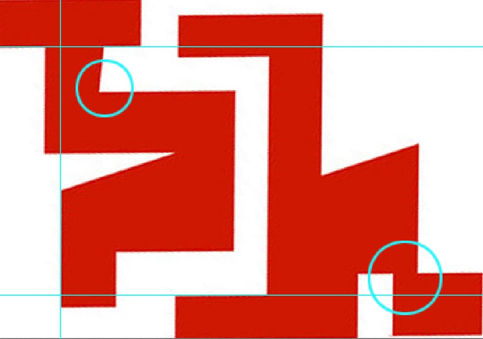
I straightened out the red mark to show what I think are problems. Very few things seem to line up, which in itself isn’t “wrong”, but when it looks like it is trying to be fairly consistent in width sizes, and gap sizes but it isn’t, that just looks sloppy.
The top left circled area shows that line isn’t even actually straight and the bottom connector is too oddly thin.
It looks like it isn’t well executed because of these issues. Also the various angles and jagged edges don’t seem to be purposeful.
Also, if you just look at the mark, seeing an S and an H is a stretch. The S looks more like a 5 and the H looks more like a k. And lastly, the little angled “cut” in the H of Hawthorn is barely noticeable and doesn’t really serve much purpose.
Do you have sketches? With logos you should have probably a minimum of 20-30 sketches of ideas. Actual sketches using pen or pencil and paper. It helps you quickly work through ideas without being so hung up on flawless execution. Then you can look through the ideas in your sketches and identify areas where there may be something to them and THEN take those ideas to the computer and work on cleaning them up. Even then there are times for me where a sketch seems that it might work, but once executing on computer it falls apart.
This logo looks more like playing around in software hoping something sticks.
3 Likes
Am I in Hong Kong? I raced cars. And I love racing cars in simulators on computer. I’m not in your age group. I’m older. But your logo reminds me of Graffiti. If your college kids know how to READ graffiti (I don’t) then your fine.
Maybe something you should consider (since this is C and C) is represent the sensation when your in a vehicle travelling at 250 km/h and the world around you blurs a bit and the world in front of you focuses more. Yeah peripheral vision and speed.
As for photoshop. If you changed the letters to be more readiable in English you could I donno use filter > wind.
This topic was automatically closed 365 days after the last reply. New replies are no longer allowed.