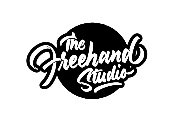
Hello everyone. Just wanted to post a logo I designed for a caricature and water color artist based in India and get some feedback. The artist works under the name of The Freehand Studio I am pretty new at this. So any feed back will be greatly appreciated
So. Logo, ok, it’s a type logo.
But it doesn’t say what it does. Had you not said caricatures I wouldn’t know what this is for. It looks like it’s for an illustrator not a caricature artist.
Research caricature logos. They are typically bright, colourful, and have a caricature of the artist.
Where you have encapsulated the words into a logo. The logo isn’t delivering because it hasn’t told the story of what it is for.
Free hand studio on its own doesn’t explain the service. And the logo doesn’t convey that either.
I think it’s nice and well-drawn, but lots depends on what we don’t know, like the style of his caricatures and watercolors. It might be just a little hard to read, but not so much so that it’s a big problem.
Honestly, I like it. I think it’s good, assuming, of course, that the style complements the artist’s work.
I just looked through a whole google page of graphic design studio logos. With the exception of one, none of the rest had a lightbulb and keyboard in them telling me that they come up with ideas and use a computer to make designs.
This logo reminds me a little too much of Brush Script. But then, brush and script might be a good solution for a caricaturist or someone who uses brushes for water color. The only thing that stand-out bugs me is the itty bitty skinny details on the F, S and the ds to some extent. Either do em to mean something or don’t do them at all. The other thing that doesn’t bug me as much, but is there, is the sameness of the duplicated letters. Even the best calligraphist has some variation to lettering when hand created.
I don’t think you’re off to a bad start. I like the direction of a typographical solution, and I like the font choice. It reminds me of a sign painter type of font. All of that said, I think you need to push this and work on refining it quite a bit as the typesetting feels amateurish to me.
Here’s a few of the things that make me feel this way. The kerning between the “T” and “h” seems too tight. Some of the letters are connected, such as “eh” and “an,” and some of the letters are not connected, such as “ee” and “ha.” I think it would look better if all of the letter pairs that should be connected are connected. The tail on the “d” seems too big; it almost looks like a “b,” and you end up with some awkward negative space. There is a good deal of visual tension between the “S” and “t.” What would it look like if “t u d i o” was lowered so that the crossbar in the “t” tucked onto the naturally occurring bow in the “S”? Is the size and placement of the black circle in the background the best it can be?
