Run logistics is a door to door pick up and delivery outfit.
What are your reviews on the Logo?
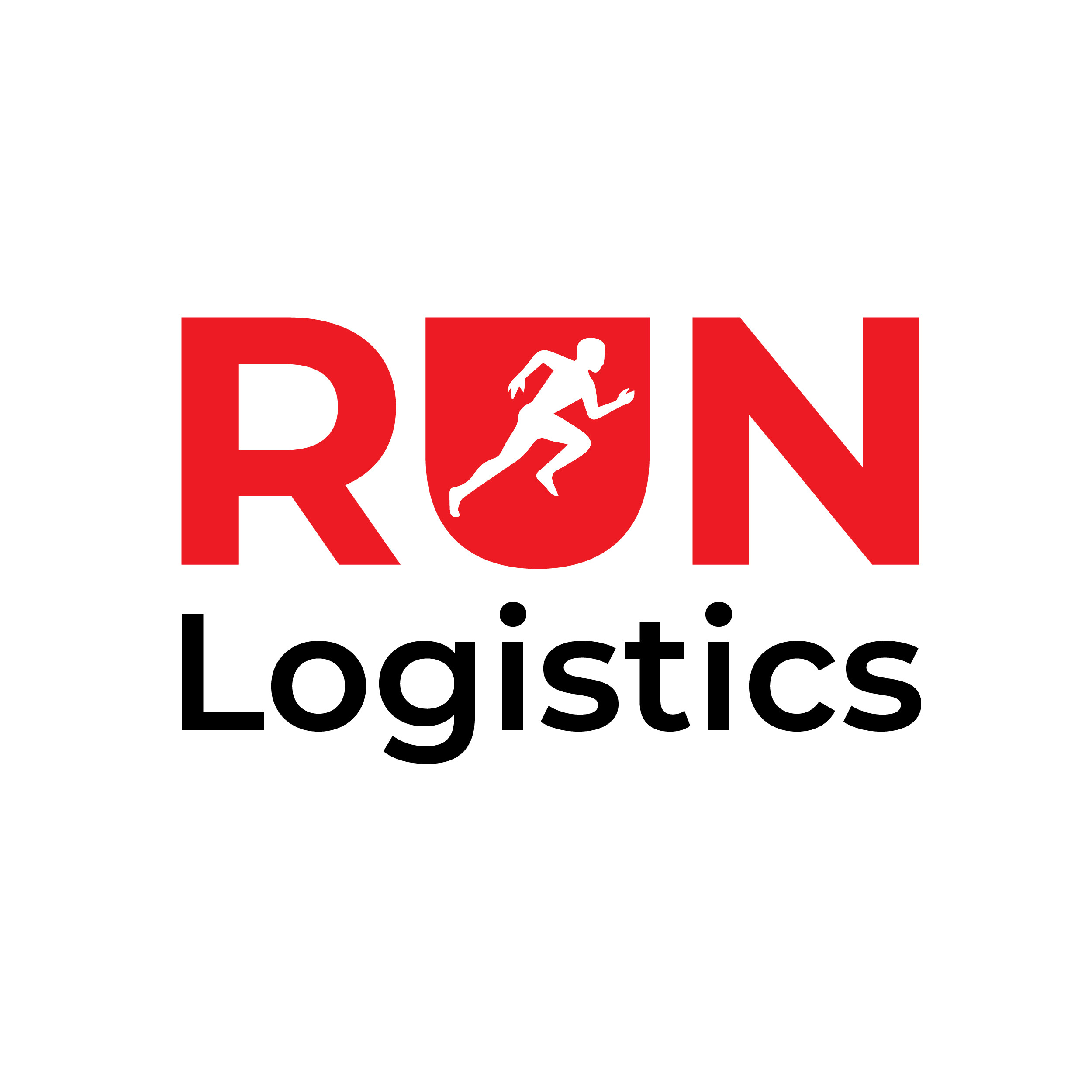
Looks like a running club. But then says logistics. So I would assume it’s a running delivery service. Logistic means so much more than delivery though.
In essence, it doesn’t make sense. I don’t get door to door. It could easily be a supply chain for running gear.
You have an opportunity for some fun with this, but that might involve making the runner look like a delivery guy carrying a package instead of an athlete in a 100-meter sprint competition.
1 Like
I use three courier services in and around Boston. I can say quite honestly that I have never even seen their logos. I use them cuz I can call them (not fill out an app) and they show up quickly and get my stuff where it needs to go in under 2 hours. That’s all that matters.
1 Like
Just-B is right on target—A runner with a package is best, plus I would suggest adding “speed lines” (think of Superman comic drawings. This might also balance out some of the heaviness of the positive (red) space
1 Like
Thank you very much for the feedback.
Let me work on it