Hello!
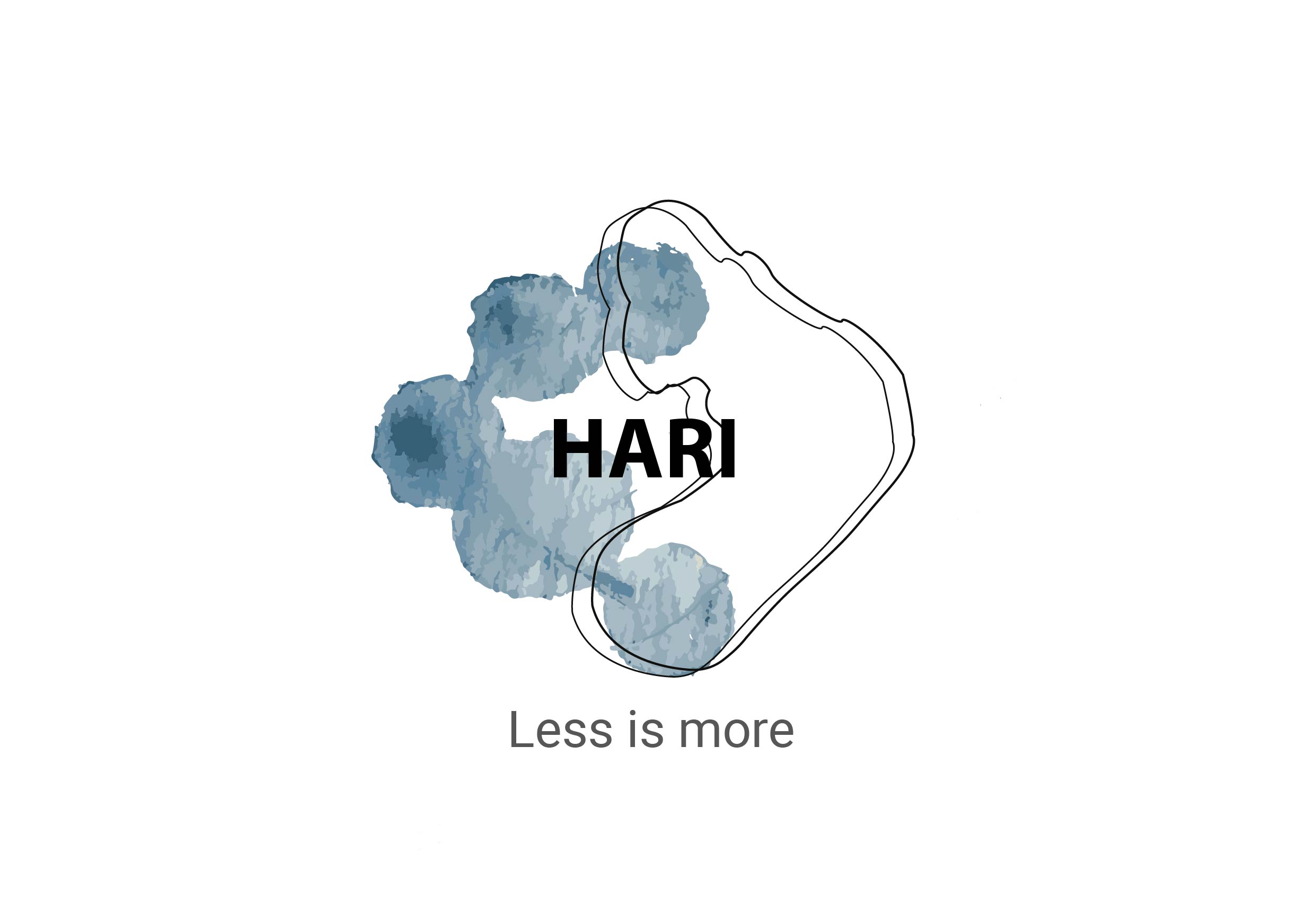
I would like to ask your opinion about this logo. It is the logo for one of my projects where we needed to create a design for a water bottle. I created an imaginary brand “Hari” which produces bottles that are bio-friendly and the water bottles have filter inside which cleans water. The shape of the water bottle was inspired by the shapes of the drops, which I have incorporated in the logo as well. The water bottle supposed to be a solution for the african villages where people do not have easy access to water, and thus they collect it with rain or from lakes and stuff. Thats why I used name Hari, which means “vessel”.
Looking forward for a feedback ![]()
Imagine your logo going on a sign large enough for a tradeshow booth or on anything other than just the water bottle or website.
Even if those gray blobs are vector, what do they look like when that logo is 3’ tall?
Where the R and I intersect that skinny-line shape, there’s a lot of traffic there that doesn’t need to be.
So you think I just need to remove one line-shape?
What I think is kinda irrelevant. (actually I think both lines are too darn skinny, but I’m a 3D sign guy.)
What does the line represent?
Why is it there if you feel you can remove it so readily?
Does it work with only one line?
Does removing one line reduce the traffic enough to matter?
I also think those gray blobs are going to look like paint by numbers when enlarged and any reversed beziers are going to stand out quite a bit as they tend to do in most grunge effects when enlarged.
1 Like