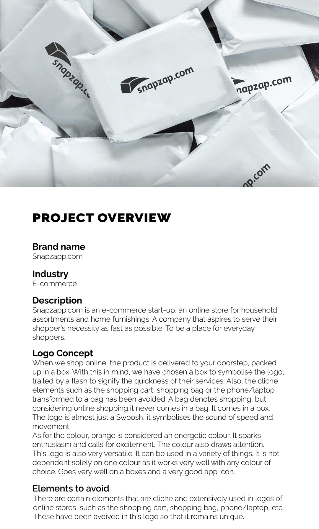
This is a logo I’m doing for an e commerce start-up. The client didn’t say a lot about the it. He said that it’s a bit like Amazon, but will be focusing on home furnishings. It was quite challenging to get good concepts. I could only come with this one which stood out. But the client doesn’t seem to like it a lot. If you can suggest some ideas or iterations it would be of great help
Screenshot_20200629-235615__01|609x1000

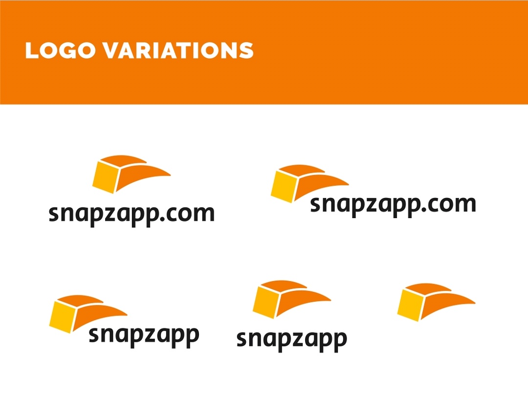
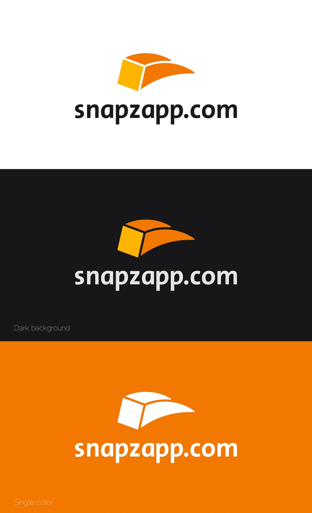
My initial impressions were that the mark was a gold bar, I think you should add some detail to the mark which makes it apparent that it’s box which is moving.
I also think it looks a bit off balance - if you blur your eyes on the black and white version the mark is too big and thick in comparrison to the type. I think you should maybe make the mark smaller and centre it up above the text, I also think you drop the .com
Thanks for sharing @Yusuf, hope that helps!!
1 Like
Well I don’t know why your client didn’t like it… Looking good as for me. May be you should play around with colors
1 Like
There’s a lot to like about what’s going on here, but there’s one big problem. Black, lowercase, sans serif type. An orange graphic device that has an arc to it. An e-commerce site. Sound familiar?
Maybe try some concepts focused around the home furnishings or snap.
1 Like