I’m finally back with an update. I played around with some alternate ideas after considering the input and feedback I received here, and then I took some time (over a month) to clear the design from my head.
I recently revisited the concept, and, while I do still like my original design, I agree with some of you that it ultimately wasn’t working. I played with some text-only variations and settled on a logotype that I quite like. It doesn’t have the sharpness of the original IMO, but it does tick more boxes, in terms of versatility and simplicity.
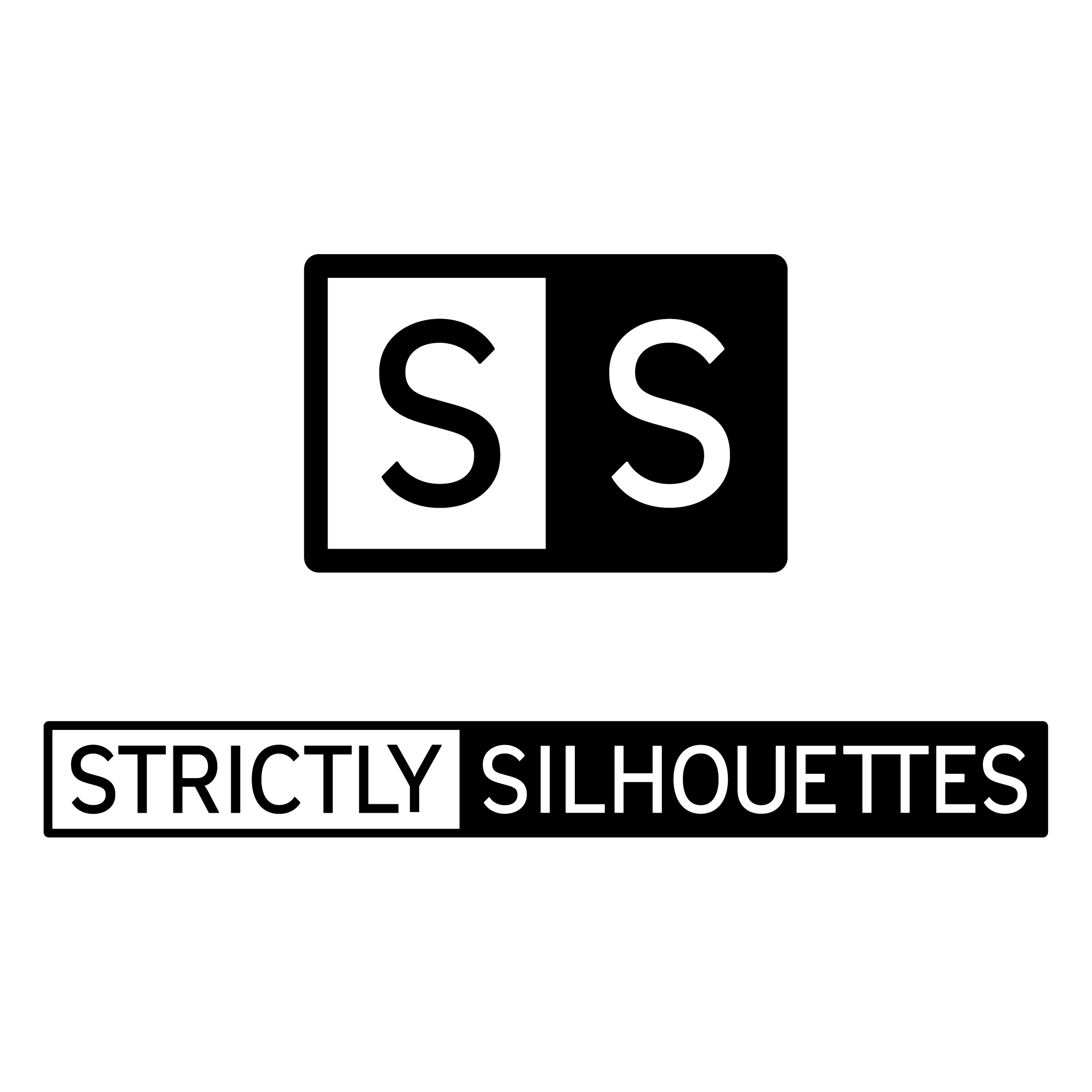
This logo is currently what I’m using, and I’m curious to know what you think, if you don’t mind sharing your opinion. It’s getting warmer here, but I still have my heavy sweater.
Thanks for looking, again! Hope everyone is doing well.
Firstly, the whole SS thing is more obvious now. Never a good look. The two components show little unity. It’s very bland. Kerning is terrible. Weights and balance are all over the place. And … that S is hideous. So poorly designed, it looks upside-down. Not sure what the font is, but it’s awful.
Sorry you’ve expended so much time and effort on this for me to just slate it, it really is not great.
@sprout I appreciate your feedback! I’m working to address your critiques now. Any mutilation of the font is likely my fault, from messing around with it so much. I do acknowledge that the concept is not exactly inspired, and I’m okay with that.
S’s are difficult to draw. The curves need to flow into each other perfectly with precise balance and correction of optical illusions. The bottom bowl of the S needs to be a bit larger and wider than the top bowl. Your S looks as though it’s about to roll over backwards.
Are the two marks you’re showing meant to be seen together or are they two separate ideas? Separately, I think the bottom one has merit, but as you said, it’s not all that original. Paired with the top one, everything’s out of whack. The split between the black and white isn’t centered on the bottom one, nor do they line up. I don’t see a way to make them work together as a cohesive unit.
I’d also avoid any SS pairings in a logo. Heinrich Himmler’s Schutzstaffel always comes to mind — at least to me.
Thank you B. That was a far more polite way of saying it.
My, somewhat, curt response was likely to do with the unholy hour I was unintentionally awake. So Joseph, I apologise for my brusqueness, if not my content.