Logo Design for an Online SVG Shop

Hello there!

So this is my first topic, and I’ll try to be as concise as possible, as I tend to ramble.

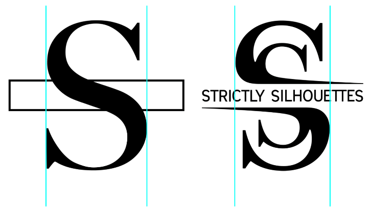
I’m planning to open a small vector/svg shop as a means to make casual, passive income and needed to come up with a logo for it, naturally. The name of the shop is Strictly Silhouettes, and I knew from the start that I wanted to do something that involved the two Ss—something simple and unoriginal (lol). This logo is intended for online/digital use only, as I’ve no need to print it. The store will be targeted toward the DIY/craft community and those who need vector assets and graphics for misc projects.

I really like what I have so far, but I’m here because I would love to get some real feedback (I’ve been told multiple times that it looks good and to stop working on it… sigh). I’ve never actively sought feedback like this, and after spending the past few days on these forums reading critiques and learning new tricks, I decided to bite the bullet. I wish I’d found this forum sooner. I have my heavy sweater on, and I’m ready.

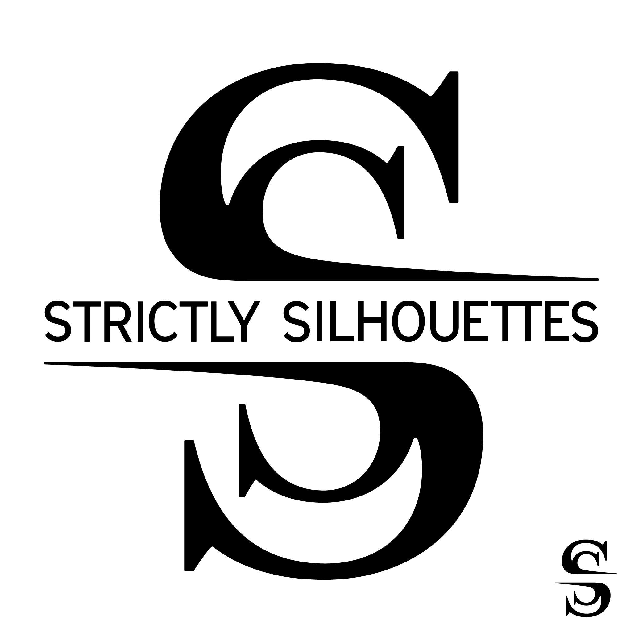
  • A modified version of Big Caslon (Medium) is used for the large Ss, and a modified version of Vitala is used for the store name.
  • The logo on the bottom right is a simplified logomark for use at smaller sizes (e.g. as a tiny avatar), where the lettering would be difficult to read. The Ss are weighted more at the top and bottom, the horizontal extensions have been shortened, and the gap between the two halves has been reduced.

The GIF below shows the progress of this particular design up until now, the last two frames being the most current (maybe final) iteration. The last frame is just the current logo shown with a circular crop.

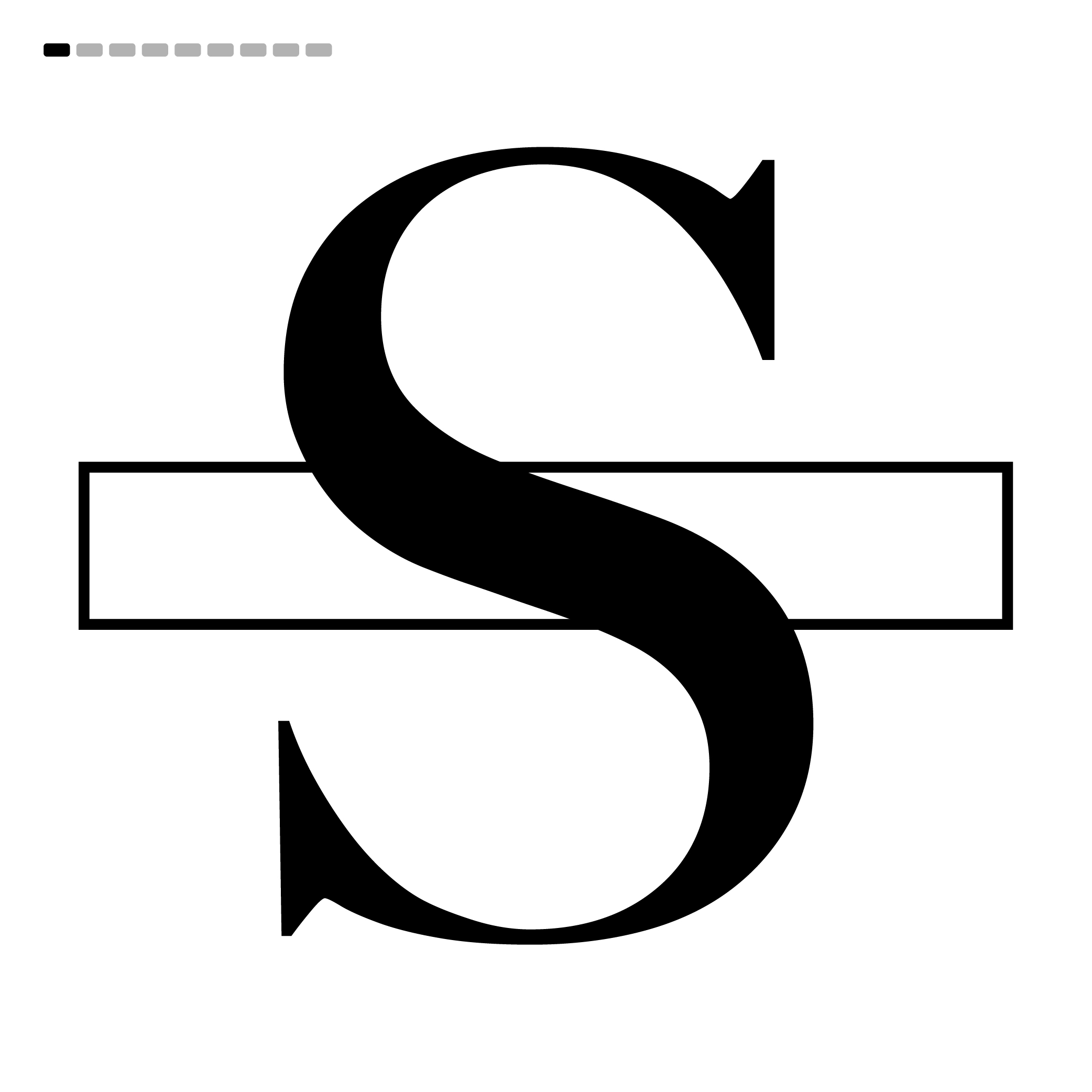
At the risk of shooting myself in the foot, I think it looks like the logo for a publishing house or some literature-focused company. The top half is reminiscent of waves breaking, and the text, in my opinion, feels like it should go up or down a weight. My main concerns center around whether the text looks properly kerned and whether the curves on the large Ss look balanced/appropriate.

For context, I’m not a professional designer, though I was once a GD student. As I’m sure is pretty common around here, Photography and design have been casual passions since my HS days. I’ve never had a client (aside from family and a few friends), and the closest I’ve gotten to a position as a designer was working as a video tech at a print and frame shop (which I enjoyed). I’ve been happy keeping this as a hobby and to myself, so-to-speak.

I think I will leave it at that for now; nice and concise… :roll_eyes:
Thanks for your time if you’ve made it this far! I’m getting a bit warm in this sweater.

1 Like

When I first read your post I really liked your logo, until I scrolled down.
I would seriously consider, Do you need the bottom parts of the letters below the company name?
It sure looked slicker without them.

I don’t disagree. Honestly, I’ve contemplated losing the bottom half several times, but the symmetry has compelled me to keep it thus far.

If it’s going to work with the top half only, the text will need to be modified or also dropped, IMO. I’ll explore this option more tonight when I have some time, and more working brain cells.

Thanks for your input!

I completely agree with this. A traditional, serif font can look modern, but you’re not pulling it off here. Compare your logo to the branding of sites like Shutterstock / iStock Dreamstime — other stock sites you’ll be competing against to see how your logo stacks up. I’m not saying your logo has to copy or mimic these other sites, but you should at least have a feel for the marketplace.

If it were me, I’d explore a few more concepts.

All of that said, I’ll give you points for designing a logo that works in black and white, doesn’t rely on gradients / shadows / effects, art that will reproduce across a wide variety of mediums, and for considering how the logo will reproduce in small sizes.

1 Like

It doesn’t sound like the OP is wanting to compete as a stock site.
His target market is the at-home makers that need svg files to run their low-entry cost shop-bots, CriKuts and table top lasers. Those require vectorizing raster items to give the machine a path to follow or a shape to engrave. Some of the more sophisticated ones can even do grayscale bas relief if you get the settings right (requires quite some trial and error with the machine in question.) Totally different market. The lettering might actually appeal to those that do woodworking in their garage, etc. That’s why it struck me as pretty good, when seeing just the top of the logo.

This if for people with a jpg file they found somewhere or created on their phone drawing software that they want converted to outlines. When I do these for people here at work, for compensation, they buy me a donut, or a coffee.

There’s a little cottage industry of at-home makers churning out stuff on machines like this. Often with no thought to trademarks, licensing, copyright or other business legal considerations, but that’s a whole other rant (though there are some savvy ones that try to school the others on the machine manufacturers’ forums, but like here, you can tell em, doesn’t mean they know what you are talking about.)

Ah, I had not considered that angle. I just thought a website selling vector silhouettes would be competing with the likes of iStock or Shutterstock. I am only roughly familiar with the DIY cutter market so, if that’s the intended market, this may be more appropriate than I’m giving it credit for.

1 Like

It’s all part of the new gig economy. Everyone seems to have a little side hustle. I’ve been tempted to get a small laser myself, but knowing quite firsthand how bad they smell while cutting stuff, no. Don’t want that in the house. Not even the garage. That would require a detached workshop, LOL!

You know all those wonderful lasered leather designs you see? Think about what leather is, and what it smells like when burning. Acrylic, just as bad. Some of the woods smell nice, others, not so much. Yes, properly vented. You still have to open the lid and even if you wait, you still have to peel the protective paper off.

Not a huge fan of it to be honest.

The distress caused to the cut off letter S looks disturbing for some reason.

I played around a bit - and putting 2 S back to back and and white box over the middle with the word.
To me it looks a bit more classy.

But if you’re happy with what you have then go for it.

Just focusing on this one thing…

With type design, a quest for symmetry needs to account for optical illusions that occur in weight balances.

Below, the left image is the first from your animated GIF. It shows a typical Caslon S. The right images is one of the final frames of the sequence.

In your attempt to make everything geometrically symmetrical, you’ve caused it to look visually nonsymmetrical. The bottom of the S needs to be taller and wider than the top half or it looks unbalanced and top-heavy. The goal should be visual symmetry and balance, not their geometric equivalents.

1 Like

It’s fantastic that you’re planning to open your own design business.

Regarding the mark - what is it you’re trying to say and to whom are you talking to?

I think these are questions you should be answering first before trying to ascertain whether or not what you’ve come up will be a good fit for what you’re trying to acomplish.

1 Like

Wow! Thank you so much for your awesome responses.

TL;DR:

I’ve played a bit with a version of this logo that omits the bottom half. I like it, but I think I’ll need to either modify or change the typeface used for the text for it to work well. So far I’m not in love with anything I’ve come up with, but I’ve not been at it for more than an hour. I do have one more idea to explore. After that it might be back to the drawing board.

Regardless of my path forward I think it’s clear that while it may be okay, it needs refinement. Your collective feedback has been very helpful. I am hoping to have more time tomorrow to actually play with alternative designs.


This is the most important question, and might answer others. I’ll do my best.

The target demographic is the DIY/maker/craft community. (PD hit the mark in his second reply.) More specifically, I’d be targeting those within the community who use vector assets as an element or aspect of their physical or digital products. The age range is quite wide here, and the logo is intended to appeal to both ends of that spectrum—sharp yet familiar and approachable. I’m aiming to convey a sense of clean and simple design, with a focus on quality and attention to detail. I’ll be selling similarly styled designs, so this logo should align with that aesthetic.

I like what I have so far, but I know it isn’t perfect. I’m passionate about it, and I feel, at the very least, the logo has “good bones." And that is why I’m here; less because of doubt or indecision and more for constructive feedback on something I feel has potential, but isn’t all the way there.

I don’t have a great reason for it, but I’ll admit this was an intentional decision and not the consequence of a lack of consideration or understanding. Still a rookie mistake I suppose, but an intentional one? In any case, I think I’m trying to turn the S into something it isn’t. I enjoyed the ripple-like appearance that the symmetry invoked, but in the end that’s irrelevant and contributes nothing. It’s still an S.

This is one of the things I was curious about, and now it’s been addressed. I will adjust it in case I end up using the bottom half. Thanks for the input!

I appreciate the honesty. I’ve never really liked the way mirrored Ss look. I don’t think I’ve ever seen it done well, which is not to say it isn’t possible. I’m curious if you’d be willing to share what you came up with. More to the point, did you align the Ss with their spines touching or “face-to-face?”

While I do like the way it’s turned out so far, I’m here looking for objective input because all I have right now is my own very non-objective thoughts. And I’ve been staring at it for too long with the same eyes. Feedback like this is exactly what I’m looking for.

I’m shooting for modern, as opposed to traditional, but PD is correct; I’m not looking to compete with commercial stock sites. I have far too little ambition for that… I hear what you’re saying though, and I partially agree. This has crossed my mind already.

Do you feel there is any room for this concept to evolve, or would you suggest approaching from a new perspective entirely? I’ll share one of my abandoned designs in my next update.

In your honest opinion, do you think that this logo works by just lopping off the bottom half? I’m genuinely curious. If what you first saw, before you scrolled down, was the finished design, what would your feedback have been? I realize this may be a moot question considering what others have pointed out, but I’m curious to know, if you’re willing to elaborate on your original reply.


Thanks again for all the great feedback! I find this extremely fun, and I really appreciate your time!

I wish I’d found this forum sooner.

1 Like

The reasons the top half worked for me:

  • It was immediately recognizable that they were the tops of two letter esses. If you take the serifs away, that might not be so clear
  • The extension of the tail over the company name balanced the white space to the left.
  • The shape sort of went toward carpentry tools (think block plane or handsaw handles,) like someone who might have a shop-bot would latch onto.
  • Similarly, they look like the top of a monogram which might drag in the crafters, scrapbookers, vinyl plotter users
  • the sharp point to the right went to the idea of precision. Now you have the laser cutters. (but keep the rounded end. Don’t make it pointy, there’s nothing more frustrating than cutting a sharply pointed logo element on a laser and having the end burn or melt off LOL!)

All in all, I thought it very effective.
Until you added all the confusion of the bottom half, which undoes all of the focus and balance you had.

I feel this logo is quite bold/strong/edgy, whereas I would guess your demo is women… I wonder if you soften it, perhaps a little more feminine…? my 2 cents

1 Like

Do you think the typeface you’ve chosen reflects a DIY/crafts-related impression? Personally the typeface you’ve chosen for “Strictly Silhouettes” seems super serious and a little boring to me; And while I get that you want it to reinforce the “strict” aspect of the brand, I don’t know whether that will fit with your target audience.

I would suggest you spend some time on Behance and try to look at the world through the eyes of your prospective customer. What brands would they like? What asthetic would resonate with them?

The target demo is hardly limited to women. The people I do vector conversions for are all men. 100% of them. They have everything from lasers to vinyl cutters to shop-bots in their home shops. The makers market isn’t just women’s craft-arts things.

There was something very balancing to me on the very top logo, and just the top half of it, where the solid, but not too heavy typeface used for the name offset the large curves of the esses. It set a good foundation (I’m still ignoring the bottom half as not necessary.)

Prospective customers are more likely to be found on Etsy or in specific discord servers

Thanks for breaking down your thoughts. My impression was that the two halves contributed more to the overall balance of the mark, but your input provides valuable perspective. The more I look at the original, the more it feels overcomplicated. I didn’t add in the bottom half for compensation; I kept it as part of the S, but I’m realizing more that the top half is sufficient on its own. Your points have clarified that for me a bit more.


On certain platforms I believe this is more true. On Etsy in particular, a majority of the sellers/buyers are women. With that said, I think this is a misconception, and the designs I’m looking to sell—the files, really—have a wide range of applicable uses.

I haven’t thought to check out discord, but Etsy is where I’ll be testing out the store first. If I find enough success there, I will explore other options/platforms.

I agree with you, and that was also intentional. I wanted to use something clean and easy to read. A lot of the SVG shop logos I’ve seen are overly complicated and lose legibility at smaller sizes (esp. on mobile). I saw this as an opportunity to differentiate my shop from the rest, again aiming to communicate a clean and simple aesthetic.


@PrintDriver The market I’m entering is a saturated one, and I don’t plan to make a killing. My focus will be on quality over “quantity,” which isn’t necessarily a concern for much of the DIY/maker community. As you’ve mentioned, there’s a high prevalence of sellers offering designs that are obviously TM’d / CR’d, many of which are included in “packs” of 100s or 1000s (yea…), and offered at a very low price. Precision in execution is not the goal here, and potential buyers see a bargain.

My original inspiration for opening the shop came from thinking I could do better—not universally, but in some areas. Whether or not this is a good enough reason to go through the trouble of opening a shop is a whole other topic. “Just good enough” has almost become an athletic of its own and one that I think many prospective buyers might prefer over a sharp, well executed design. I’m looking to test this theory. My conviction is clear, and even if this proves unsuccessful, It will have been worth it to me

For now, I’m perfectly happy with the car I have. :wink:


Thanks again for all the feedback! I am actively working on the design, but I’m letting things marinate and crystallize, taking into account what has been pointed out thus far. The goal was never to turn this into an exercise in design-by-committee, but your collective input has been awesome so far. I will post an update soon.

It’s great that you’re giving so much consideration to the legibility, but if that’s what you’re trying to prioritise, why did you include the “SS” in the background? Why not just opt for a logotype instead which would be far more effective as far as versitility and legibility go?

While I think legibility is the most important thing (and I don’t think you should choose some quirky typeface!), I do think you need to give it some character, and the driving force behind this decision should be something that connects with your prospective customers.

Why do you think you need to differentiate yourself from everyone else in this space?

I would suggest you watch this (you only need to watch 5 mins):

Maybe the overall demographic of Etsy is women. Dunno, I only go there for specifically Steampunk stuff which teeters just over the edge of a male dominated demographic (actually it’s probably 50/50.) Same for Discord. I’m probably not your target demographic either and where I work the demographic is mostly men as well. Quite honestly, if I were gonna take this leap I might add 3D .stl print file capabilities. That’s where I see some demand that outstrips supply (again though, anyone that lays out money for a 3D printer starts with some capabilities so yours would have to be above and beyond entry level stuff.)

That’s a good point, and my initial response would be that I wanted to do something more interesting than a logotype, but I know that’s not a great answer. I’m not at all locked to the design I posted. I like it quite a lot, but for reasons that don’t necessarily reinforce its purpose.

Another good question. I watched this whole video; there’s a lot of great info here. I realize the question was probably rhetorical, but my short answer is similar to the woman’s, which is I feel the natural urge to want to stand out amongst a sea of shops that all kind of look the same. I understand the inherent risk in that.

To his point, what I’m offering is not so different to what’s being offered at other shops. On the flip side, I am, to some extent, looking to attract the antelope hunters. Different obviously isn’t always better, but it does often cause people to look. I’m not expecting this logo mark to pull all the weight of the shop; the listings will have to do most of the heavy lifting, as that is what most will see first when searching for a [thing].

Thank you for sharing this with me!

Most of the time I’m in the same boat, usually searching for shop stuff or industrial design (things I can’t afford). I’ve never thought about offering STL files, but that is beyond my scope at the moment. I have an ambition:motivation issue. I’d love to get into 3D designs, but I have too many on-going projects and hobbies.

This reminded me of an exchange I had with a customer a few years back. She insisted I turn her digital photo into a 3D printable file, so she could go take it to the local fab lab. She would not accept what I had to say and argued with me for 30 minutes over whether or not it was possible, let alone feasible. This was after I already spent an hour cropping her questionably-sourced graphics as she hovered over my shoulder.

1 Like