Hello guys, it’s me again with another logo design try.
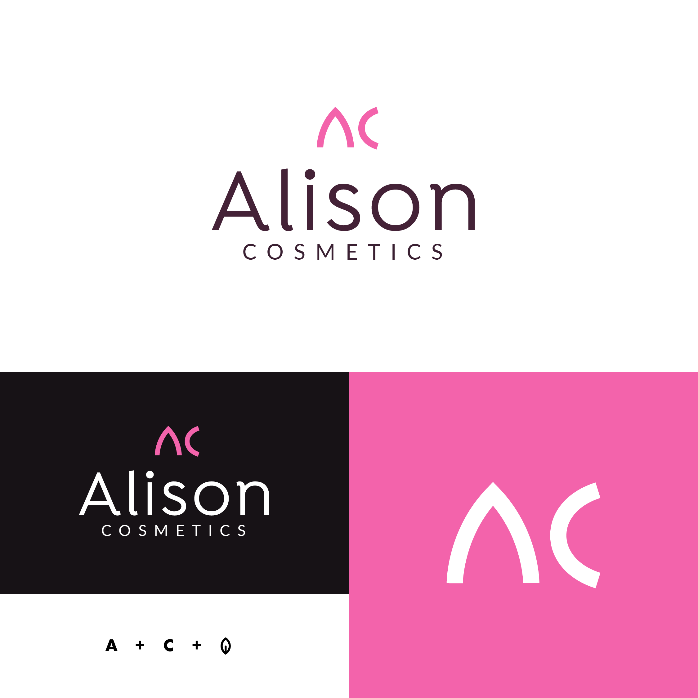
Company: Alison Cosmetics (from 30-day logo challenge at LogoCore). Beauty company that sells vegan skincare products and cosmetics. They wanted to use colors ranging from pinks to purples (I guess mostly because the target audience for beauty products are women).
In brief was stated that previous logo was plain text and they wanted something readable when used as a profile picture (thats why I chose brandmark + type logo).
Logo: I was playin with idea of a leaves, since they produce vegan products and came up with idea of making first two letters out of leaf shape if you cut it in a half vertically and horizontaly, which creates a mark. With a font I went for something “feminine” and softer rather then strong and bold typeface.
My initial thoughts are that it looks quite, clean, elegant (kerning needs attention) until, I read the bit about vegan, then it all fell over. Pink doesn’t say vegan, natural, wholesome, etc. I now it is a stipulation of the brief. However, if it were a live job, I’d be going back to talk to the client about this. Perhaps use an appropriate colour and submit a rationale with your design.
To stipulate pink is a little cliché on their part and also, arguably reduces the target audience age. If you have to use pink, raise the demographic age a bit and use a more subtle, dustier pink.
Overall, the typographic feel is not at all bad. Understated, sophisticated. I like the thinking of the leaf. However, the execution is a bit too subtle (something I’m guilty of myself. I’d always rather underplay, that be gauche – depending on the project, of course), but this is so subtle that unless you were told, it may get missed.
I like the overall typesetting for the primary logo. The “C” in the “AC” acronym bothers me. It reminds of a particular typeface that I despise. The name alludes me, without looking it up it may actually be papyrus or one of those Greek-Esk typefaces.
It presents a primitive feel that I think clashes with the rest of the piece.
Edit: if the the C completed its curvature a bit more and offered similar symmetry and character weight as the “A” , I think it could work
I disagree with @sprout here that vegan products can’t be pink. Especially with cosmetics, being vegan does not have to be about being green and “anti-carnivore”. People who buy vegan cosmetics simply want something organic and without chemicals - often rather because they want something natural on their skin, than because of concern for animals. In any case, if you want to make the color pallet more “organic” looking, shades of lavender and peach blossom could work.
The choice of colours and light-weight font makes it feel very femmine.
I’m liking the choice of typeface for the word “Cosmetics”, however the choice of typeface for the words “Alison” feels a bit funny.
I think it’s the curved tails on the characters, they’re round which makes it feel very friendly and soft, however it doesn’t seem like the attributes I’d associate with a beauty product.
In terms of recommendations, I’d suggest exploring different typefaces for the “Alison” text. I would thinking maybe either a light weight geometric san serif font or a modern serif font.
I like the idea of trying to combine the leaves and letters for the monogram. However it feels a bit imbalanced as the “A” is significantly wider than the the “C” and the baselines are misaligned. Have you considered droping the “C” altogether and focusing on the just the “A” which looks more leaf-like than the “C”?
Guys thank you for your feedbacks, it’s very helpfull. I try to symplify my logos as much as possible because I want them to be easily memorable (I guess because I like Sagiv Havivs works and I am influenced by his style).
@OVOAO Shades of lavender and peach blossom didn’t come to my mind. That’s a great idea, it’s more softer and maybe even not so “aggresive” than saturated pink, also there is more nature aspect to it.
@pluto Ye, I have sometimes problems to come up with good typefaces for my logos, need to work on that, because I keep repeating same few fonts when creating
Where on the price scale does the brand sit? Is it high end? Is it drug store? Who is the target demographic?
Right now, it looks more drugstore to me. The name and logo makes me think of the cute, girl next door. Maybe cheaper teenage makeup. Not high fashion or runway.
As someone who buys vegan cosmetics, I don’t think the logo needs to scream VEGAN. It should be about quality and style. The colour pink works fine to me but the general aesthetic looks quite cheap which would turn me off buying it, even though I might be the target demographic.
I like your train of thought with regards to creating an A / C out of a leaf, but I don’t think the leaf is readily apparent – maybe that’s not a bad thing. I’d recommend pushing this one a bit more. Do you need the A and C or would just the A work? Side note, the A by itself looks like the top of a lipstick – not saying that as a good or bad thing, just making the observation. Is there a way to make the leaf derivative more apparent? One thing I’d definitely recommend is setting ALISON in all caps. Right now, the negative space between Alison and the bottom of the mark is too busy.