Logo Design for multiple businesses

Hello everyone,
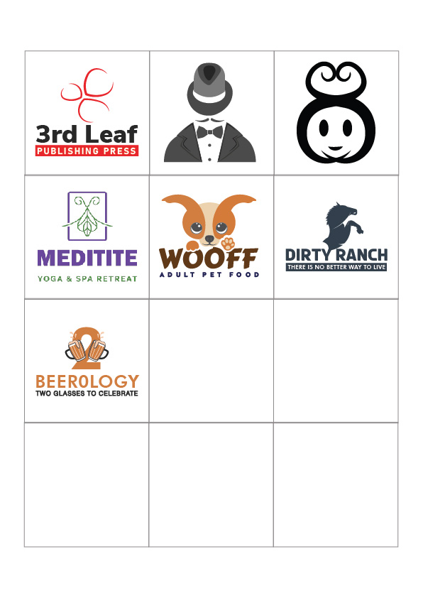
This my first post here, rather I have just registered on this site, completely disheartened. Need help from experts here. I have created some logos and would love to know what’s wrong with them. I have been mostly denied or told that my designs are not professional and unfortunately i came up here to understand is - where do I stand in the graphic world. Please be as brutal a critic can be - I wish this to be a background check for me:

1-01
1-02

Thank you in advance.

Unless we knew what each logo was for, there is no way to let you know if it’s working or not.

Why don’t you pick one you really thought was working and post that with the brief. Then we could give you more direction.

And welcome to the forum :slight_smile:

2 Likes

I’m not seeing anything that would warrant that kind of judgment. There are some I like better than others and some that I think are too detailed or a bit clumsy, but in general, I’ve seen a whole lot worse.

Like RKK said, much depends on the clients, their wishes, their businesses, the logo’s primary uses, the target audiences, etc. Without knowing those things and the challenges faced when designing each, we’re simply judging based an aesthetic appeal and general best practices for logos.

1 Like

Firstly, welcome to the forum.

Can I ask; when you say, ‘rejected’, do you mean from a crowd-sourcing sites? If so, even if you get accepted, working in that way, is not exactly a sustainable way to build a career. You’ll always be bottom-feeding.

Learn the craft properly. Learn what logos really are – or should be. In and of themselves, they are pretty meaningless. They should be part of a unified, consistent branding strategy. As stand-alone items, they just become adornment.

Have you created these yourself from scratch? Have you used any stock imagery in them?

As B says, I’ve seen worse, but, they are what they are, but not the right way to go, to my mind – and in my experience. Your job as a designer is to communicate someone’s unique message, not to make pretty logos. You’ll need all the tools of the trade to be able to do that effectively.

Also, you won’t get many people championing crowd-sourcing site around these parts.

I am not saying this to dishearten or deflate you, but we see these sorts of things day in day out and those of us who do this for a living – and have done for a number of years – know the signs. It’s a path to remaining in the amateur, hobbyist market. If you did them yourself, you obviously have some ability. I’d always suggest going and getting yourself educated properly. That way you’ll learn how to build a solid career as a designer.

Good luck.

1 Like

Actually, none of them are for clients, to be true I have not received a single client until now. These logos were created for the portfolio that can be presented to clients. Let me just give a brief on each one:
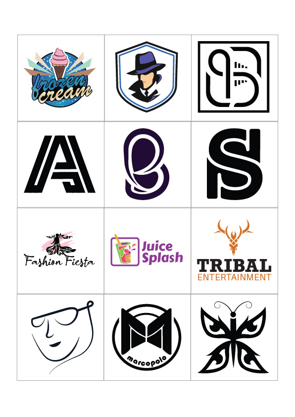
1. Frozen Ice-Cream: This concept is for an Ice-cream cart or a ice-cream Parlour. I wanted the circle to represent Sun & the Star in it to signify night (Day or Night this is the place for your ice cream cravings). The wings(in different colors) to the cone to mention the specials in the menu. The strawberry cream on the cone because that flavor appeals to children.
2. Spy Community: This one was simple, as it is meant to be used as a badge or seal for a spy-tech related group or a group that helps people with technical frauds, etc. Mostly a company that is recognized by its logo, or needs to provide badges to its employees.
3. Sabre-Securities: Logo was meant to be used by Security companies, as security companies have multiple branches, the logo should be simple yet recognizable. There is a letter " S " in the middle and a complete network icon (denotes we are just a call away, 24 x7).
4. 5. 6. Are just lettering or letter marks, " A “, " B " and " S " I created to test if I can do letter mark logos to not.
7. Fashion Fiesta: Elegance was my primary concern, created for fashion events or reality dance shows, Its just a girl with a long skirt and spread wings using random shapes. I wanted to capture the elegance and power of a woman.
8. Health Juice Counter/Shop: A glass of fresh juice is something that can refresh anyone instantly. The motto of the company should be " to deliver all healthiest fruit juices in a glass” target audience was people who work out in a gym/health center. Organic Glass, with different fruits ( Apply, orange, blackberry, etc) splashing out of the glass - freshly extracted to be consumed.
9. Tribal Entertainment: Inspired by Reindeer, the heart of the jungle. Haven’t thought much - just liked the shape of reindeer so thought it can be used by Tattoo artists or Production houses that love to go for elegance and prominence.
10. Eye Shadow: A logo for an eyeglasses company, simple and sophisticated. Easily engraved and embroider on Sunglasses and T-shirts. Thought was a girl with glasses on.
11. Marcopolo: Can be seen as a gate or the letter M, which means the gate to adventures/exploration. Inspired by the famous Marco Polo who was a Venetian merchant, explorer, and writer. This logo gives a sense of dominance and determination.
12. Butterfly: A butterfly with eagle-eye-shaped wings - you would notice it if you see the upper wing or the lower wing. Ideal usage for surveillance companies. A total of 4 separate wings (eyes) represent four directions i.e. East West North and South.

Sorry, I made it longer than necessary. Please forgive me if i have made any spelling or grammatical mistakes

Hello,
Thank you for being supportive. It would help me a lot if you can tell me which one were clumsy and which one are too detailed. Next time, I will try coming up with single design with description.
Thank you

Yes, As you know we all are facing difficult times due to the pandemic from last year. Me and my business (was into the hospitality business) have suffered huge losses and it’s important for me to do anything to sustain it now. I used to work as a designer in college time for some extra income. Some of the jobs I did were for my college.

I will definitely

I do have taken inspiration from the web, but all of these are entirely my own creation from scratch.

I will definitely try and educate myself more on the subject. Will keep everything you said as a piece of valuable advice.

Thank you

image

Too much detail. Insufficient contrast between the blue type and blue background. Would likely be made into a sign, which would need to be read from as far away as possible. Unfortunately, this would be nearly illegible at a distance. I see no way for it to easily work in black and white.

image

Clumsy shapes. Awkward curves. I don’t have a clue what it is, but it’s sort of peculiar.

image

The S looks like it’s tipping over backward.

image

Legibility problems

image

Too much detail. Cups has legibility issues. See what I wrote about your ice cream logo.

image

Nice (but it’s a weird name)

image

Also nice, but the ears are peculiar

image

Too many concepts in the same logo — two beers, the numeral 2, a zero substituting for the O. One concept per logo usually works best.

image

Dirty Ranch? Letterspacing. What’s with the curved shape cutting the horse in two? Did you just remove the back leg. The relationship between the severed horse torso and how it touches the Y is awkward.

image

Are these supposed to be leaves? They look a bit more like stones.


Anyway, those are a few quick comments. In the real world, you won’t be making up your own names of companies and you’ll need to not only do what you think works best for the logo and the clients’ businesses (it involves research) but also balance that with the whims of clients who almost always get too involved in their logo designs — making everything more difficult and ensuring a less-than-good solution. For what it’s worth, I hate designing logos for these kinds of reasons — that and the fact that people expect Fiverr rates for what should be four- and five-figure branding projects.

Hey bud, great on you for surviving and adapting. The design world is a crazy roller coaster right now and things are changing to adapt to the last 3 year shift in economy and mindset.

As per your work, from a business stand point, the advice given before this comment is powerful, from a design perspective here is my advice.

I challenge you to spend at least 30-60 min a day creating and experimenting with illustrator (if you can access it) and at least 15 - 30 min drawing on paper. Do this for several months daily and you will see a dramatic upgrade in your ability to connect whats in your mind and on the screen.

Learn how use the pen tool, the shape builder tool, the pathfinder tool… Learn to use bezier curves properly, learn to build shapes that are clean and flow properly.
Learn to use grids or at least rulers and lines to align to.

Keep in mind logos are not illustrations. You need to test your logo, on various backgrounds, (black, white, image) to see if it works. Make it 50px and zoom out, can you tell what it is?

Put your logo next to nike, starbucks, apple, do they look like the belong in that artform? Or are your logos way more complicated?

They need to work on business cards, on website favicons, social media profiles, etc. Now if your end user needs large format printing done, say a side of a truck, signage, a building for example… the weak points of your logo will show. (Ie: too many anchor points, bad curves, incomplete paths, etc. )

Watch lots of videos or take courses online if you can’t afford college, domestika has a couple courses that are ok, skillshare and lynda or linda also.

Something to get the fundamentals down.

THEN, and ONLY THEN should you even be looking to serve a client. (Artisticly speaking) You should also be learning the trade, business terminology, what printers need to successfully print your work, (pantone matching , pms, preparing your layers for screenprinting, organizing and naming your layers, etc.

Learn about strategy, you can make pretty marks eventually, but does it serve the client? Are you studying the competition of the client? Their market? Do you know their end user? Do THEY? Is your logo going to be relevant to the industry?

Remember a Logo is not a brand. The job of the logo is to stand as a symbol for the brand. Its up to the client and marketing efforts to attach the Branding to that symbol. It is not a salesman, it is not the illustration of what the service is, it is not the brand…

Always remember, Apple, inc does not sell apples…
1 Like