I’m new to this forum and I’m here to gather some valuable critique about my works as there are not many places like that on the internet.
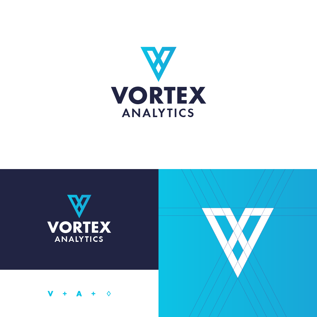
This is my first logo design work and it was made for fictional company called Vortex Analytics, which is modern big data company. Their goals are providing clarity and being accessible by any skill level. They wanted to avoid using stereotypical charts and pie graphics as iconography.
Symbol is constructed out of letters A and V forming diamond shape which represents clarity (one of their goals).
I would like some feeback from you guys about the overall logo.
If the A is upside down, that’s pushing it one step too far, because the cross bar just isn’t there. If you hadn’t said you were trying to do that, I’d have gone with a V-shaped logo bug with extra leg detail and called it a day.
I like the general aesthetic of the logo but I would have picked a font that had a pointed V and A.
You could have pushed the diamond concept a little bit more I don’t think most people would see diamond in this right away. Although subtlety can be a good thing. Perhaps with the rest of the brand story the diamond concept can be pushed further.
The X doesn’t bother me since the last character in Vortex is an X.
Maty, I’m curious about your background. You said this was your first logo, but the mark, type, proportions, and color palette don’t make this look like a first logo effort.
Thanks for feedback. Yes this is my first logo attempt.
Well I would say that I’m self-taught graphic designer. I bought LogoCore course, some courses at Domestika and I watched tons of videos at Futur youtube channel. But I did not study any graphic school or art school.
I like it. A V and an X. It’s good, simple, and fits the industry you mentioned.
Here’s what I don’t like, but it has little to do with your logo. It’s the version of your logo with the superfluous lines. I see new designers draw in these kinds of meaningless logo decorations all the time, and I’ll admit to it being a pet peeve. At least you resisted fitting a bunch of circles around it or superimposing some reference to a golden ratio over it.