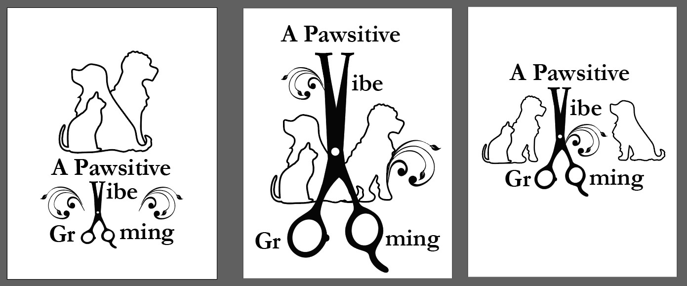
This is a logo for “A Pawsitive Vibe Grooming” my client drew out a sketch of what she wanted and I am not sure how to make it not look like a mess. I have attached my attempts at it. She wants the three specific animals and vine / tattoo like details. She also wanted sheers with the “V” of “Vibe” being the sharp end and the double “O” of “Grooming” to be the finger holds.
I know you probably know this, but clearly her overly detailed sketches and requirements are essentially making it where you are unable to provide her with a more professional and well thought out logo tailored to her business. With that in mind, you have a few options IMO.
Give her the options above and politely explain how it won’t work. Or, don’t explain it and just collect the money for executing her sketch and ideas. Lastly, you could offer an idea or two of your own showing what you recommend, but that’s up to you to judge whether your client would be receptive to that. Because if you think there is little to no chance of her being receptive to it, then it would be a waste of your time and money.
Bottom line, with those restrictions and elements, it will look like a mess as you said.
Thank you for your fast input! I have tried to give her other options but she has stuck with her idea. I thought I was not creative enough to figure it out but your input has given me hope that its not me. I appreciate it.
This is not a logo. It is not even a messy logo. It’s an insult to a dog’s breakfast.
It took me 12 seconds to figure out all the interlinking nuances, by which time I already lost interest in the company name. I’d like to see it on a freebie pen.
2 Likes
A job that starts with a client assuming that I’m a pair of hands hired to bring their wretched ideas to life are the ones I always turn down. There’s just no point. Even if it’s just a take-the-money-and-run thing, it’s rarely a straightforward project. Instead, these kinds of jobs typically spiral off into endless revisions and ultimately become money-losers.
There’s no way to make this work without a significant overhaul in the client’s wishes — the idea is just too detailed, too complicated, too many separate elements, too busy, and too impractical.
Despite the way you’ve meticulously cleaned it up (good job), they exude amateurism in concept that will do more damage to the business than good. From experience, these kinds of clients just don’t get it and think they do get it. They’re typically not open-minded and not worth the effort or frustration.
Sorry to be such a downer. If it were me, I’d cut my losses — even if I needed to refund a deposit.
1 Like
Thank you all for your input. Like I said I thought it was me but your comments have helped me understand that it is not. I will send her this and hope to be done with it.
I’m not going to be quite the downer those above are. They’re right, it is too much.
But the one on the left has more promise the the two on the right which scatter everything on the page..
Take the scissors several steps simpler would help. Give em a skinny waist maybe to be able to make the V without the top serifs and the finger holes round and the correct size to match the typeface, with no pinkie stick, to make the oo’s better.
Do something else with the flourishes. There’s nothing (except perhaps the client) that says they have to go up-and-over. They can go down and in, or sideways and up.
It’ll still be yuck, but make it something you can hand off with a straight face. ![]()
1 Like
2 dogs + 1 cat
Surely you can cut out one dog keep it even ![]()
They really love those swirly things..
Here’s what I’m thinking:
-
Put text in a circle around the silhouettes
1a. Off centre them so it’s not exactly centred on the circle, but put the V at the very bottom centred
1b. Grooming should also be alligned off centre to match the alignment of the V and the O’s -
Use the swirly thing to encompass the cat + dog (and reduce the amount of flourishes or soften them)
-
Use solid fills for the animals if possible (as I think it would add more balance)
-
position the scissors and the O and V in line
-
Shorten the grooming scissors so there is not a huge gap between the V and the O’s - and also not a huge gap between the o’s themselves
-
Pick a much better font.
I think by incorporating all their ideas in a pawsitive way - they will appreciate their ideas being incorporated but it will look a lot neater.
Overall - it’s nice and clean - just needs a designer eye to replace the naff with the nice.
1 Like