New to graphic design, working at a sign shop as a table worker, working up the ladder toward graphic designer.
This is a computer generated prompt from FakeClients. I’m using Fake Clients to force me to use Adobe Illustrator to put together a design that stretches me–and given that I’m new, even simple stuff stretches me. The prompt is:
Hey,
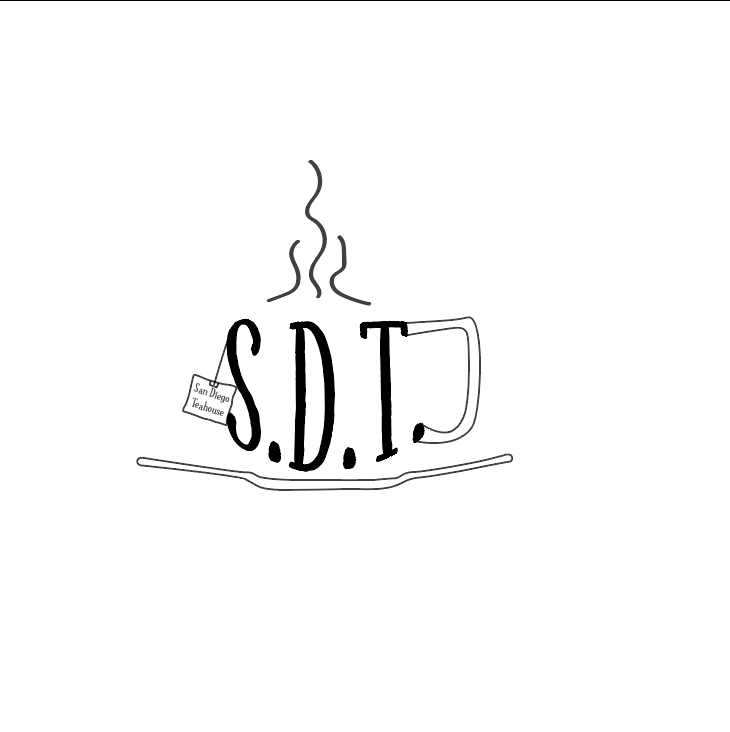
I am Tamekia, I recently started a new business called San Diego Teahouse. For a while now, I’ve been looking for a good logo for my Teahouse. I think a [lettermark] will fit best. Can you help us out?
I believe my ideal customer is 60 years old, female, lives in San Diego, California USA, and is a retired real estate agent.
What do you think?
I’m a bit surprised you were able to produce something so rough-sketch-like using Illustrator’s relatively sterile tools.
That aside, I’d encourage you to do better, and you’ll have to. Pro designers with a lot of logo and Illustrator experience often avoid attempts to warp letterforms into shapes and gimmicks, simply because it is so seldom successful.
To set some logo design principles on the table, a good brand has to be simple. It’s rare that a business and its trade offer an opportunity to execute on a really good visual trick. When that opportunity is presented, a good designer slam-dunks the singular trick and leaves it at that. Your endeavor here is an example of no opportunity, but multiple failed attempts at trickery nevertheless; initials mangled into a cup shape with a handle forced to float next to it, unrefined lines representing steam, the business name set far too small on a teabag tag, and what I finally figured is meant to be a section-profile of a saucer. Even if all those things were impeccably executed, and they aren’t, this would not be logo design. It’s just a series of attempts to decorate, all jammed into a common space.
The FakeClients thing is what it is, but it’s not much help to you, really. I mean you or anyone could come up with a couple sentences about a fictional business looking for a logo. That’s far from a realistic brief. And, reading those couple sentences, then diving right into Illustrator is far from logo design reality.
2 Likes
I completely agree with what @HotButton said, so I won’t repeat it.
In addition, you’re sort of shooting a gun in the dark without knowing what you’re aiming at. I’m not at all sure you understand what a good logo is or the necessary practical considerations that surround the subject. You might want to pick up a book on the subject, for example, Logo Love Design.
However, if you’re just beginning, designing logos probably isn’t the best place to start. The best place is in design school where you’d be working on the foundations of design, but I’m guessing that isn’t an option for you.
Since you’re employed in a sign shop working your way up, the logical place to start would be working with typography. For that matter, the best place for any beginning graphic designer to start is with typography. I’m not saying you need to learn how to design typefaces — I’m saying that learning how to use and appreciate good typography is the best place to start.
2 Likes
What Hotbutton didn’t finish saying was, don’t go directly to Illustrator (or maybe you didn’t and what you posted is a photo of a hand sketch) but the trick with logos is to draw literally a hundred sketches. This will get past all the bad, not-working ideas, and maybe leave you with two or three to flesh out. If not, sketch some more.
Table worker is a good place to start as a foundation for design, but you need to get a better understanding of the theory behind what makes logos work.
On your submittal, you have a bunch of different elements in there that could work as stand alone concepts. Deconstruct it and do some sketches taking elements in different directions from the esoteric to the whimsical. Since you have no real brief, you need to pretty much decide up front what you would want this place to be and work in that directioin. Not how it works in the real world, but at least that brief gives you a starting place. For instance the described clientele more fits a traditional tea house, not a funky place. The logo you create has to appeal to the aesthetic values of a 60-year-old female real estate agent in San Diego, not so much the local college students. But don’t narrow your focus too much to exclude others.
When a client says Lettermark, they usually mean just words. The words have to be legible from the street while driving by in a car. Don’t make it hard to read.
Chin up!
2 Likes
In addition to what PrintDriver said, the words also need to be legible when reduced to smaller than a postage stamp for business cards or, worse still, placed on the barrel of a promotional pen. Small words don’t belong in logos. They can be part of a flexibly positioned and optional tagline, but not in the logo itself.
2 Likes
It’s impossible to design a good logo based on information contained in just two lines of text.
The purpuse of a logo is to send a particular message to a particular group of people in the simplest possible way.
When designing a logo, you must first gather much more information about your client’s company/organization, its market, target audience and competitors.
Once you wknow who your clients competitors are, you must analyze theis logos/branding systems.
I highly recommend taking this cheap logo design course with Sagi Haviv of Chermayeff and Geismar & Haviv:
Also, you should study their portfolio, which contains some of the most famous logos in the world:
2 Likes
Thank you, all.
Your responses make a lot of sense, and I’m extremely open to looking/working in the directions you sent me. @Just-B, you’re right that I am aiming in the dark and that I don’t know exactly what I’m looking for, so thank you. Originally, that’s why I came here.
One of the reasons I’m diving straight into Illustrator, though, is because my employer needs me to learn it so I can start working on basic yard signs, etc–which might mean that I’m not in a position to study high level graphig design yet.
I’ve read a few different books on marketing that tie into what most people on the forum say–one of those books being The Ceo’s Guide To Marketing…and it makes perfect sense based on what I know from that book why I would need exponentially more context and information, and knowledge of theory/design application.
You’re also correct that design school isn’t an option. Most of what I’ve had available is basic online research and books here and there, along with some really basic practice. One of the issues I’m finding with books is that it’s really hard to know which ones will be helpful and which ones won’t. Are there books on typograhpy and similarly important starting points that you can recommend, similar to Logo Love Design?
Thanks all for your encouragement.
There are lots of books on learning to design with type. However, I’ve never purchased one, so I can’t recommend any specific books. I’ve worked with typography for 40 years, so it’s pretty much second nature to me. I’ve sort of lost touch with what it’s like starting out. My first experience with it was in design school, so the way I learned would be different anyway.
You might want to jump on Amazon and read the reviews of some of those books.
1 Like
Read a few many years ago. Never bought one. Went to the library.
1 Like
Learn from the greats, going back to early lettering and stone carving, to get the origins, then look at Claude Garamond, Caslon, through to Tischold, Morrison, through to the Bauhaus, Swiss style, Adrian Frutiger, Eric Gill. I could go on forever, but start with the history to give yourself a grounding. Even the most modern sans serifs have their roots in hand drawn letterforms.
2 Likes