Dear members, I require feedback on that logo design composition. It’s meant for a client that just founded a start up. I still research the competition and thinking about the target audience, but I am open to ideas concerning the later stages of logo creation.
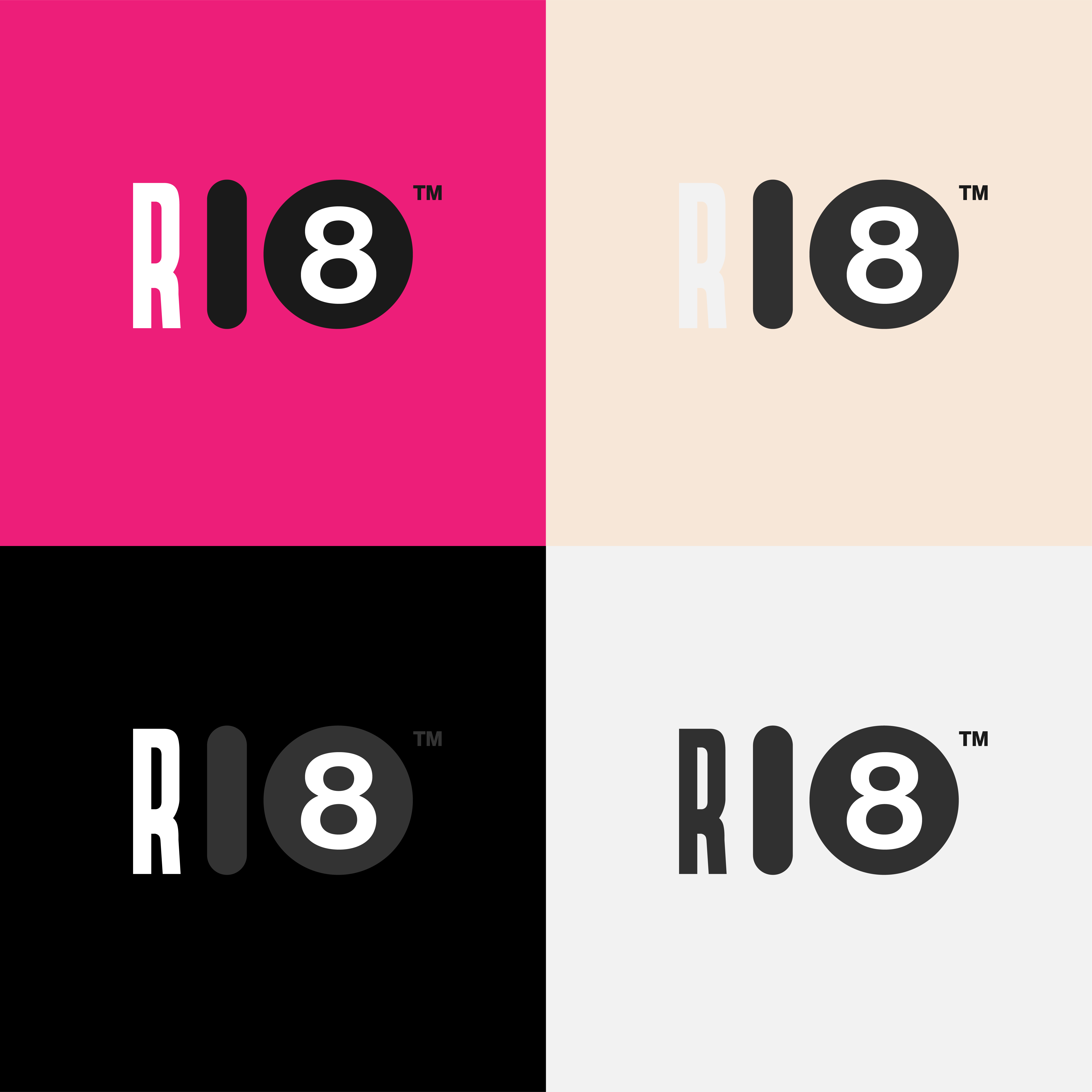
I don’t know what kind of organization this logo is for, what it’s supposed to represent, why you chose it, why the R is in a condensed typeface, or why the heights of the component parts differ slightly. I’m sorry, but you haven’t supplied enough information for a meaningful critique.
1 Like
It’s honestly difficult to know what it even says. Is it R18? R108? R180? Or is the “1” really a capital “I”?
Or is “R|8” or any of the above variations with a “|” instead of a “1”?
Also, the R needs more contrast in the second version. Easy to look right past it. Maybe a stroke or something if set on those colors?
1 Like
R divided by Eight Ball.
OK, Scientist here. In Math the “Divided By” Symbol is a “/” and the “|” is usually just a separator. It would convey the meaning better if it was a slash, but again - I do not know your target audience. I can say if I were commissioning an “R divided by Eight Ball” logo, I would want a slash.
Perhaps the “|” is used for the Divided By Operator in places of which I am unaware? I do know that, seeing it cold as I just did, I would not have guessed that from the logo.
Personally, I would raise the R a little bit, change the | to a / and lower the 8 Ball the same amount the R was raised. But it is an interesting design and may work for it’s intended audience as it is.
Good luck with it!
I’m just curious about the type of company or service you’re trying to sell with this logo. Is it a toy company, or perhaps a game studio?
I was taking into consideration a design decision to straighten the slash to match the vertical stretch of the R. 