Hello! I’d like to share my logo design for branding for a sports wear company. Please let me know your thoughts. I wanted to create something simple but poerful with inspiration from the sun.
I don’t think this is working; sorry. If you want me to go into detail, I will; but I don’t think it would serve you as I don’t think you have anything here that could benefit by a few tweaks. My suggestion is that you get back to the drawing board. If you’re in the sportswear market, you’re going to be competing against brand heavyweights like Nike and Under Armour – you’ll need something that can compete and hold its own. This is not it.
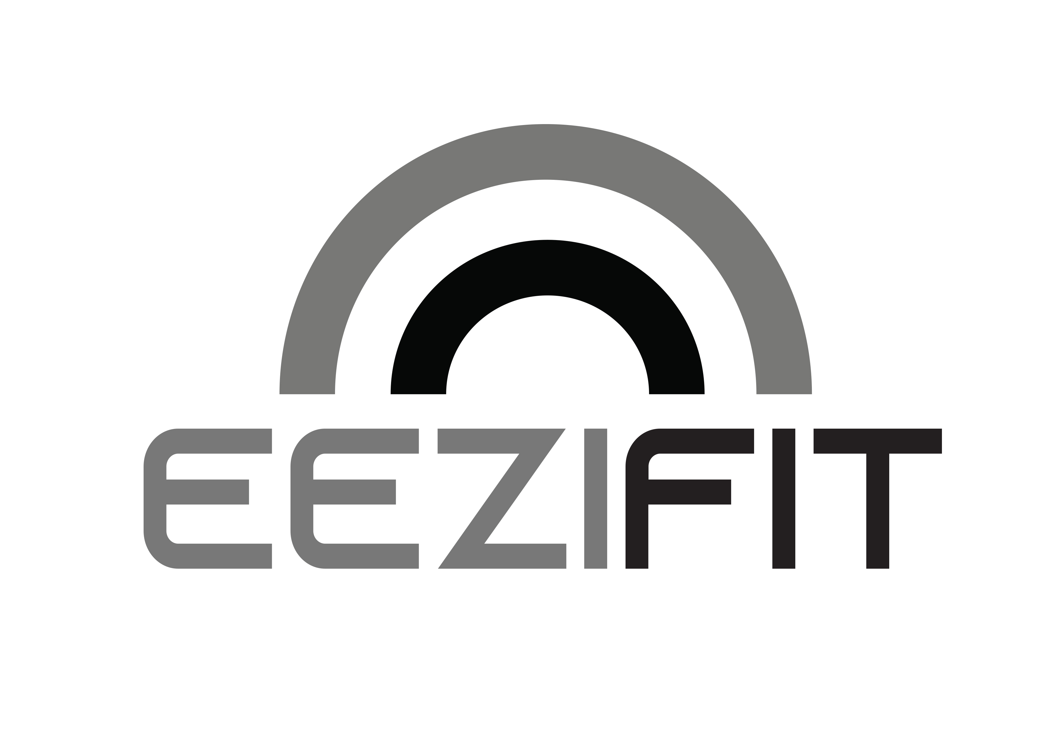
Were you planning on introducing colour, or keeping in monochrome?
What were you thinking with the arcs? To me they look like a rainbow and I’m not sure how that fits with sportswear?
I like the typeface, it’s smooth and clean! ![]()
Thanks for the feedback, you’re the first person who has given me such negative feedback. Everyone else liked the clean lines and the simplicity.
Yes I am introducing color. I just think this is strong. Not rainbows but the sun
Perhaps when you introduce the colour the arcs will be more evocative of the sun?
Petakaplan, is this a practice excercise, student work or a real job? You’ve placed it in the Crit Pit where your work will be judged against professional standards by other professionals, like Steve. This is fine, if that’s what you want, but if you’re a student or beginner (which we all were at one time), you might get more appropriate feedback in the student forum.
I’m not really a fan of the typography you’ve used. The general design is OK, but the details are off. Is it a freebie sort of font or, perhaps, some lettering you’ve designed yourself, maybe?
There are lots of optical illusions in typography that need to be taken into consideration. For example, horizontal and vertical strokes that are exactly the same width, don’t appear to be the same weight. Horizontal strokes will always appear a bit thicker, like in your type. The Z is another example, even though the proportions measure correctly, it appears to be top heavy and tipping frontwards a bit. The F is an E with one the bottom crossbar removed, but that leaves a big, empty hole, which could be countered a bit by reducing the width of the crossbars on the F. The same is true of the T. The Z also has very sharp pointy corners, yet the Es and F are rounded. In an entire alphabet of glyphs, pointy juxtaposed with roundness might very well be a quirky feature of the face that makes it work. When it’s just one word, with one single pointy letter, however, that pointiness stands out as an anomaly.
As for the sun (which looks a bit rainbowish), it’s not a bad idea, but three simple concentric semi-circles takes simplicity a bit too far and into the realm of being unimaginative.
I don’t think your gut instincts are wrong — clean are simple are good qualities for a sports clothing company. You have the beginnings of something, but it’s not really there yet. It needs something to make it unique with more refinement and nuance.
Thank you for your feedback. I am a professional designer. I appreciate your pointers, and will think them through. And no it’s not student work or a freebee…:))