Hi I have been putting some logo design ideas, I am new at design so I need some feedback and opinions. I am creating a logo for my brother, he is a personal trainer, so if you could vote for the logo you think is the best and give some constuctive critique. Thanks,
The success of a logo is only partially determined by looks and being clever.
I’m picking up that he goes by the name Pedja the Coach, and you’re trying to make an a logo using the initials PTC and some barbells, right?
The trouble with trying to merge initials and images into a clever combination is that, more often than not, it compromises the visual integrity of both the image and the letterforms into unnatural, forced shapes that really just don’t work very well. Sometimes magic happens and it all comes together into something really nice, but typically not.
If the name is Pedja the Coach, using just the initials doesn’t convey what the initials stand for, unless he want’s to shorten his branding to just PTC.
If it were me, I’d likely just write out Pedja the Coach in a simple, solid, beefy typeface, then create a nice, simple logo from the weights without trying to merge them with the initials or the name. Coming up with something clever is nice, but it’s not essential. The main goal is to clearly convey the name, make it visually attractive and appropriate for a trainer, use type and imagery that suggests stability and professionalism, and do all this while making it memorable.
2 Likes
It looks like you’re jumping right into design without drawing or sketching ideas out.
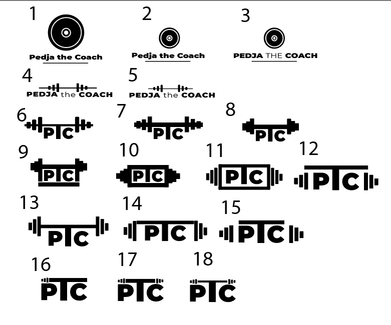
The best idea is 3 and 8, but that isn’t saying you should use them.
I’d almost go with further developing #4 or #5 but with the barbell under the name, and keep it shorter in width than the name, like a decorative element underline.
1 Like
Either the barbell or the line is extraneous. Lose one.
I’m only a student, but I think 3, 8 and 11 are the most simple yet effective logos. I’m unclear on whether you’re trying to make the barbells into a “T”? It seems like a very significant part of the design to be giving to the word “the”. I also agree with a previous poster, I think 3 could be strengthened by getting rid of the underline.
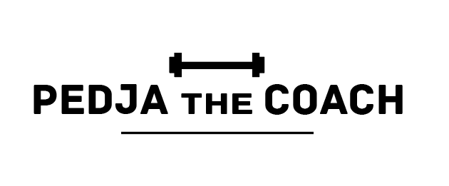
Hi and thanks to everybody for the feedback, I finally came up with this solution, and I would appreciate your thoughts and opinions on this logo?
You might want to add the bar between the weights to make it look more like barbells. The way you’ve drawn the weights reminds of me of certain kinds of earphones.

Personally, I’d probably be inclined to keep the light weight for the word the, but make the letters uppercase instead of lowercase.
1 Like
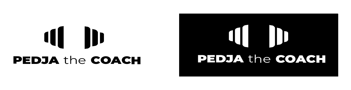
Yeah, the barbell you had on version 13 was the closest one to correct proportions. Others look like all kind of other things.
The more recent logos you have posted are far better than the original set. The type looks good and seems appropriate for the business. The problem you have now is the bar and the 2 plates nearest the type ressemble an H. Pity it’s not Harry the coach or you might be on to a winner lol.
For me, the last 2 are definitely the best of all those you have posted. I would just try and make the barbell look less like an H, because that’s the first thing I see at the moment.
Impressed with how quickly you have improved from the first set though. Good work.
None of these wow me, it all looks like pretty much any other personal trainer logo with some variation of barbells, weights, etc. (like this google image search) I guess if it truly is more training such as eight lifting and body building, but if it is more about getting in shape, being fit, being toned, it seems bland. Just my 2 cents.
No. That looks nothing like #13, and not like a barbell at all.
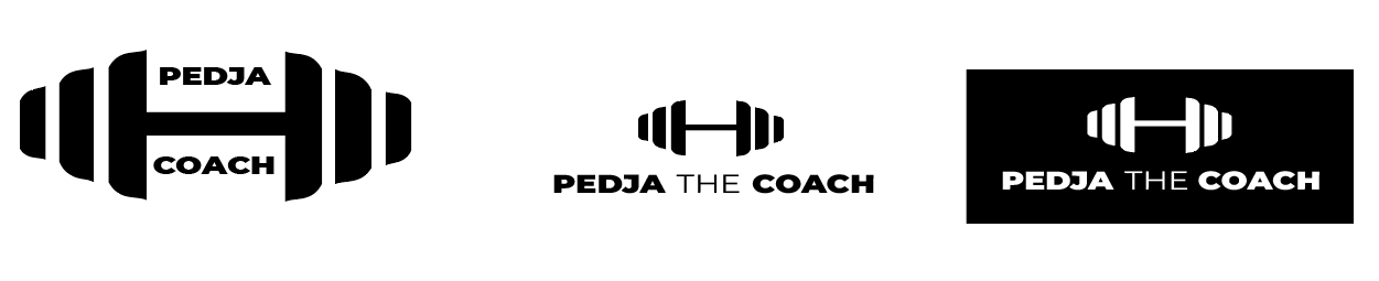
Have you tried splitting the text?
Put pedja on top
The in between the barbell in place of the bar
Coach on the bottom
If Pedja became a tax-preparer, what logo design would you use?