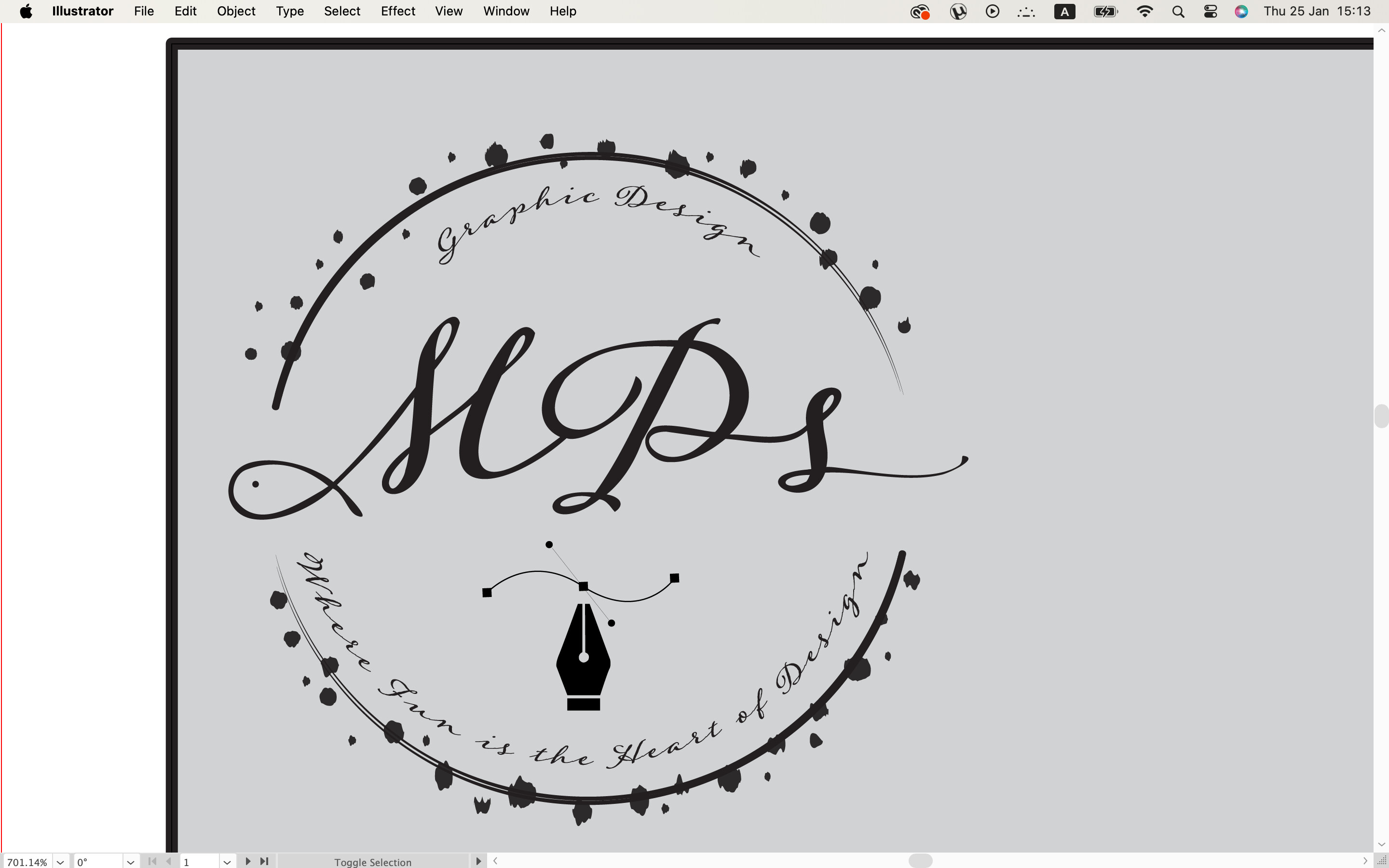
I’m trying to create a logo for myself as a graphic designer (for an assignment), but I’m not sure, if I did the right choice for the letters.
3D letters would be better compared to this design that looks like a signature?
Its not complete yet, but I want your opinion before i continue the design.
(The Fish on the first letter means my surname which is fish )
You have way too much going on here, and there are too many details that will be lost at small sizes. I think this needs to be scrapped and you need to start fresh. Sorry.
I think you missed @Eriskay’s point. A business card is typically 2" x 3.5". To fit on a business card, the logo would need to be 1.75" to leave a little margin. Reduce this down to that size, print it out, and see if you can read the text? Do the double lines in the ring hold up? What about the super thin lines of the bezier curve?
I’m not trying to be overly harsh, but I don’t think there are changes to be made to the existing logo that will make it work. I think you need to scrap this design and start over. Sorry.
You’re right. So if I change the font and make it a little bit bigger, would it be better? Isn’t there anything on the logo that is nice or nothing at all ?
This one comes across as sloppy and illegible (ink blobs and illegible font choice,) with a vector perfect pen and a bezier stroke that nobody cares about, except, perhaps, another designer. Other designers are not (necessarily) your clients. And if they were, the blobs and bad font choice would be a non-starter.
Why include the fish at all?
Think about who your clientele will be. Define them in every way possible. Then make a logo that would appeal to THEM. The first mistake a tyro business owner makes is projecting their likes and pets and hobbies into their logos, which have nothing to do with making a brand appeal to a potential client.
Maybe I am misreading you, but I hear a little despair or frustration in your tone, here. I’d guess that you designed this, you are proud of it, and you posted it here hoping for some tweaks or suggestions to take it from a grade B assignment to a grade A assignment.
There are three things to keep in mind: logos are much harder than they look, you’re a student, and this is your first logo design ever. I’ve most likely been designing longer than you’ve been alive (assuming you didn’t go back to school as an adult for a second career). I design logos all the time that never see the light of day. It’s part of the process. On a typical logo project, I might sketch out 50 ideas, pick 15 of those to develop in Illustrator, and refine that down to 5 to present to the client who picks one final design. That’s 49 logo designs that didn’t make the cut.
Go back to the drawing board — literally. Step away from the computer and sketch out a bunch of ideas. Personally, I like the idea of playing off of fish. Spend your afternoon sketching out ideas and post those for feedback. It’s all part of the learning process.
To work effectively, logos must be legible and readable at all sizes (if there is typography), from very large to quite small. To accomplish this goal, they must be simple.
Your logo is not simple; it’s very complex and composed of many different shapes, sentences, difficult-to-read typography, and a hidden fish that no one will ever notice.
In other words, it doesn’t work at the most basic and fundamental levels. As Steve said, sketch out a few dozen other ideas. And focus on simplicity and legibility.
You’re right Steve thanks ! I don’t have much experience in logos to draw something, but I’ll do my best. I have already started trying to sketch. Do you have any idea how the inspiration might come?
I may be good at drawing things, but I’ve never tried to draw something from my mind, so it’s hard for me to get inspired for anything. I’ll try to draw something and see if something comes out.