I think if you’ve brought this design up for discussion, then I can express my opinion. This logo immediately reminds me of a writer or something similar. However, looking at this design, I certainly don’t envision it as a designer’s logo. I think it might be due to the font you’ve chosen. But overall, I like the logo.
Those are sketches you need to do, but push through them.
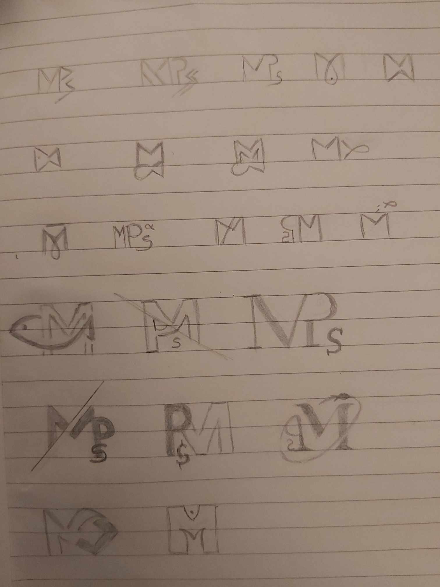
Putting letters backwards, combining them so you don’t know where one ends and the next one starts are both usually unworkable. You don’t want people to be guessing is it MPS or PMS or SPM.
Keep sketching.
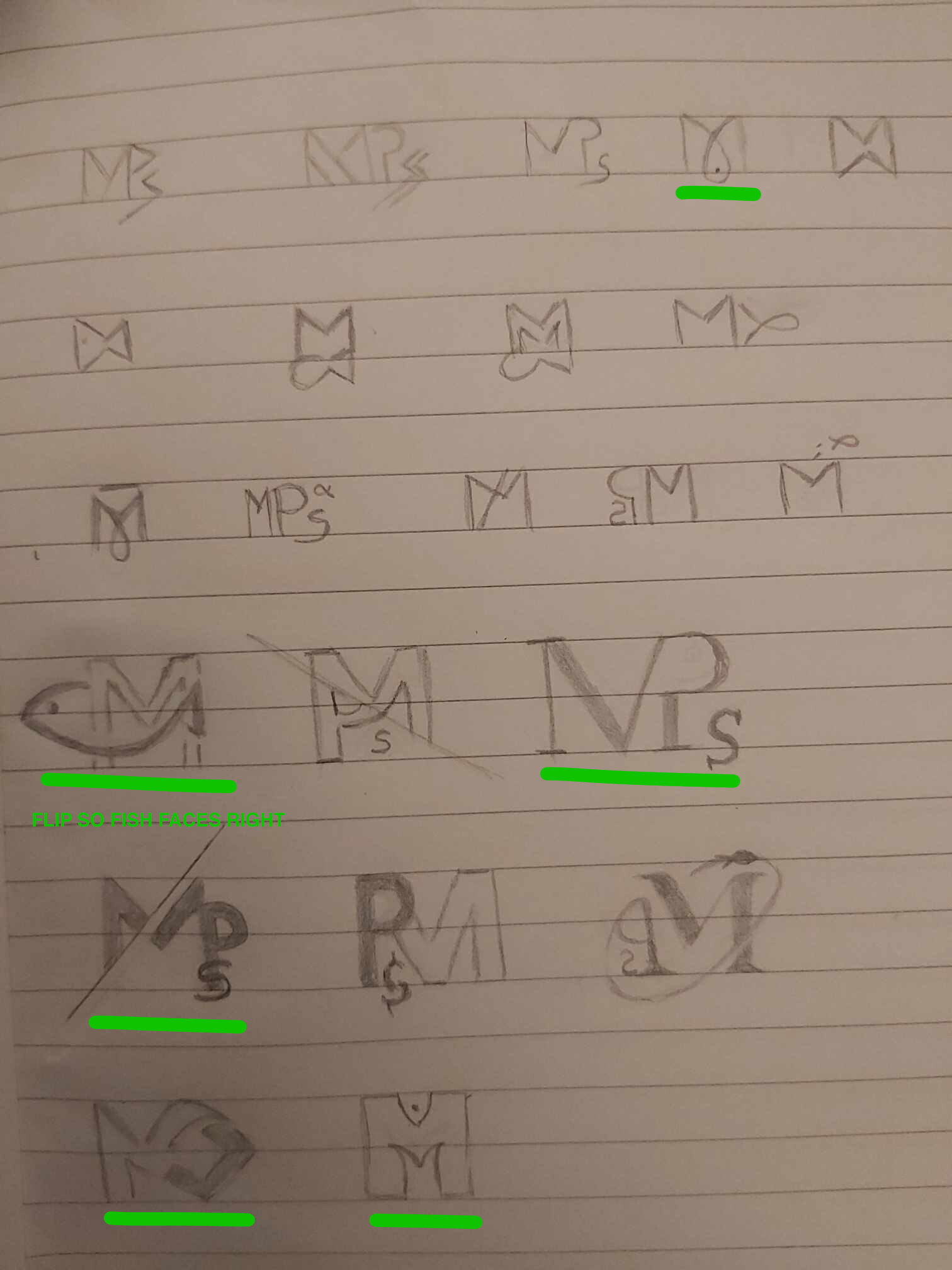
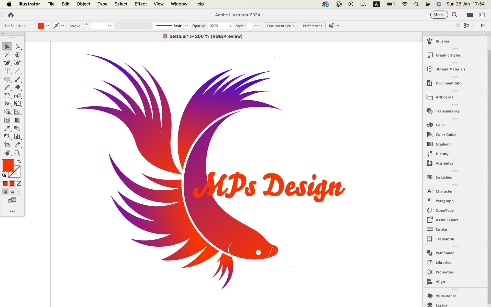
Not sure what the significance of the fish is but it seems to be important. Push the 4th row, first logo with the M-fish. Of the lot, that one is the most coherent. Perhaps even the last one of the last line if you are going for ‘fun’.
Also nothing says you have to use your initials, unless it’s part of the lesson brief. Your business could be called Goldfish Design. That would roll of the tongue better than MPS. ![]()
Or Betta Design maybe?! The colorful fish. ![]() Good idea!
Good idea!
Then should I try with letter B? Or the whole word Betta? What do you think?
I can also draw a betta fish and then with simple letters write Betta right below @PrintDriver
Be very careful on your use of color. Most logos stick with up to 3 colors. More and you can get expensive when printing. For spot printing (and screenprinting too,) each color needs a plate, or 4 plates for CMYK (and those CMYK colors may not be as ‘bright’ as you might want.) If digital printing (no plates) there are still color matching charges if you want exact matches.
I’d use one of the more familiar silhouettes of the more simple-finned Betta if you are going full illustration. Some of the super-frilly ones are not immediately recognizable as even being fish.
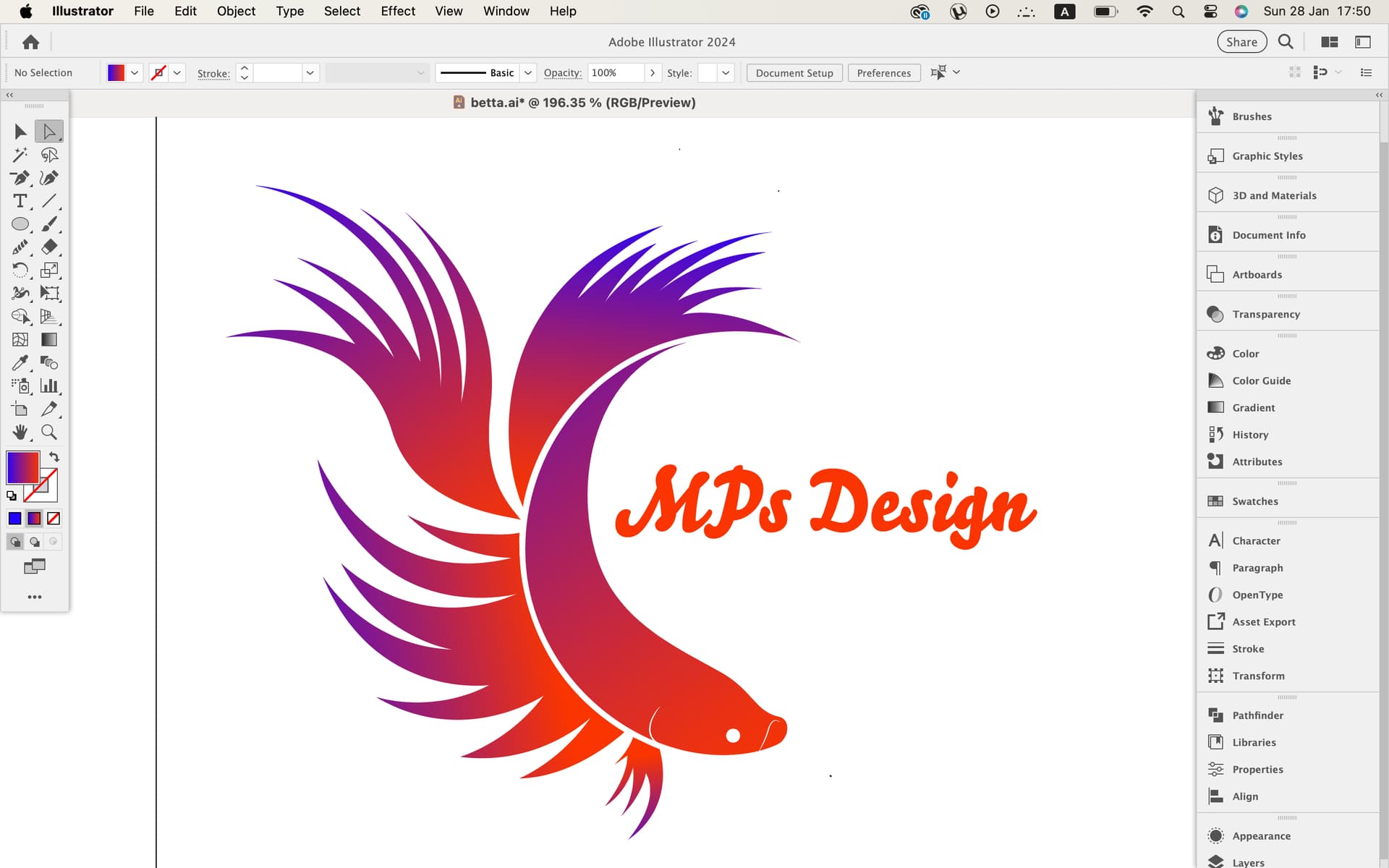
Try not to use gradients or effects in your logo. Those can also cause production issues.
Start with a flat version. You can always do something with “full bling” later as an adjunct to the logo itself.
I put an underline on the sketches that I think have the most potential. If you wanted to pursue Betta, also, that wouldn’t be bad; but I’d suggest you settle on a name before the logo.
1 Like
Isn´t Betta Design a good name? Also if I use betta for my logo, I will not use these sketches. But I’m trying to think what would be better as a final result.
I have an unrelated question. Why are you guys helping people? Do you earn something from this? If yes, is there anything I can do to help you?
1 Like
If Betta Design produces good design and good services, then it is a good name.
Send money.
No. It’s just out of the goodness of our hearts. As for help – see above.
1 Like
That’s sweet of you ![]()
I’ll do my best !
1 Like
I’ve been called a lot names, “sweet” was not one of them. Thanks for your intention, however.
4 Likes
That depends on how you want to make your customers feel, it’s actually very subjective.
Personally seeing “Betta Design” - I initially wouldn’t assume that Betta is part of your name, so not knowing this vital piece of information could make it feel a bit gimmicky, the way the internet went through a phase of rewriting words with different characters to create unique names, it could also come across as being a little pretentious. That said, maybe these attributes could possibly be viewed as positivie by someone else ![]() .
.
I would first start with the feeling you want people to experience when they see your name and logo and come up with 2-3 words to describe the feeling.
The image below is from Erik Spiekermann’s book Stop Stealing Sheep and the challenge is, can you connect shoes with type?
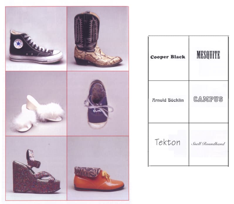
Is MPs/Betta design luxury or affordable? Does it have a specific style? Is it serious or playful? Is it traditional or progressive? Is it scientific or cosmic?
1 Like
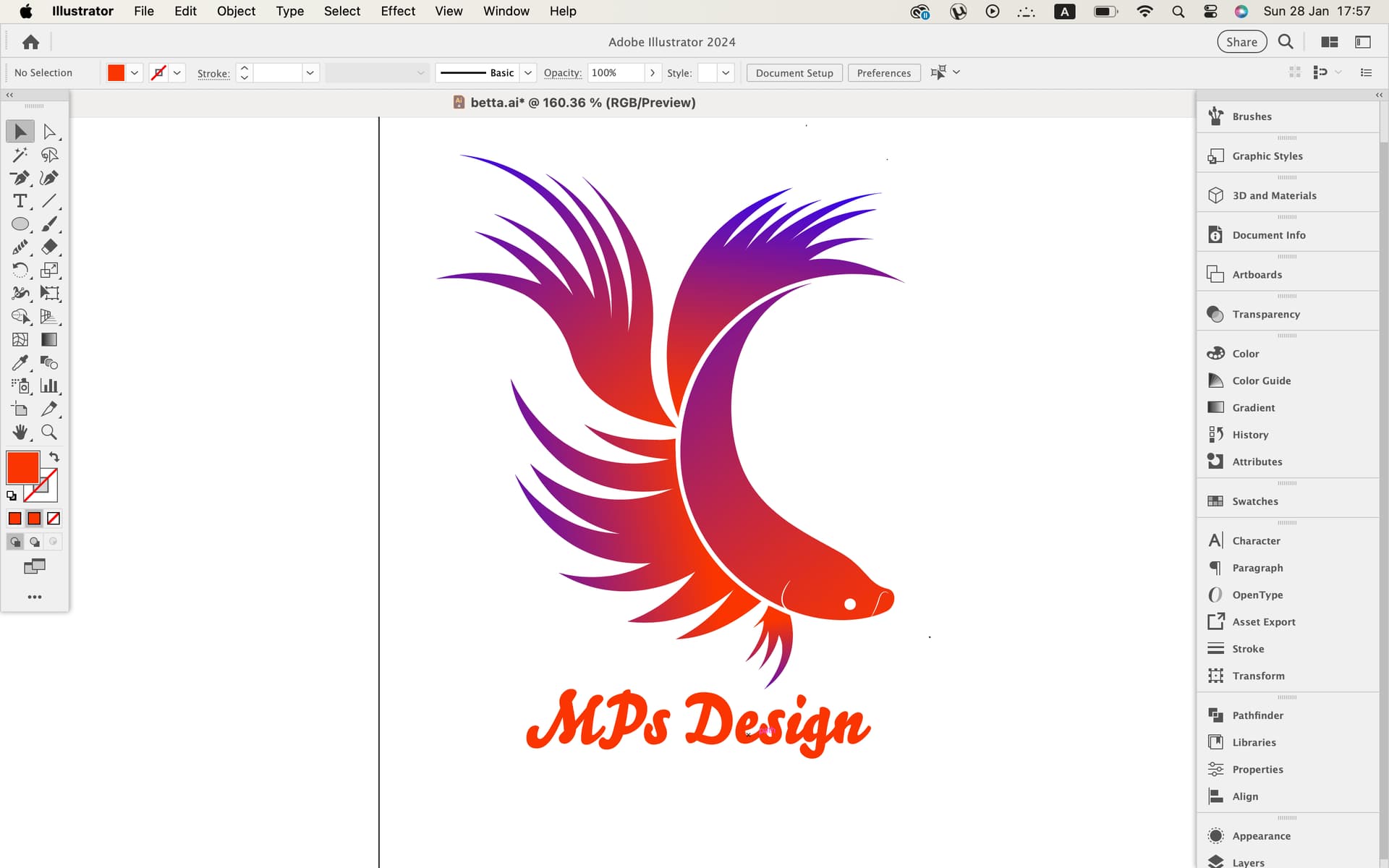
Hi Pluto, I made this design. I like it, but I don’t have experience to judge it. What do you think?
I was thinking to make a text wrap, making a circle and add a slogan, but i want to keep it simple.
I tried to make the fish according to circles but I don’t know if I did it right ![]()
1 Like
1 Like
That’s for you to decide. Without having the benefit of talking to you directly and getting more in-depth feel of your style, the type of work you want to go after, etc., I’d say MPs sounds more corporate-like and Betta Design seems a little more small business / startup.
Correct.
I think most designers are willing to help others. But a lot of it depends on your attitude. There have been people that have posted in the past that can’t take constructive criticism, won’t listen, or cop an attitude. I have no time for that sort of thing.
Nope.
Four thoughts.
-
I’m a bit torn on the illustration. On the one hand, i think this is a pretty nice illustration. On the other hand there is a white line in there that makes it look like the fish’s back is sort of twisted. The latter could be nit-picky since you’re a student and this is your first logo.
-
The use of gradients in a logo is generally frowned upon.
-
I don’t care for the font used for MPs Design. It might work in another scenario, but it’s not working here. Choose something understated that won’t visually compete with the illustration.
-
The proportions of the fish illustration to the type feels off to me.
These are fine-tuning fixes. Don’t let them discourage you.
Yes, keep it simple.
You have the original design, you have the fish design, now take a little time and develop one of the sketches you showed us. Then you’ll have three different concepts for one logo. Show them all to your professor for feedback. If I were your professor, I’d be impressed with a student that took the time to flesh out three completely different approaches.
1 Like
Hey @Steve_O, I hope you’re doing well.
When you say that MPs sounds more like corporate, is it a good thing? I also thought of the name Spectra Design.
Regarding my illustration, the fish is twisted actually but it’s a little bit strange now that you mention it.
I’ll try to fix these things that you said and I’ll come back again for feedback.
In addition, I will do the things that you said with the 3 concepts of the logo.
Thanks a lot, I’m very happy that I have people who can help me and i appreciate it! ![]()
1 Like
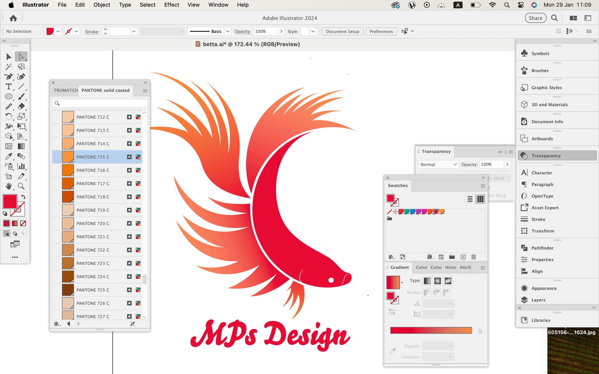
It looks like you’ve used 2 reds on the fish that are within the same Delta-e (the difference between two acceptable shades of the Same Color.) It might be too subtle to come across on a digital press. As spot colors it may work, depending on what they are, but even on screen they are way too close.
Gotta say I’m impressed with the leap from the first sketches to this last.
1 Like
Thanks PrintDriver, I’m trying to apply your suggestions.
I have to use only 2 Pantone colors from my teacher. What colors would you use? And would you change font or something? I wanted to use blue with red, but without gradient, I don’t like it so simple, that’s why i chose two reds.
And that’s part of the reason you’re getting useful help … you’re taking feedback to heart and putting in the work.
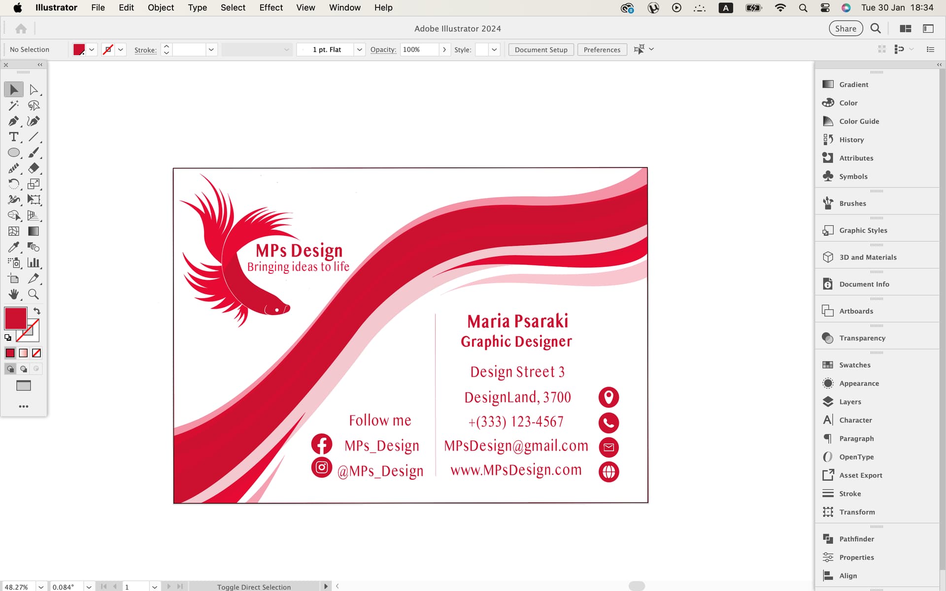
As to your graphic, the first thing my eye sees is the diagonal swish or flourish. Personally, I think it’s too much. Make that smaller and less visually prominent, that will give your logo a little more room to breath. Capitalize Ideas and Life in your tag line. Reduce the size of Graphic Designer a bit so that it is clearly secondary to your name.
2 Likes
I’m glad I don’t have to fix too much. that’s good, i think
Thanks again!
1 Like