Logo Design

It’s a nice illustration of a fish :tropical_fish: , however the idea is a bit simple and despite having a connection to your name is actually kinda irrelevant… am glad you changed the type on the business card though.

That said, design by committee never works, because there will always be someone who can find an issue with what you’ve done, so you should do what you think is best irrespective of whether or not I think it’s a good idea. :slight_smile:

1 Like

Thanks for your comment Pluto. I like it the way it is, but I want to hear other opinions. I changed it again a little bit, now I use helvetica and the wave thing in the middle is also changed

1 Like


which one?

Are these business cards? If so, it’s a lot, and the font spacing and handling has a lot of room for improvement.

Also I know that you have been working on your logo, but at the moment the fish element and the typography do not currently work together well. Both feel as if they have just been randomly attached to each other.

I know that this is for a school assignment, so you should have quite a bit of flexibility. I know there was earlier discussion oof using Betta Design. I think that makes more sense, especially with the visual. At the moment the fish looks more like an illustration and doesn’t seem to have anything to do with “MPS Design”. By using Betta design it helps bring the two together.

You are heading in the right direction, I just think that you can continue to push yourself further.

If this is for a business card, scour the internet and look at business card designs and try too understand what works and what doesn’t. As you are looking at other cards be inspired by them (but don’t outright “copy” them, ha).

1 Like

Hey CraigB, what would you change in the font and what would you remove?

I would change the name to Betta design. As far as the fonts, the center alignment seems out of place and without purpose. The fonts sizes also don’t have enough hierarchy. For the most part everything is the same size (I realize there is some difference between your name and title and the other info, but it is minor and, once again, doesn’t seem to have a purpose. Design should always be with purpose. I know that is vague, but things should have balance, hierarchy, a flow to them.

Even using the same font for the logo as the rest of the information seems out of place. Yes, some companies may do that, but if you look at most business cards, the font used is different from the logotype. And, IMO, that is for good reason. It helps to have the logo stand apart from the business card information.

Right now my eye doesn’t know where to look first? The circled icons compete with the fish and compete with the very dense and large separating wave graphic. My opinion is the wave graphic is too heavy and too much of the focus.

I’d also argue that the tagline is not necessary. I’m not sure if that was a requirement of the project, but even if it was, taglines are not always “locked up” with the logo. , they can be, but in this case the tagline also comes across as yet another competing element.

And lastly, you don’t need to use a standard business card size. I know there is a lot more variety in card sizes than say 25 years ago, but is there a reason for the business card size you are using?

Is that inset line part of the design? Just curious as it seems a little random as well.

Best advice is look at other cards (there are a million examples online). Hopefully be doing some research it will help you out more.

Do you think that I should start from the begin then ? This is the size that I have to use for my assignment. The red line is bleed. I have to use bleed as well but I don’t know if i did it right.

If that is the size you need to use, stick with it. If the red line is bleed, then any elements that go up to the trim line (the edge of your business card), those elements need to continue fully to the edge of the bleed line (the red line.) So, if you keep the dense wave lines in the middle (which I wouldn’t) they should continue at least to the red line or beyond. Same thing with the light pink background.

I did a quick web search, and this site and short video do a good job of explaining bleed and how to ensure it is set up correctly in your art.

What is the physical trim size? Visually it does not look like the standard 3-1/2" x 2" to me. I understand there is such a thing as custom size, but if you hand me a special size business card and it does not fit into my (standard size) business card holder, I’ll be screwed and get annoyed, and that will not reflect well on you.

And no, you do not need to start from the beginning necessarily. It is pretty normal to work through ideas and designs. I think your fish is pretty well done.

I think new designers and students struggle with design, which is pretty normal.

This analogy may help. Take cooking as an example. You may know what the ingredients that you need to include in a dish, and when you start you may follow a recipe. But over time, you begin to know what ingredients compliment each other, and how to work with different flavors, how to use different techniques to enhance the result. And, if you are a professional chef you don’t usually follow a recipe.

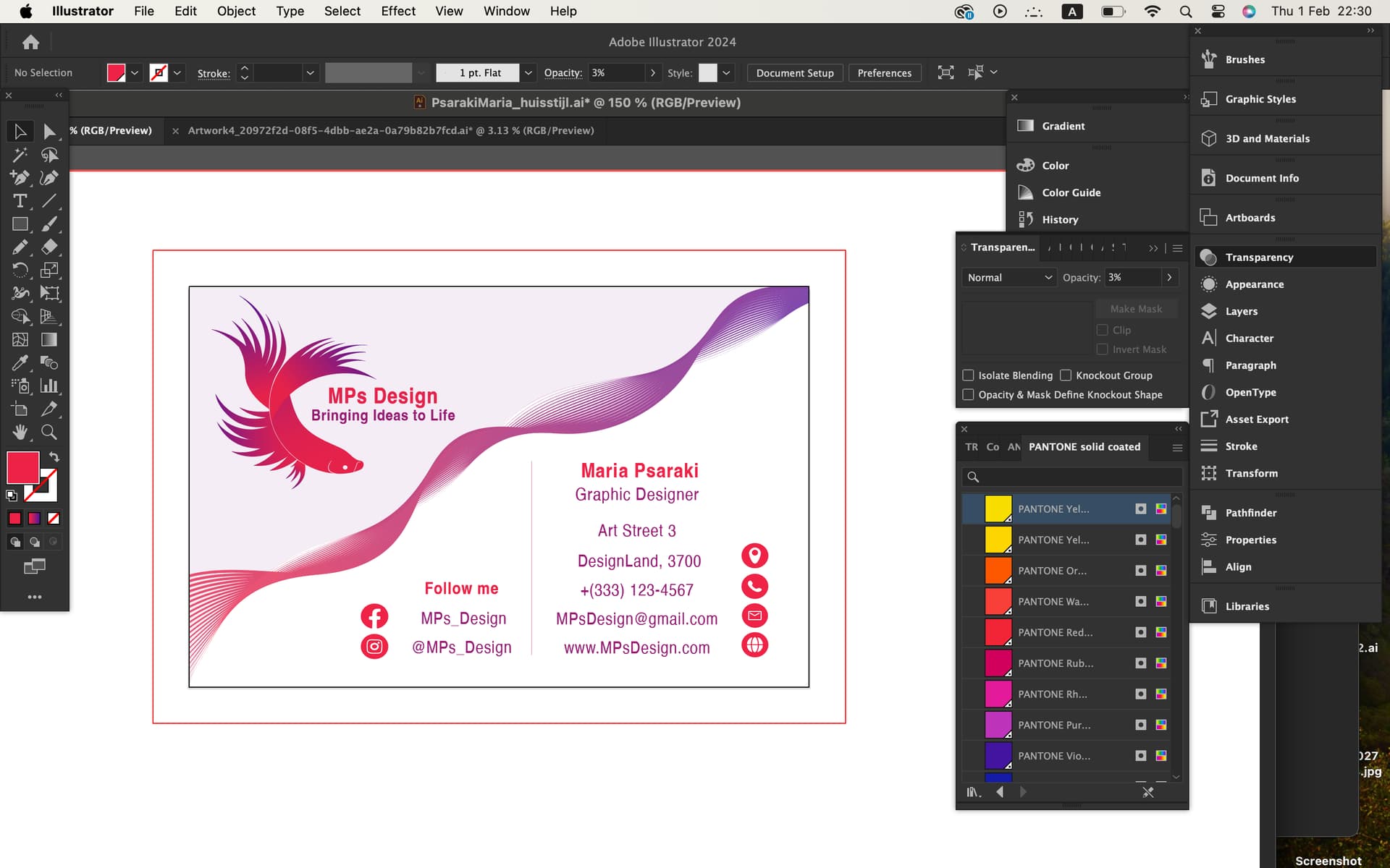
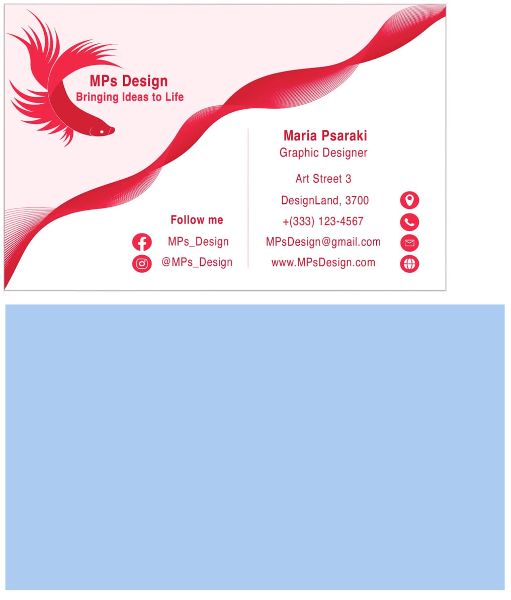
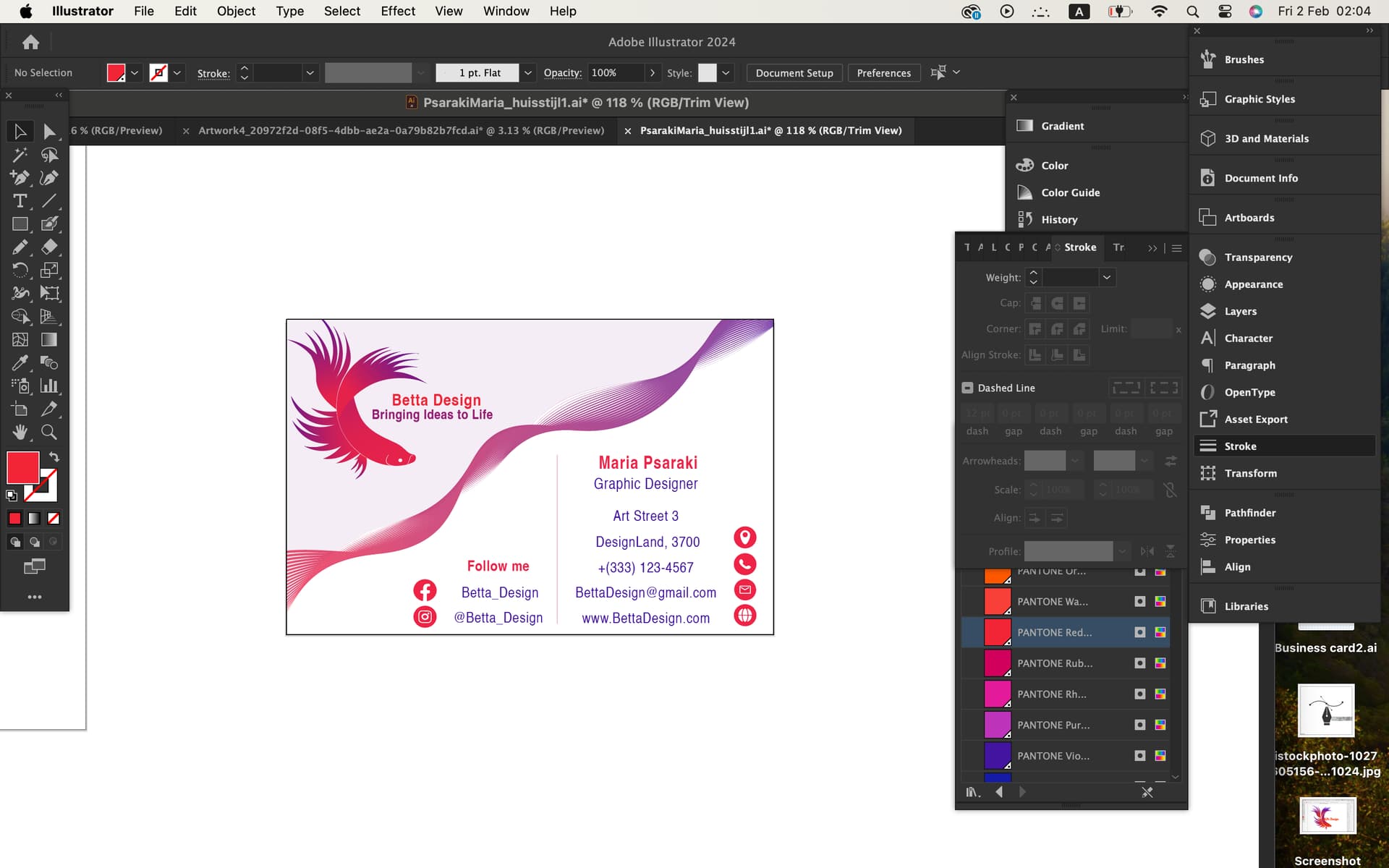
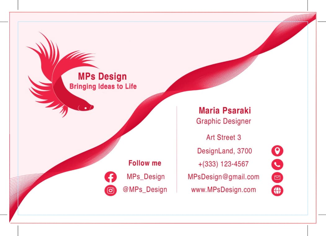
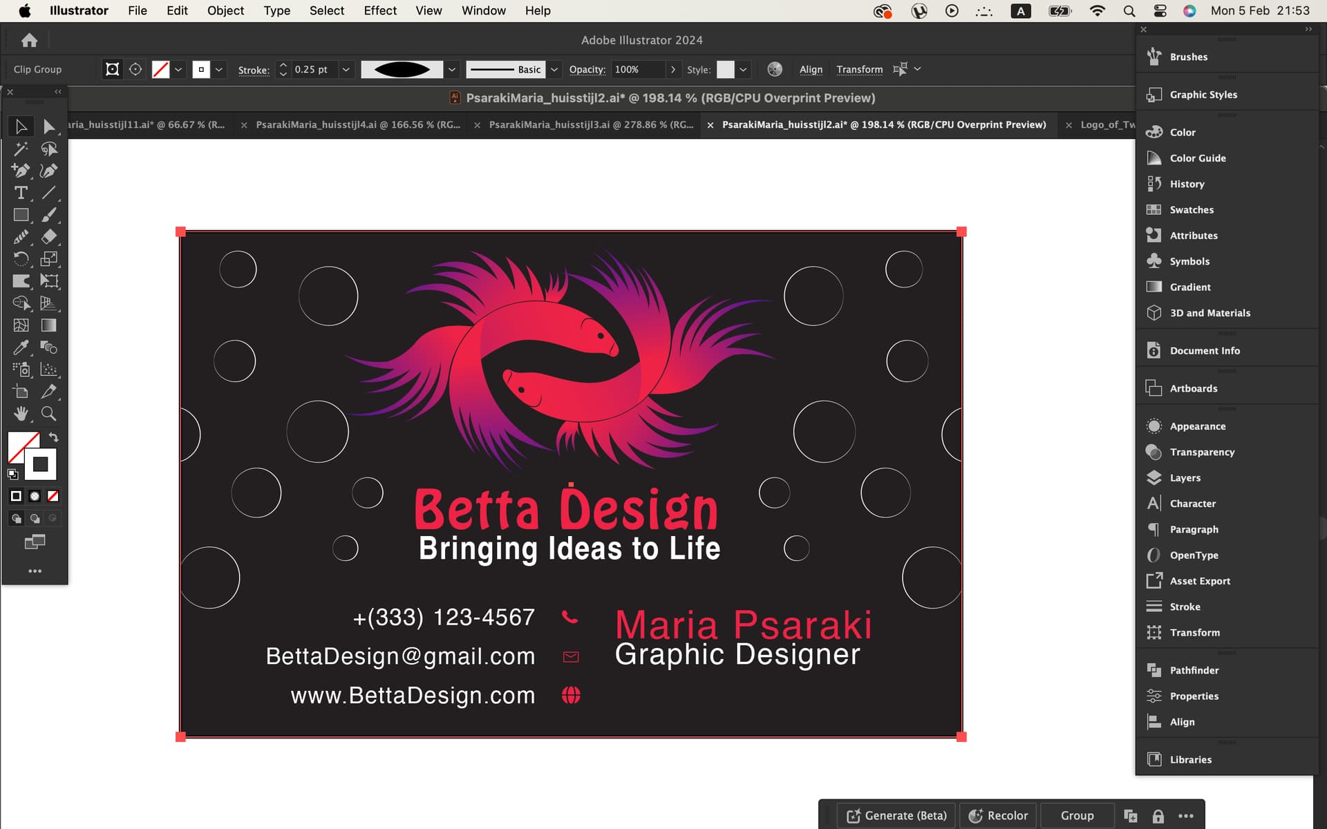
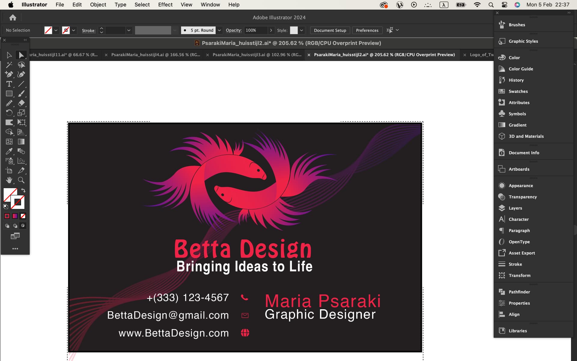
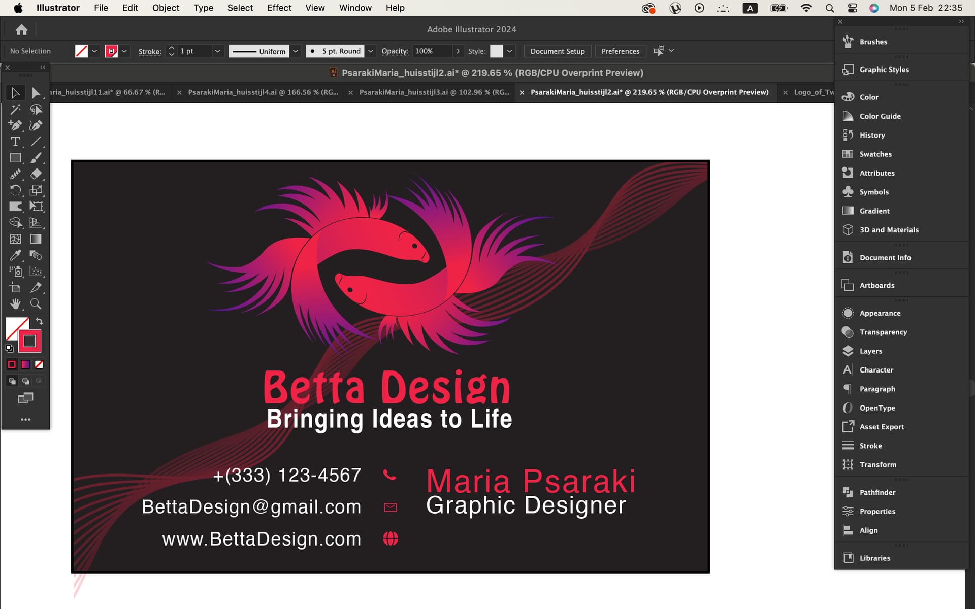
As a designer you know the “ingredients” for the business card. A logo, the business name, your name, address, phone number, etc. and initially you try to follow maybe a basic recipe (even if it is just a rough idea in your head). So you out the logo here, the text here, you pick a font and you think you are done. But just as with cooking, over time you learn what works and what doesn’t. You learn how to create something unique and memorable, even when working with potentially simple and basic “ingredients”.

So, take a look at other designs. Take a look at how they use the ingredients. See what they have done that works and doesn’t work. It takes time but I’d recommend literally going out and finding a handful of business card designs that you believe work well. Then figure out why they work well.

The other challenge is logo design is one of the most challenging aspects of design, even for seasoned designers. Business cards IMO can be equally challenging mainly due to space constraints. But even in a limited space, you can come up with ideas that work well.

I know that some of this is vague, but that’s because giving literal step by step advice is less helpful to me. At that point you are just executing someone else’s vision and ideas. If you re in school to become a designer you need to learn how to execute your own ideas.

1 Like

Hey Eriskay, It doesn’t look like, but it’s 3-1/2" x 2". :slightly_smiling_face:

1 Like

Thank you for your time Craig, i really appreciate it. I will try to apply your suggestions and I’ll come back for feedback. :smiling_face:
I have a lot to think :stuck_out_tongue_closed_eyes:

I have one more question by the way.I just watched the video from the site you provided, and I gathered that I need to resize the entire card to fit within the red line. Did I get it right?
Because earlier you talked about the pink area and the wave thing only. @CraigB

As carpenters say, measure twice and cut once.

Your card is 2 inches high but only a little over 3 inches wide. The blue box beneath your card below is 2x3½.

Resize might be the wrong word, but yes, everything that will extend to the edge of the finished card should also extend to the edge of the bleed area. Printers generally can’t print right to the edge of cards, and even if they could, business cards are printed on larger sheets of paper that contain many cards. After the sheet is printed, each of the cards is trimmed to the correct size (with the bleed being trimmed off). Since the trim is never exactly perfect, the printing in the bleed area provides a little wiggle room.


If I extend it to the edge of the bleed area and select trim view, it appears like this. Is this how it should be? I feel stupid right now. :stuck_out_tongue:

You’re right about the dimensions, it was like that and I did something wrong with the settings, maybe.

2 Likes

There’s no need to feel stupid. I felt much the same way when I was learning years ago.

I mentioned resizing being the wrong word. This is because resizing will do precisely what you showed us. Instead of resizing all the elements, you need to extend those elements that will touch the edge of the card to the edge of the bleed. Those elements that won’t touch the edge of the card should stay the same size.

I’ve added trim marks and a light blue line to indicate where the edge of the card will be once it’s trimmed.

Make sense?

1 Like

Aaaah understood ! Thanks :heart_eyes:

1 Like

Hey, I created another business card and I’d like to share it with you to get your opinion.