Hey folks,
I am doing a project for a local men’s wear fashion company called “WEXEA” and they are looking for a logo.
The requirements they laid forward:
1- Logo must be modern and minimalistic
2- Since its a mens wear fashion brand, the logo must communicate masculinity.
3- The logo clearly represents itself as a logo of a fashion company and should resonates with audiences.
Well thats all with the hardest part for a graphic guy. Here are few concepts I just made.
Have a look and fire your cannons.
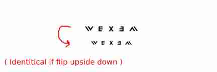
Of the three, I think the middle one is the strongest — I like the stitch making the X. The first one reads as WEXAM to me. The third one is neither modern nor minimalistic.
With that out of the way…
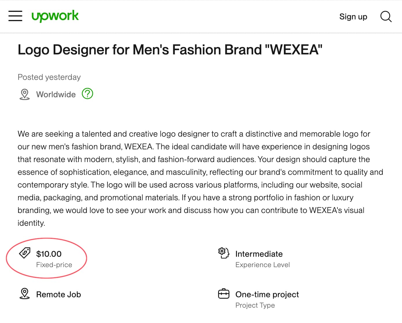
I searched online to see if the company already had an existing visual brand and found the following.
Seriously, ten bucks for a logo? It’s the most important element in their visual branding, and they want to spend the equivalent of a burger, fries, and a drink at McDonald’s.
I hope I stumbled across a joke on UpWork, and I certainly hope you’re not doing this for 10 dollars. If so, you’ve already spent the ten dollars in the time it took you to read my response. A ten-dollar logo easily crosses the line from absurd to obscene.
They have got another upwork post for $50 and one another for $120.
I am doing it for way more than that. lol.
Btw, thanks for your points.
I thought the third one has more masculine impression. Ofcourse it is neither minimalistic nor modern but we can do something about it later.
I’m glad you’re not doing this for $10 … or even $120.
I think you need to narrow down the target market. Men’s wear fashion could mean Hot Topic, Banana Republic, Brooks Brothers, Neiman Marcus or just about anything in between. Something that appeals to the Hot Topic customer avatar isn’t going to fly with the Neiman Marcus customer avatar.
Out of what you’ve shown here and without knowing the target market, I like the middle option the best. I do have one concern with it. I read your post, so I knew it is supposed to read WEXEA. Run this by a group of people without telling them how it’s supposed to read and see if they read it as WEXEA.
I just feel this is really degrading - for people in the design industry. For a fashion place to treat design with such low regard - even if it’s $10 or $20 or $120 - it’s just a disgrace.
I won’t be participating in the review of the logo.
If you’re working for that low amount of money $120 is far too low - then I wish you good luck.
You have some good ideas going on for “WEXEA.” I can appreciate your intended design for a men’s wear fashion brand, going for modern and minimalistic, which is really fitting with today’s times. Now, let me give my feedback for each of these concepts:
WEXEA 1: It is sleek and modern but really needs to be bolder to show that masculine edge. Perhaps use thicker lines or sharper edges to give it a more solid, confident feel. As it is now, this one has a very neutral quality to it.
WEXEA 2: I like the simplicity here, but it may be a tad too minimal. To make unmistakably a fashion brand, perhaps incorporate a subtle design element in the form of an allusion to clothes or tailoring. For instance, a button or even the texture of fabric-you can still keep it minimal, but with more character.
WEXEA 3: This one has a bit of personality, but it is bordering on too complicated for minimalism. I would advise refining it by peeling back some of the elements, which are keeping its strong identity. This could be the one that balances modern and masculine.
Overall, you are on the right track! Refine those fashion screams and make it more masculine with bold shapes, all while keeping in mind that this will have to work on things like tags, websites, and possibly even embroidery. Keep going, dude-you got some killer ideas in here!
The first thing I’d be doing is questioning them on the name. With the caveat others have raised about not knowing who the target audience is, I can’t imagine anyone particularly responding to WEXEA well. The only area of clothing I can see that sitting in at all is something like outdoor agricultural wear. There’s not a lot of ‘poetry’ and aspiration in there. Of course you can mitigate this a lot with brand design, but the way a word hits the left side of the brain runs very deep very quickly.
Muck
Meadow
I know these two words are more extreme, but when you read them, focus on your emotional response. Not what they make you think of, but more the way they make you feel. My response to Wexea is definitely closer to the first.
Determine the market and find a name that resonates with that demographic and also ties with product. Too often designers just accept the ‘kitchen table’ name the client gives them and end up with a constant uphill struggle to fight the incorrect connotations.
That’s a very long-winded way of saying, back to the drawing board – unless they are selling waxed jackets and wellies.
Totally agree with you! I would look at some big agencies works to understand how it works in 2024. For example, when I was looking for this theme and something similar to an example of what a logo should look like I noticed a signature logo by Artlogo that I found quite interesting. I think it might be a useful resource for you. Good luck!
Great work on the logo concepts for WEXEA! The minimalistic approach and masculine vibe fit the brand well. For a project like this, clarity and audience connection are key—similar to how the Rutificador in Chile needs to balance access and privacy when offering public information. It’s all about representing the brand (or service) while being mindful of the message it sends to the audience. Looking forward to seeing the final design!