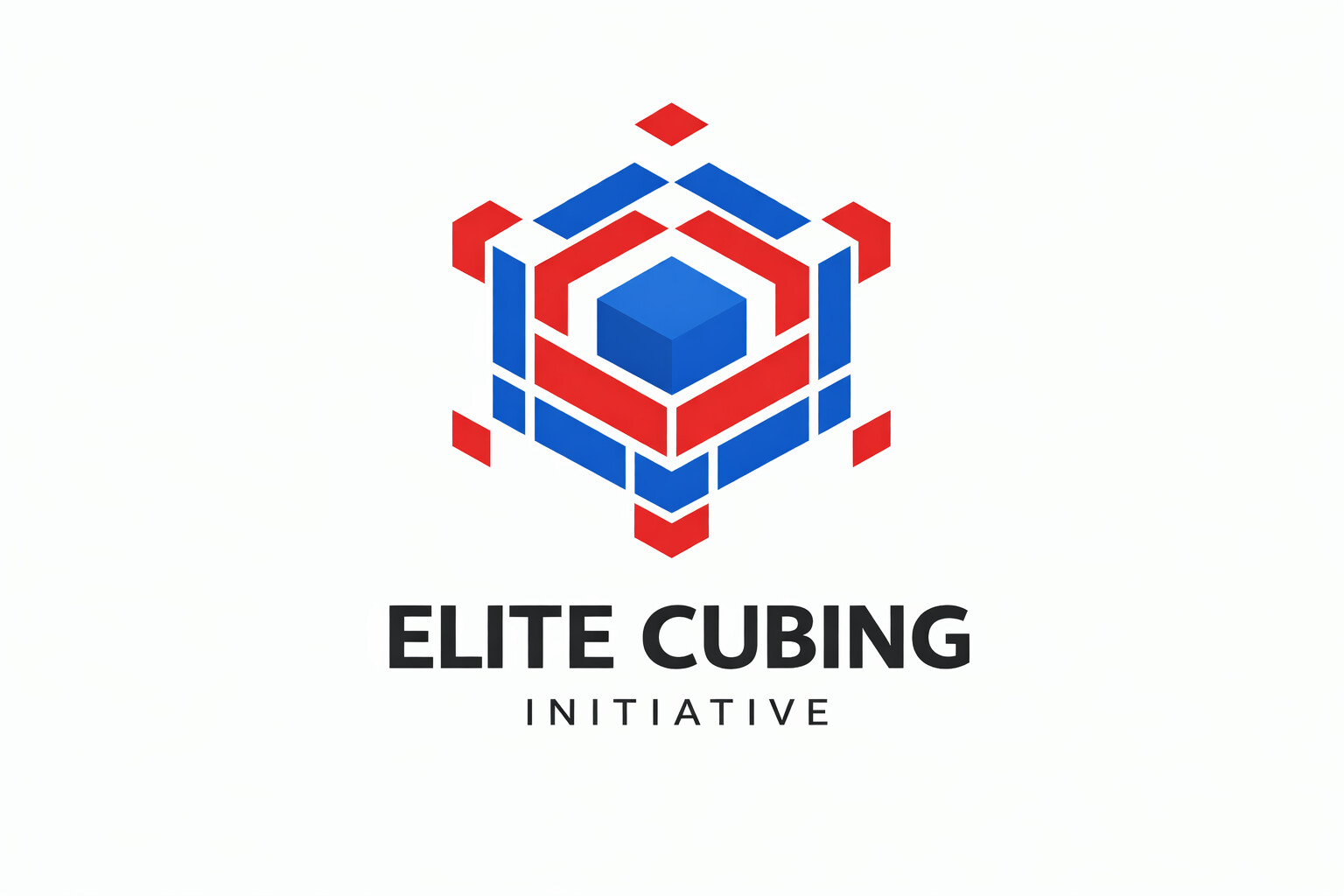
Someone I know wanted me to design a logo (despite me being a hundred percent noob at design), so I decided to give it a try.
Brief: Create a cubing logo for a cubing initiative. Required colours: Blue, white, and red. Text: Black text reading “Elite Cubing Initiative”. Target audience: Cubers of all ages.
The logo will probably be used on a social media banner, or a profile.
It’s not bad but hard to judge besides that it’s a cube and elite. Why the colours? What’s the company? What’s the brief? What’s the ethos of the company? Have you more info you can share on your choices?
Additional colours for shading adds cost a print
How does it stand in black and white and small sizes?
This wasn’t for a company or anything with a proper brand behind it. It was just a personal logo for a cuber, and there wasn’t much of a brief. Basically just “cube” and something that felt a bit elite.
The blue, white, and red were colours he specifically asked for, no real reason behind them. I get the point about extra colours adding print cost, but I think it’s probably just going to be used as a profile pic or online, not printed anywhere.
Yeh, I didn’t focus too much on how it would look when shrunk, since it was mostly for online use.
You have ‘appendages’ at the nodes of your cube which contrasts your cube with the regular Rubik’s. What effect were you trying to achieve with the bits attached to your cube?
By the way, there’s nothing elitist about your design.