Hello,
I’m looking for some guidence with this logo design.
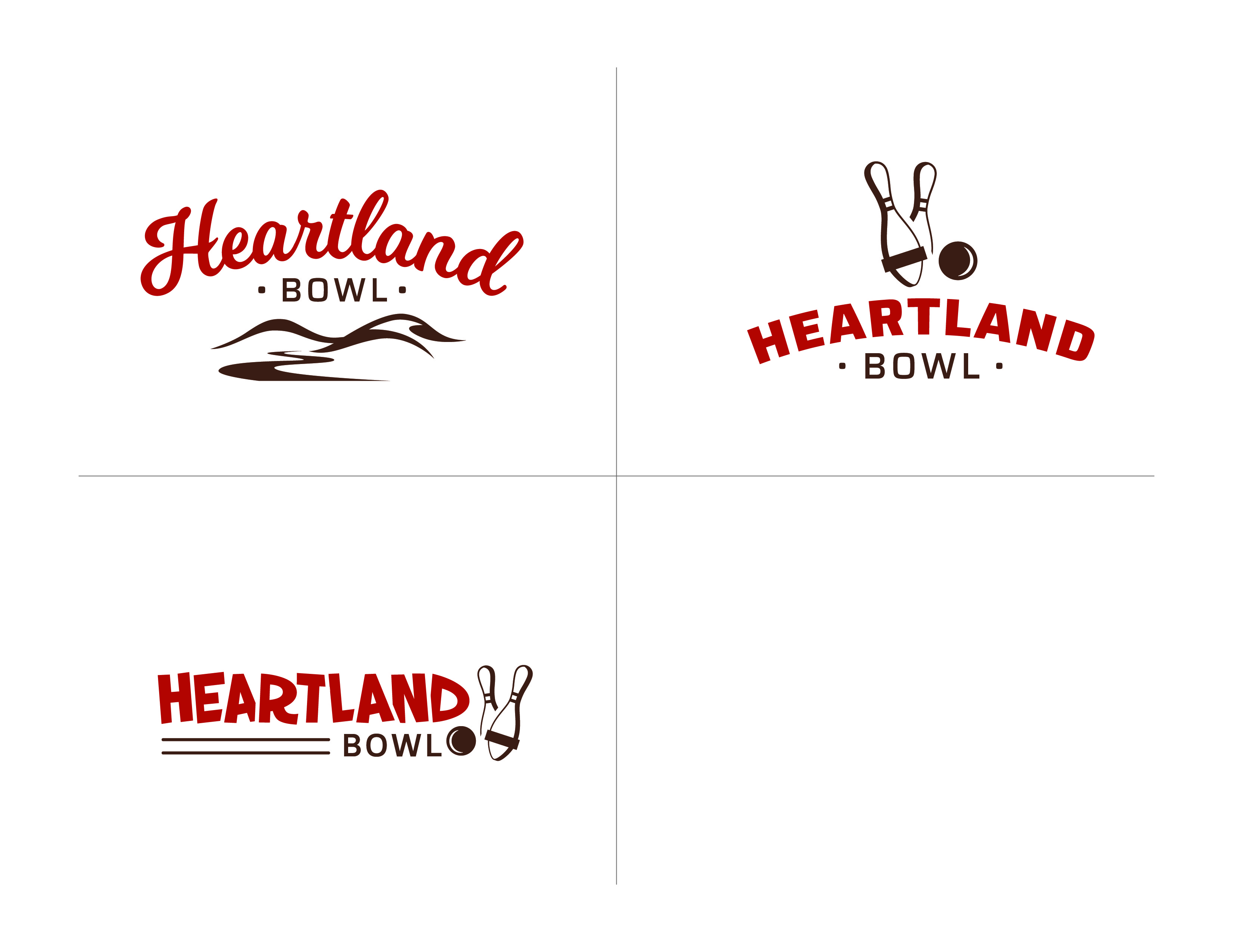
It is for a bowling centre. The client likes the “heartland” which is hills and such but he also wanted 5 pin bowling incorporated. I made three options and he liked the top left but not the “hills” icon. he also said “On top one can we throw pins, ball or heart under instead of hills??” What I think he liked about the top one was the script font.
I’m trying to work through this, but I am stuck since having the pins on the bottom is not working and feels to disconnected from the type. It seems this way for anything that I try. I’ve made some more options but none of them feel right.
Can you help me come to a better solution.
Thank YOU!
Color Top Left – I agree with the client, the hills aren’t working.
Color Top Right – I think this is your best of the bunch.
Color Bottom Left – Not crazy about the font.
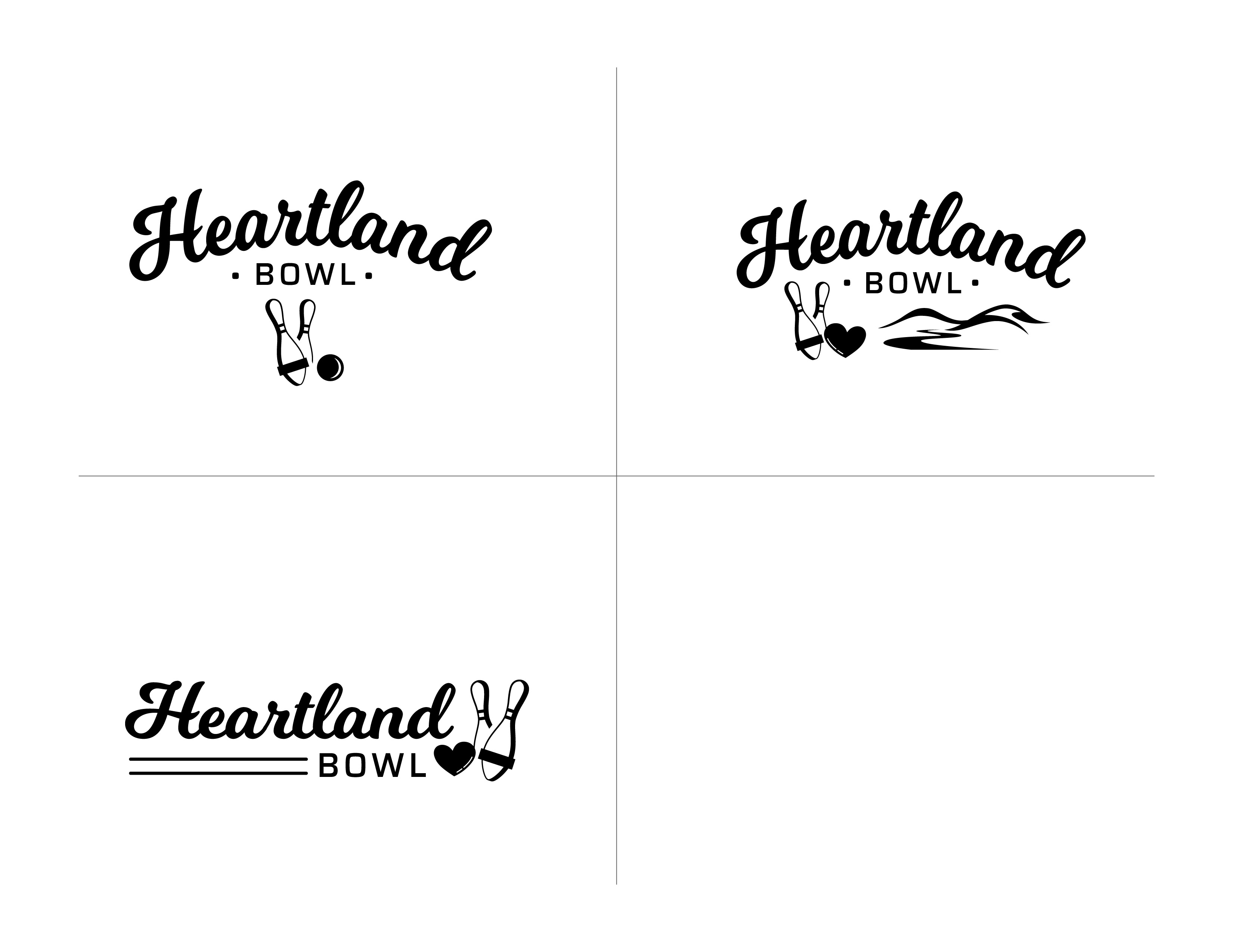
Black/White Top Left – You are correct in that the pins and ball seem disconnected.
Black/White Top Right – Way too much going on.
Black/White Bottom Left – Not crazy about the layout.
I think the problem is the script font you used for Heartland. The font calls a lot of attention to itself, so it will be challenging to incorporate the pins/ball motif without it looking to busy or disconnected.
Do an image search for vintage bowling sign – there is some great stuff out there.
Thank you for your reply,
I do think the colour top right one works the best
Do you suggest a different script font then?
I guess I’m struggling with the layout since heartland is so long and bowl is such a short word.
You don’t need to use the entire bowling pin. Or ball for that matter. You’ve got that partly figured out with the second pin. Do some sketching of the same concept using the logo.
The heart is redundant.
Yes I agree about the heart, however the client asked for it. Should I just not show them an option with it then?
I see what you are saying with not using the whole bowling pin. The tough thing is he specifically asked for a 5 pin bowling pin (which has the bar across the bottom). I’m not sure how I would show that its a 5 pin, perhaps cut vertically instead of horizontally?
Thank you for your advice!
Well that’s one way to approach it, but really, it’s your job to guide them away from the weak, the literal, the personal stuff, etc., that so many clients tend to demand as components of their brand. That is, you counsel, explain, persuade, or otherwise assert your marketing expertise in such a way that convinces them to acquiesce.
1 Like
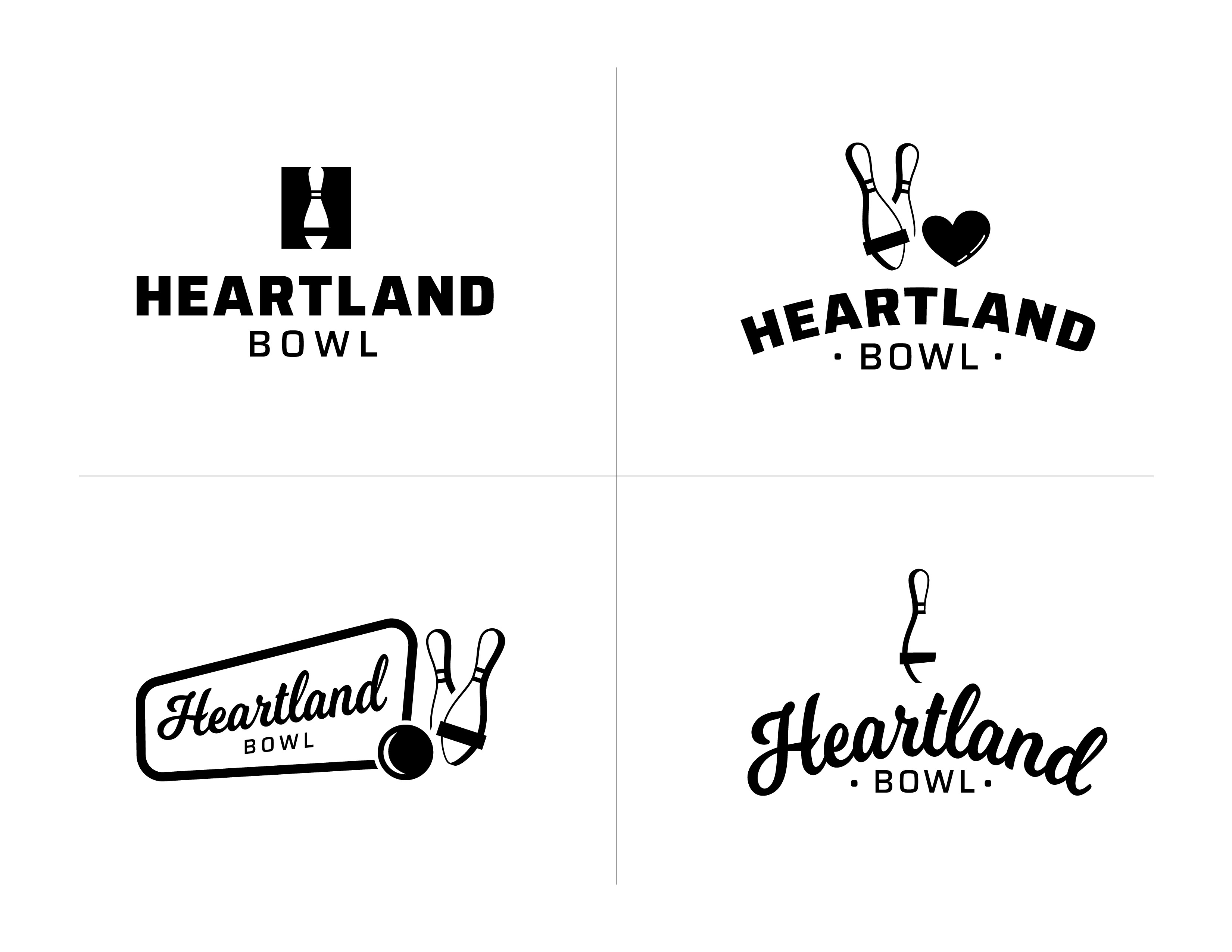
Okay so I took your thoughts into consideration and after trying a bunch of options that didn’t work. I’m hoping that maybe one of these are working better…
If you could please give me some more feedback that would be awesome!! Thank you
The bowling pins look like an afterthought.
Do you have a version where the wordmark cuts into 2 or 3 pins either from the left or right?
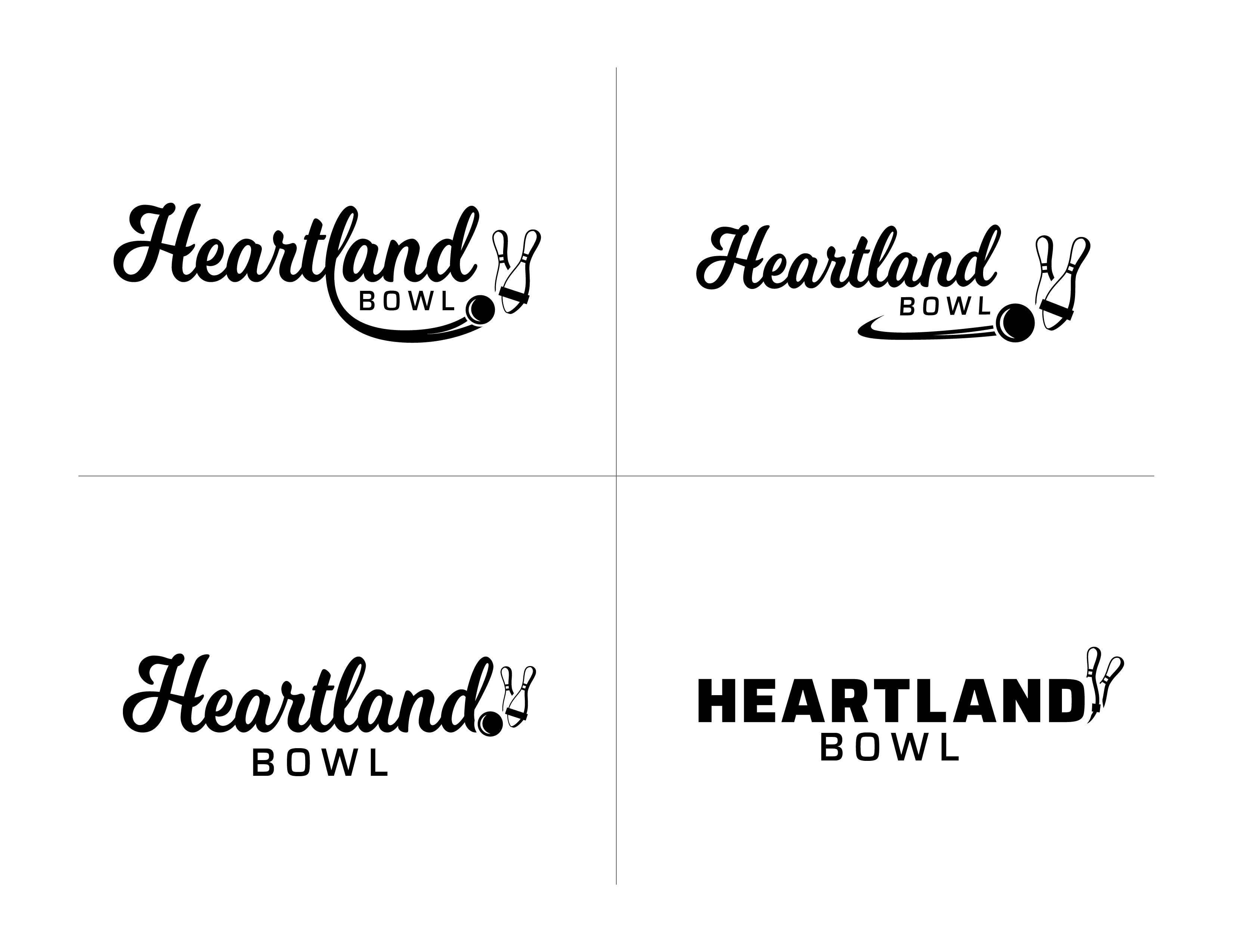
Give it a little more kinetic energy. These are all pretty static.
Hipster … to my eyes.
Put some life / fun into this logo … not everything (in fact most nothing) fits neat and tidy.
I took your suggestions and I tried to make these next ones more connected as a whole with energy and in motion. How are they looking
yes, you are right I might just be thinking to hard on this one maybe my last revisions are something a little bit better?