We are a a group of 4 dive centers on Curacao and are looking for a logo that would fit our shops. We all have our own names and we will be using this logo for our overall name. The logo is for people between 21 and 60 years that are looking for a vacation experience. they are active people and generally already familiar with diving.
Other notes:
Include the Diving into the logo. Also it would be nice to see our different facets, Diving, Boating, Retail shops.
Have you done any research on Curaçao? It’s a somewhat dry, but tropical island off the coast of Venezuela that’s owned by the Netherlands. Consequently, it, along with its neighboring islands of Aruba and Bonaire, have an odd mixture of Dutch, Spanish and Creole influences that make these island unique and very interesting as tourist destinations.
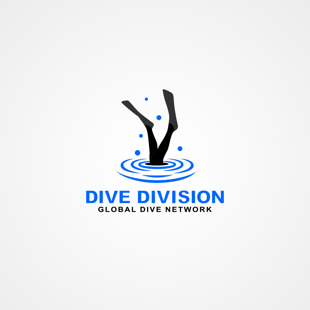
Your logo captures none of this personality.
Your typography has a corporate look, but it needs to look laid back, easy-going, warm and inviting.
The mark itself looks a bit more like a diving accident than good diving technique. Your diver looks as though he might be at risk of drowning, sort of like he dived in head first, hit the muddy bottom and got stuck there. I doubt this is the message the company wants to convey.
In addition, the mark needs to look fun, easy, fluid, relaxing, and it should convey a sense of serenity that’s indicative of what tourists heading to Curaçao would want. You should try to imagine yourself in a tourist’s position — planning a vacation to a tropical island. This logo needs to appeal to them, the target audience of tourists. It also needs to make the company look reliable, professional, experienced and trustworthy.
The examples the owners like all have fun, exciting, tropical island colors, yet yours does not. You really need to convey the appropriate personality in this logo instead of it being just a literal depiction (which their brief indicates they do not want).
I don’t think you did your research and didn’t think deeply enough about this.
I admire your ability to take criticism, but remember that I’m not necessarily right. I’m just giving you my opinions.
The most important thing is to think through things before you do them. Graphic design is more than making things look nice; it’s also a problem-solving field that requires research, lots of thought and defensible reasoning behind any decisions.
Don’t just accept my criticisms as what you should do. Remain skeptical. Think through the problem, decide for yourself, then feel free to disagree when you think we’re wrong. This is different from being defensive. Instead, it’s a matter of remaining open-minded while engaging in a discussion with others to work through a problem.
I really like your pure intentions with this response. I know you got the impression that I take whatever was told to me, So you felt you should tell me which I really appreciate.I am trying to improve so I really need to be honest with myself, I knew my logo was ugly lol. I need this criticism, In the future I will know why you told me this. I am glad that there is nice people like you in here.