I’m in the process of branding my freelance business, Point Blank Design. I posted earlier today on the crit pit and got some feedback that made me go in the direction that you can see below. I have come up with 6 variations of the logo and I need a new set of eyes to look at what I have. I’m liking 1 and 2 myself but I want to know what you guys think.
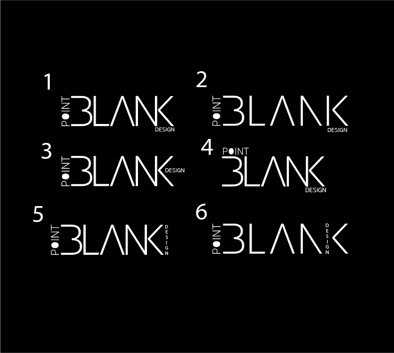
First of all, really consider if you need the word design in there. If so, find another solution on where to put it. Don’t use it as part of a letter.
Too many parts making it a hassle to read. None of these are working. They look like a lot of little sticks in a jumble with no distinguishing features.
You are going to lose the word “design” at small sizes anyway.
Consider your sign blank (the negative space around the logo, as if you had to make a board shape to put 3D letters on.)
Right now this reads 3LANK at best.
If I had to pick, number 1 or number 5 are least offensive.
2 Likes
Thanks PrintDriver I agree with pretty much 100% of everything you said. I’m gonna try going bolder, you’re right about it looking like a bunch of sticks and not making any distinguishing features. I’m gonna take out “Design” its really not needed. Thanks again for the feedback!