Hey everyone, keen to get some feedback on which of these logo options you prefer. They’re for a large retailer who sell many different things, think Costco.
1 Like
This is something you designed, correct?
Yeah all my logo designs
Thank you for confirming. ![]()
do you have any thoughts on them?
Can you give us some context? That helps us give better feedback.
Are you a student with an assignment, or a professional with a client project?
If the second, is there a previous logo you can post?
I think you need to do some more sketching.
Does the store sell generic brands?
Who is it selling to?
Is it red and white to match BJs, Costco, Sam’s, Target etc?
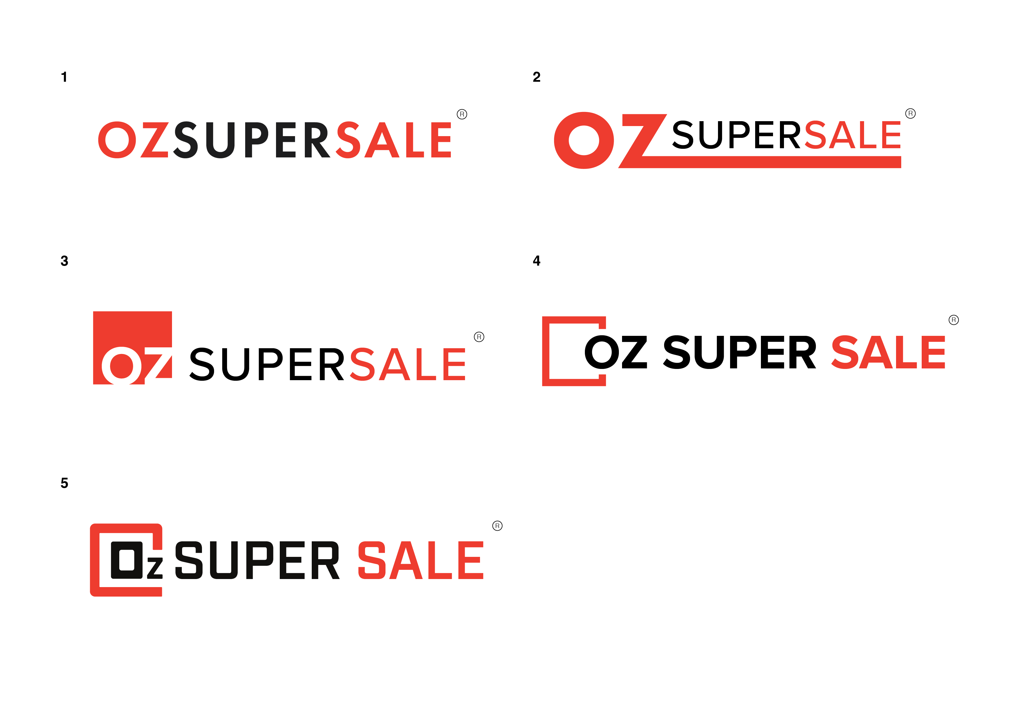
Is it OZ or O2? #5 suggests the latter.
Have you tried a google search with this? You get every product under the sun that is sold in ounces and is having a super sale. That’s a lot of clutter to SEO your way out of.
The store name is awkward, and so are your solutions so far.
Options 3, 4, and 5 remind me of the old joke logos that were flying around after a big brand decided to mess with putting a smaller square on their logo.
Brand New: Follow-up: Gapgate
and
http://newsfeed.time.com/2010/10/22/the-science-of-fail-why-the-new-gap-logo-made-our-brains-angry/
The one with the long tail reminds me of the old Verizon logo. It also begs the question, if you are building that as an 6’ tall sign for the side of warehouse building, constructing a lightbox for that long tail is gonna be a PITA if it’s something like 40’ long.
And number 1 is boring.
Think really long and hard about where you put that magically floating trademark symbol.
As a sign guy, those things are the bane of my existence.
I agree some more background would be helpful. Student project or live project? Will this be a brick and mortar store or online store or both? Is it a wholesale club? Is it directly competing with Costco and Sam’s Club?
Based on what you’re showing and the minimal background, I’d say these all feel a bit rushed. Spend some time away from the computer and do more conceptual thinking and development.
Number 3 reminds me a lot of the overstock.com logo, so you might want to steer clear of that one.
I kind of like the no nonsense of #1. It’s a low cost retailer so I think it works to have a no fuss logo. You’ll have to tidy up your kerning though.
#4 and #5 are a bit problematic for readability. The square design makes it read like CozSUPERSALE.
online store, its an ebay store. Nothing as big as costco but they sell a bit of everything.
okay thanks
this is the old logo they wanted re doing. It’s just for online, mainly ebay store i think. The name was give to me by the client
im also about to graduate and picked us this freelance job
As this is a re-brand, it is important to communicate with the client what they don’t like about their old logo. Otherwise you risk giving them something similar in the wrong ways.
I don’t see much of a design here. In many respects, you took a plain-text logo and changed the font.
You mentioned that the client was “like Costco,” but not as big. Let’s take a moment to look at the Costco logo:
It’s also (mostly) a text-logo, but the font choices could convey a few things about the brand. 1) it’s a bulk retail store, and the font that they chose is bulky. 2) The font is italicized and creates a sense of motion and could represent, “get everything you need and get on with your day.” Add the racing stripes, and it screams, “look how fast we are.”
For contrast, we’ll look at the Sam’s Club logo.
Another big box store, this logo features many boxes. The logo is in a box, and it has more boxes inside. The inner boxes pay homage to previous versions of the logo, and they chose blue, most likely to harmonize with their Walmart Brand.
So, by looking at these other logos, what can you do for Oz Super Sale to add meaning to their logo? You may be onto something with using the boxes, but I agree with other’s who have said it looks like a “C”.
#3 looks like the box is mostly empty. #4 looks like the box was too small to begin with, and #5 looks like the client would only sell tech products. Maybe some of that is true and should explore that more. If not, maybe make some other considerations.
Id say number 4, I like the way how you placed half of the letter O in the box. Its not too flashy ang the color is good. Having a distinct something that is not very similar to other would catch consumers attention. Great job!