I am designing a logo and a light brand for a client who is a realtor. She is in her early 30s and wanted a more fun, funky approach to real estate to reflect her personality. Some keywords from her about her brand: joy, excitement, trust, professional, positivity, energized, friendly, maybe a little flirty / sassy?
Her logo will live on business cards and mailers, as well as social media and eventually a website. She says her audience is primarily women in there 30s and 40s.
This is paid work. I am in-between a junior and mid-level designer (at least I hope I am!)
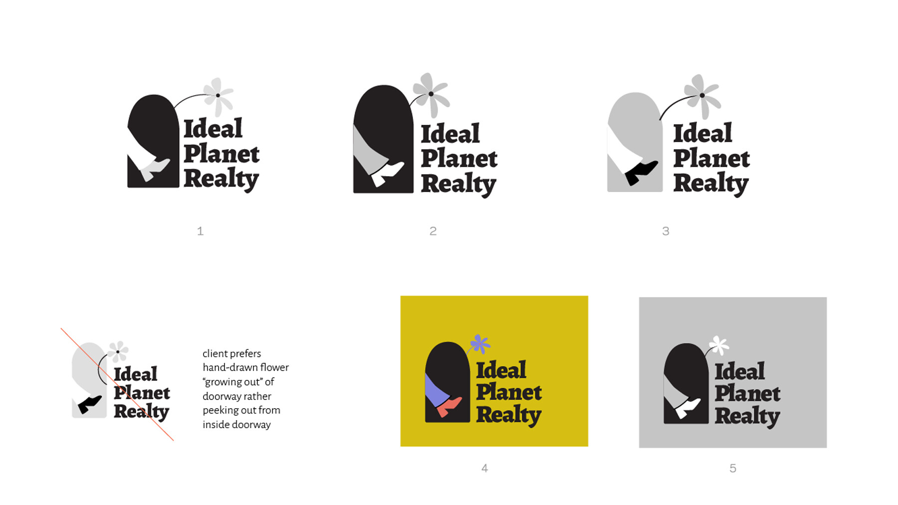
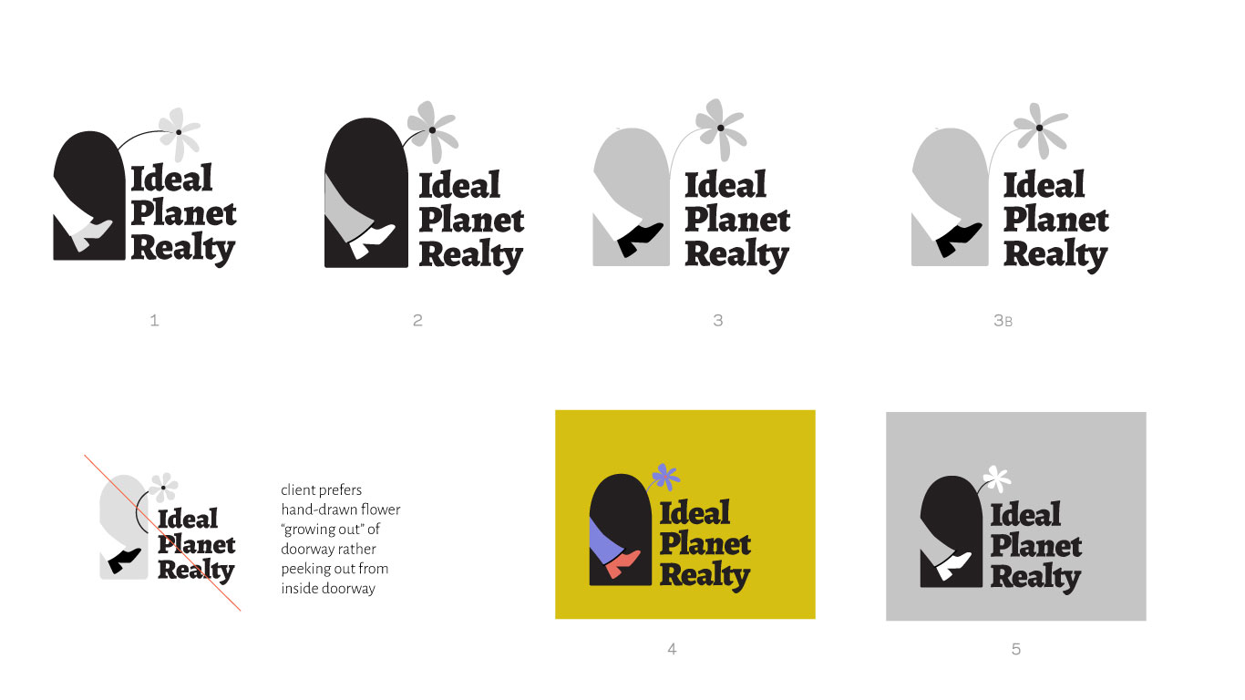
We’ve explored other logo concepts and are committed to this font and this boot/leg/door/flower direction. Before I start applying color to the logo, I want to nail the shapes and finalize the grayscale version.
There are two main questions I have:
How are the spatial relationships between the boot/leg/door/flower and type working? Any suggestions there?
I think we are hitting on most of her brand attributes–it’s definitely fun and warm and inviting and youthful. But how can I push for more of “trust” and “professional” in this concept?
Here’s the thing about logos…
They have to appeal to the clientele, not the client.
So who is your client aiming for? And will an extraneous flower growing out of a door impress them?
As I mentioned in the original post, her audience is primarily women in there 30s and 40s.
The flower was added to an early round to add some whimsy and fun and also because the client wanted the logo to reflect some of the sentiment of the company name “ideal planet realty”. She asked about adding earth, and to me that was too far a stretch for a realtor logo, so the flower was a compromise. To me, the flower is a connection back to ecology / front yards / gardens / optimism.
Anyway, I see your point, but the client really likes the flower. I think it was better incorporated in the version that’s crossed out, but the client didn’t like this version. So I am looking to this forum for advice on unifying the design.
It has a 1970s look — bell bottoms, high-heeled boots, '70s-looking typography, a flower. I’m not saying that’s bad. The look is sort of in style again. I just wanted to point it out.
The shape you’re saying is door-shaped, doesn’t remind me of a door. If it is a door, the leg showing through it is gigantic. Then again, maybe it doesn’t need to look like a door. Maybe we’re looking out from an old cartoon mouse door and seeing the leg of someone walking by.
The yellow ochre or mustard color is a little odd, but again, it’s sort of a 1970’s color.
All that said, which sounds like a bunch of criticisms, I like the feeling the logo has. I think it matches up with the light-hearted, funky approach you were after. I’m assuming your client knows her clientele and thinks this sort of not-typical-for-a-realtor look is appropriate. As @PrintDriver mentioned, appealing to your client’s clients is the goal (whether or not your client realizes it.
As for the spatial relationships you asked about, I prefer a little more space between the “door” shape and the typography. In other words, the top-right version’s spacing.
So your client wants to limit her clientele to women in their 30s and 40s who find retro whimsy appropriate to a realty search? Admittedly not in the demographic described, I’d pass over this one if I were looking for a realtor. Whimsy is fine, for something like a hat shop. Investing in property is a bit more serious.
I share @Just-Bs and @PrintDrivers concerns but you should know that as a designer I think you’re doing well. I feel we often see logo designs on here that get shredded for typography choice, color palette, gradient used, un-readability, etc so thank you for a designer logo!
My initial reaction to this as a 30+ year old female who always loves home shopping, was “what? Hmm Hah!” I’m not interested in its 70s + whimsical design BUT it absolutely got my attention and curiosity. I would consider working with her because she seems different and perhaps more interested in helping me than throwing me into a house quickly.
The current door(mouse hole) shape doesn’t do anything for me… in fact for some reason I get a library vibe. Especially if you’re trying to fit in a trust, professional feel then I’d play around with changing that shape or removing it.
Mechanically, the arched door/hole doesn’t work, and the flower would be better placed coming up out of the cap I or the lowercase l in Ideal, as though it was a bud vase. Needs a leaf or two on the stem.
Looks good. Not so sure with trust. But that’s hard to reach when focused on the other qualities. Trust may be achieved outside the logo. Otherwise, you could still adjust the font and color. But better the former since it probably would break style. Maybe your customer is allowed to show a seal of quality for the real estate industry, which you could place far away in an cautious unobtrusive way, maybe in grey and small.
Foot comes out of the dark beneath an arch. For me it was a door within the first second without looking like clip art.
(1) As Just-B mentioned, the door does not look like a door. I laughed at Just-B’s “Mouse Hole” impression, but the current door design struck me that way too. It needs a fix.
(2) If your target audience is women, the leg kicking the door should look like a female leg. As it is, the leg/foot looks like a guy wearing 1960’s era bell-bottoms.
(3) The colors are much too dark to give a fun, happy, youthful appearance—especially the black door (gives the wrong impression) also the mustard yellow which needs to be a much brighter yellow (or some other bright or light color.)
Remember, design is all about communication first and foremost. So called “Trends” come and go, just like the mustard color for example. These can actually work against what you are trying to communicate. Trends are just trends, not hard-and-fast rules of good design. Communicating in a style your target audience can relate to is the key.
I hope this helps and I wish you the best of success with the project!