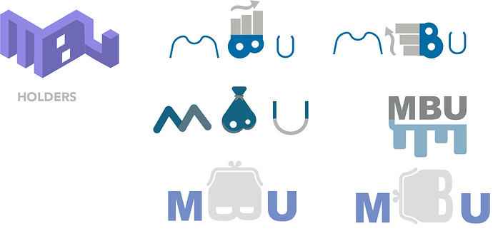
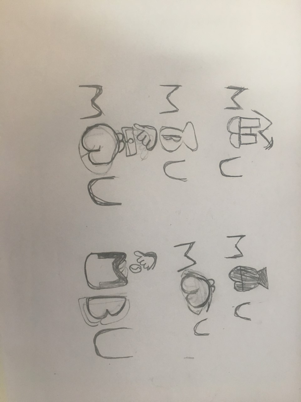
Today in my interships i got a project to make a logo for a holding/investor this what i got so far ( every logo contains MBU)
You’re trying to be too clever while introducing disparate, trite and inappropriately frivolous elements into the logo. Finance is a subject that calls for stability, seriousness, prudence and a more conservative and conventional treatment.
Good for you for working through this, sketching, and putting the work out there for review. I have to agree with Just-B, none of these are working. I’d suggest working on either a strong typographic solution (think TD Ameritrade) or some sort of an ambiguous mark (think Chase Bank).
Thank you guys! My last qeustion is do you think the seometric logo does make sens
Quite a few gave the impression of a burglar. Perhaps the subconscious was at work?
What do you mean with ´burglar´
Surely you know of Mac Burglar? No? It’s the thief who wears mask and breaks into other people’s home to steal. Now, you don’t want that kind of implication do you?
now that it’s been seen, it can’t be unseen.
@troep also think of the implications of coins in the bank bag, coins don’t carry much value.
Burglar’s mask and/or testicles on some of these options. Sketch out 50 more options to get past the ideas that are obvious or don’t work. And @Just-B had excellent advice. Most logos involving finance/money/banking etc. are much more conservative and serious.
Do you mean isometric, as in the first logo?
It’s the initials, but is it supposed to be a building, like a bank or some other financial institution?
Again, though, I think you’re trying to be too clever and forcing things to an awkward middle ground where both the letters and the building are compromised by how you’ve merged them.
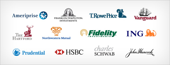
A quick Google search turned up a bunch of actual logos of successful financial and investment companies. Notice how they’re all quite conservative and designed to convey an impression of confidence, strength and stability instead of style, flair or creativity. This is not an accident.
All really weird, confusing, unattractive, and difficult to read for the most part.
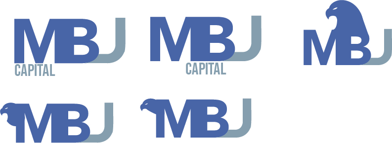
Thanks folks. I have proceed your advice this is what i got so far
The recruitments of the client
MBU in capitals
colors need to be gray/blue
I’m sorry troep, but in every designer’s career, there comes a time when you have to just let type be type, and stop trying to make it do more than that. This is one of those times for you. The brand of a finance firm cannot also be a circus act.
This is a step in the right direction over the initial post. Now that you’ve started down the path, keep going. Let’s see 50 alternates. By the way, to my eye, this looks like MBJ.
What a warped and corrupted mind! I would never think of that.
… and I never lie.
You’ve moved further down the road with this new wave of logo concepts, but you are still not there. You did make massive improvement, though. The next step of improvement will be harder but you need to definitely take it.
I think you’re missing some great opportunity to play around with the negative space there if you’re going to include a bird. But I agree with HotButton’s earlier comment, it’s tricky to use both a mascot AND have the text look nice in one logo. ![]() The more elements, the less clear the image will turn out. Also I thought your last designs said MBJ instead of MBU. (I see someone already mentioned this in another comment, so that definately needs some changes) What do the initials stand for anyway? (full name)
The more elements, the less clear the image will turn out. Also I thought your last designs said MBJ instead of MBU. (I see someone already mentioned this in another comment, so that definately needs some changes) What do the initials stand for anyway? (full name)
There was certainly lots of improvement. Hope it’s gotten even better.
Thank you guys. There is not a full name is just names of 3 people


