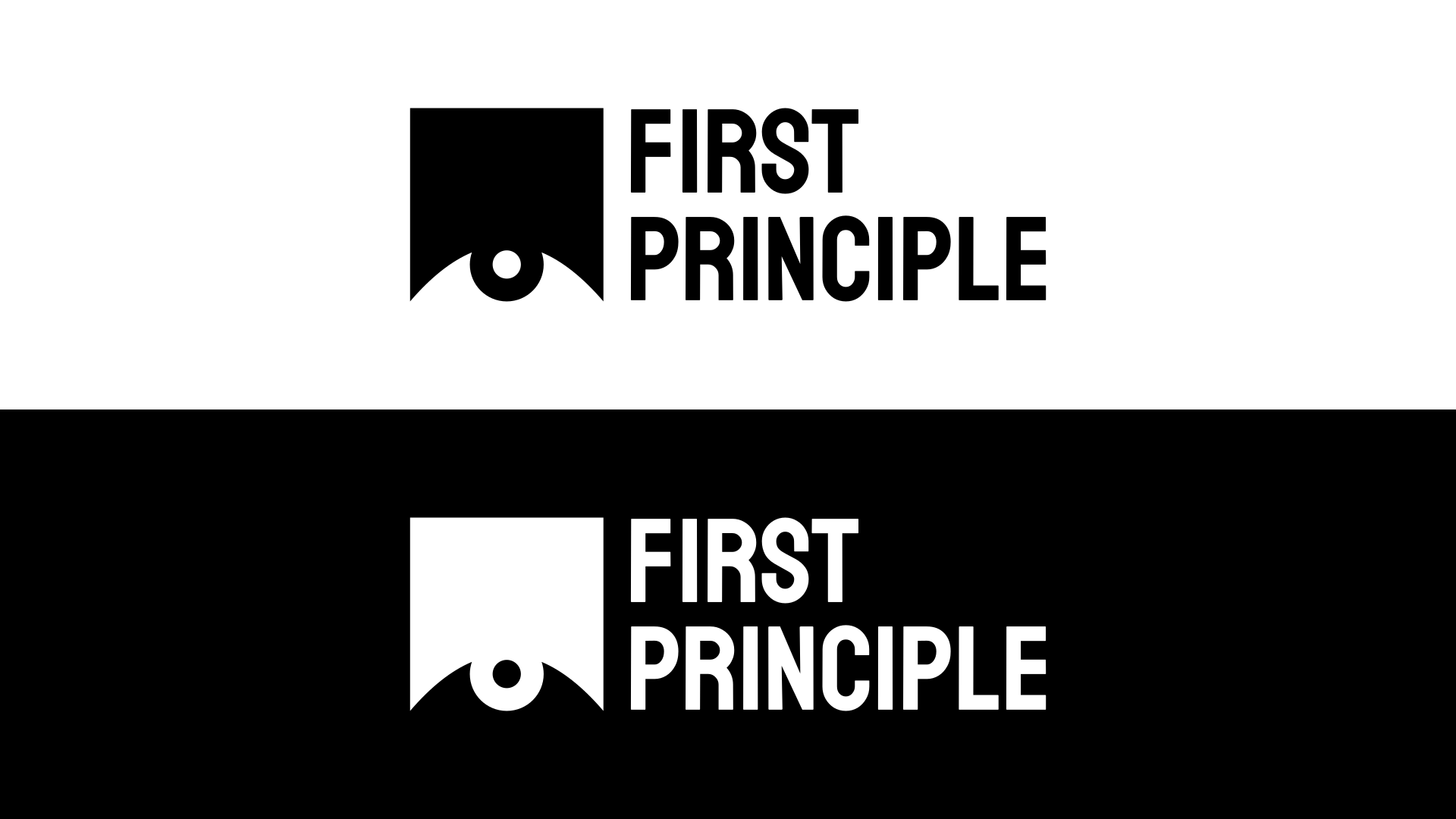
First Principle seeks to address some of the toughest problems existing today and take up initiative which no one has done before. Our approach is to look at all these problems from first principles- develop a deep understanding of the problem and look for solutions based on it. We also strongly believe in the use of technology for scale and the role of research in solving tough problems.
See how low you’ve cut the pupil? it looks like “tired” rather than “normal”
And as far as google searches go, the end client here will eventually run across your post here and wonder why you are resorting to a bunch of internet strangers for opinions. I gotta say, I’ve not seen a more vaguely worded brief any time in recent history.
I do not think the illustration looks like an eye at all. You should not have to explain what something is in order for it to be communicated. Even if the eyeball was communicated clearly, it doesn’t make sense to have it looking up from the bottom for two reasons. (1) You don’t usually investigate things from the bottom, but rather from the top (think microscope or magnifying glass). (2) The top 75% of the logomark is an empty square.
Aside from the illustration, I don’t think the typography works either. The brief explains this company as a tech and research company but the type choice feels very playful and not as clean as I would expect for a tech company. The “S” especially is an eyesore.
I would start by more clearly defining what this company does and then try to create a visual connection between that and the logo. Unfortunately, I don’t see anything in this current version that I would keep.
The R and S in the font you have selected for your logo are also very awkward, IMO. Especially the leg of the R and the bowl of the R. And there is something off on the curve of the S.
I will say, I do think it’s nice that you adjusted the font to be a little heavier as reversed out since when text is reversed out, the weight of the font tends to visually appear thinner.
If you wish to stick with the eye idea, I believe that there are stronger ways of handling it. Do you have other sketches or concepts other than this eye approach?
I think sketching out several dozen (or more) ideas would help. Here is an example of a designer using quick sketches (see first image) and then refining those ideas to come up with a solution. Sketching is more freeing as you are less worried about execution, and more focused on concepts and ideas.
To me it was obvious it is an eye without even reading the description and it is not a sleepy eye! it is looking not up (why would it?), it is looking straight at me.
The logo is bold and simple.
The negative eye would do with the pupil ever so slightly enlarged because it presents tiny bit smaller than on the white bg above.
Good work! I suggest no explainers, let them think/read your design.
I see a piston. I actually quite liked the piston as a symbol too.
I can see the eye as well….but, I don’t like the design of it. It doesn’t feel particularly well proportioned or something - can’t quite put my finger on it. Anyway, there’s a figure/ ground problem between the pupil and the “forehead”. It’s an abstract rectangle of color with no other anatomical reference so - it just seems awkward to me and I think makes the eye hard to discern as an eye. Even some sort of brow would help.