Hello again.
A friend’s friend asked me to design a logo for his company “IRIS lab”
It’s a small local business, a laboratory that analyzes speciments of animal’s feed, animal’s urine, water quality and makes assessments about stuff like that.
Because he is a friend’s friend he asked me to give a very low offer, so the budget is quite low.
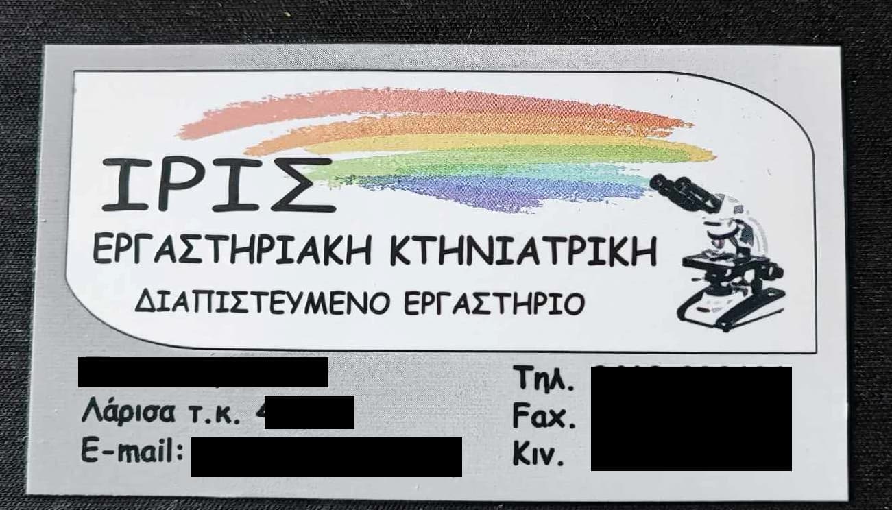
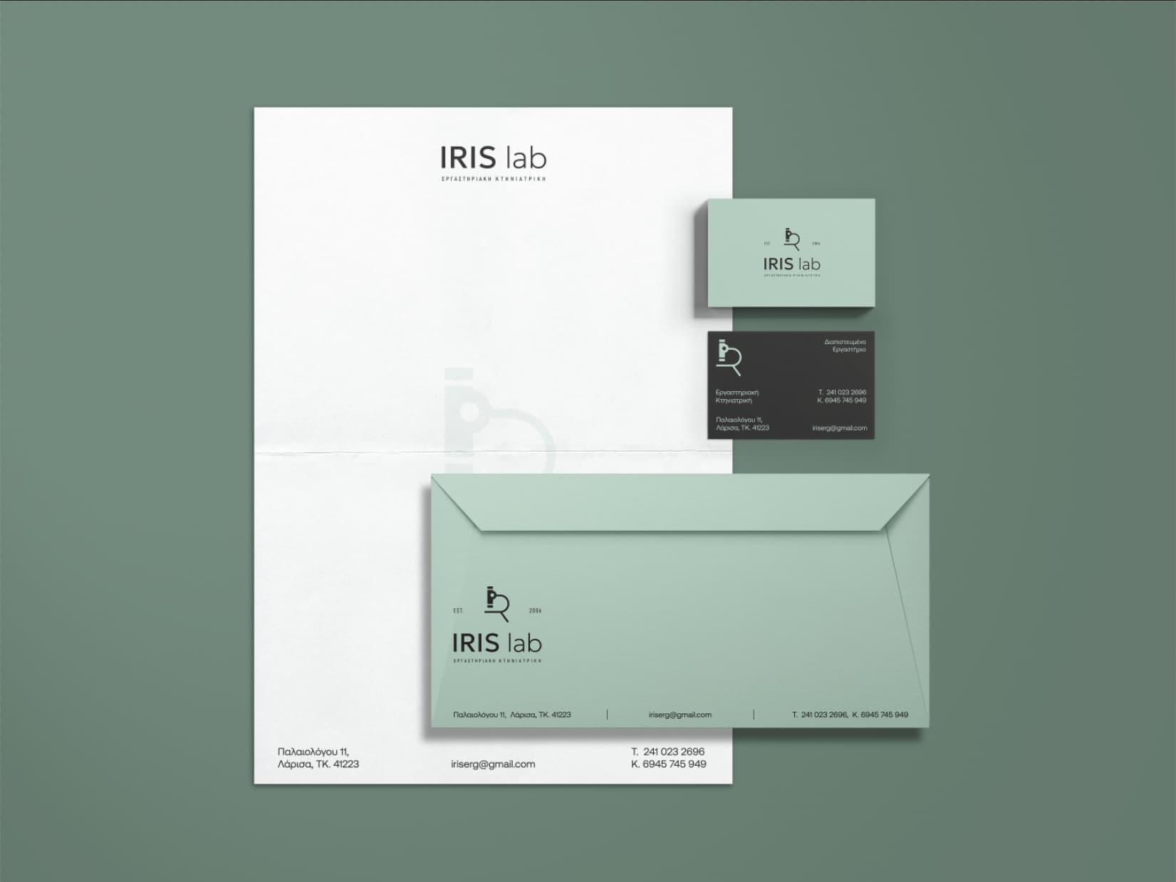
The existing business card that he designed by himself is this:
He wanted something modern, not very abstract, his clients are 30-50 yo, simple and literal somehow.
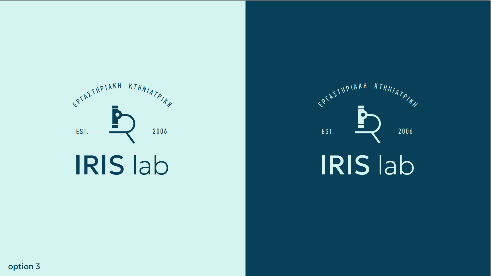
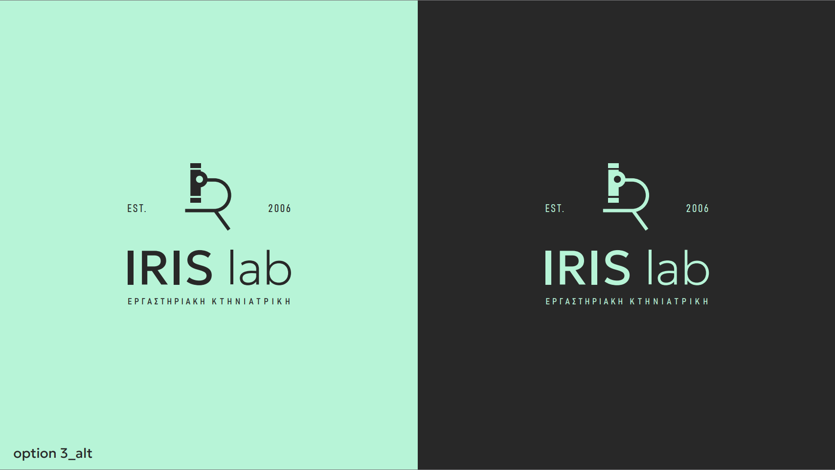
Also he mentioned the microscope quite often and that he wanted to implement a microscope or lab equipment in the logo. About colors he said “i have no idea, something modern?”
He didn’t like anything of it at all. Judging from the card he designed by himself, his taste is quite “difficult”.
The question is, if there is no possibility to convince him that these logos is an upgrade, should I bring my taste close to his? From my experience I know that clients that are not willing to pay a decent amount, are those that are the most difficult to please.
I offered to give him a moodboard to choose and discuss, maybe we can find a solution out of it.
Any other opinions how to handle this?
First of all - these are all really good - a great job, well done.
I searched for these icons, and they are similar but none I could find the same - so again well done for being unique. The amount of people that come here using stock images as logos is crazy.
Here’s a few snippets I took from what you posted - and my initial response.
And then a more thought out process below.
Your taste doesn’t come into the equation
No idea what the text is - and I can’t read the text so it doesn’t speak to what the company is.
Lots of logos don’t, Coke, Nike, Google, Adidas - but they are established brands with world wide recognition. Apple for example, they had a crappy logo at the start, but built a reputation on computers and then simplified it over time.
Yours is modern and abstract (to extents)
Not good. You shouldn’t undersell yourself.
This type of deal should come with very limited revisions and time spent.
50% upfront for unknown clients (non refundable)
Don’t give away your skills.
He runs a laboratory that charges fees for tests.
Would they do you a favour cos you’re a friend of their friend? Would they lower their fees for you?
---------------------------]
What other types of equipment do they use?
I know when I bring my dog for a urine test at the Vet - they require me to bring him outside and fill a cup with his pee.
And I’d imagine humans would associate filling a cup with Pee would also be the same for animals for testing.
Maybe it’s simpler than you think.
Here’s my more in-depth thoughts.
Understand the client and their vision. You’ve emphasised the microscope but it’s sub to the name of the lab or at least equal value - what I gather is they want the microscope to be the main image - and not modern. They want probably premodern maybe a more of a handdrawn feel.
Get moodboards and think of different design directions - show the client various styles/colours/approaches. Get them to tell you what they like/don’t like from the different moodboards.
Show other logos you have designed and the design process in them and why they work - it might help them understand your approach is actually good and open their eyes a little to a different approach.
I said earlier your style shouldn’t come into it. That’s not entirely true - you should of course compromise without compromising quality. It’s always a case of finding a middle ground - which usually means incorporating elements they like that you may not like.
And set your boundaries. It might be a low budget, but it’s not unlimited revisions and you should have this already agreed. You should be compensated fairly for your time.
If it’s not working - you can walk away - but hope you got 50% or some payment upfront - that’s usually what I would do if working with an unknown client.
It’s ok to tell them that it’s not realistic to be achieved in the budget and timeframe. It’s ok to say you need to charge more based on certain circumstances. It’s managing expectations.
Keep it professional, patient, and show your commitment to finding a solution that suits. But the budget is the budget and if they reach the budget amount and not willing to budge, then neither should you.
Thank you for you comments and your time constructing this long and informative answer!
No I don’t copy anything, I design. I might take some inspiration from other logos (as many do) but I always design from scratch.
What I should probably work on is my confidence because I let people/clients who have no idea to make me question my skills.
As for the “handdrawn feel” I asked about it beforehand and he said no, he doesn’t want something artistic. He wants something modern, not very abstract, with microscope or some lab equipment.
As for the tagline “ΕΡΓΑΣΤΗΡΙΑΚΗ ΚΤΗΝΙΑΤΡΙΚΗ” it means “veterinary laboratory” and it is given form him. He was very clear that he doesn’t want animals to be shown in his logo.
His girlfriend, who is an artist (painter) agreed with him that the logos are not good, but I told them that art and graphic design is two different things, with different approach and goals each.
Difficult clients are a nigthmare, and the fun fact is that they are who are not willing to pay.
Anyway moodboard is the way to go. And maybe I should clarify what modern is.
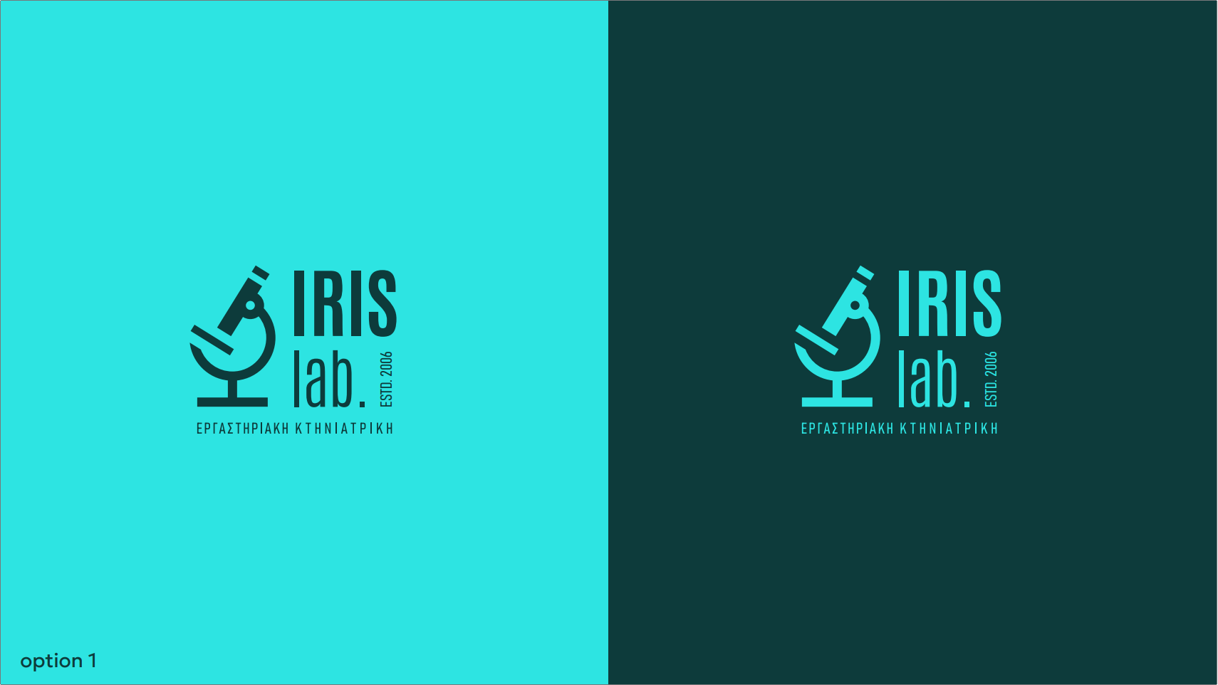
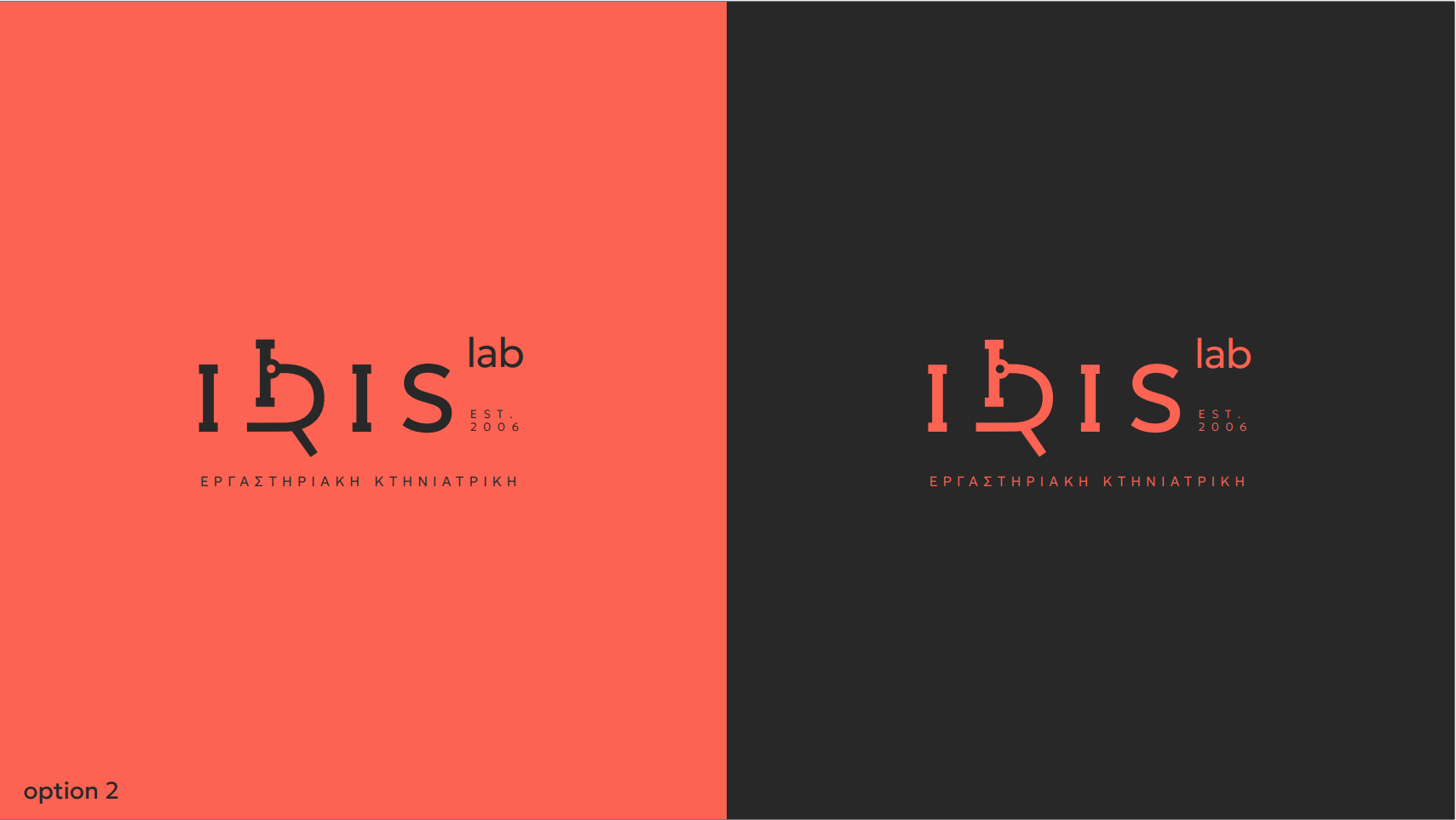
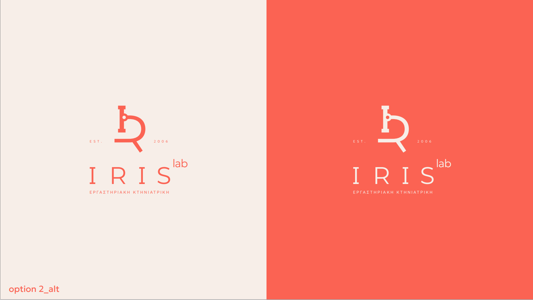
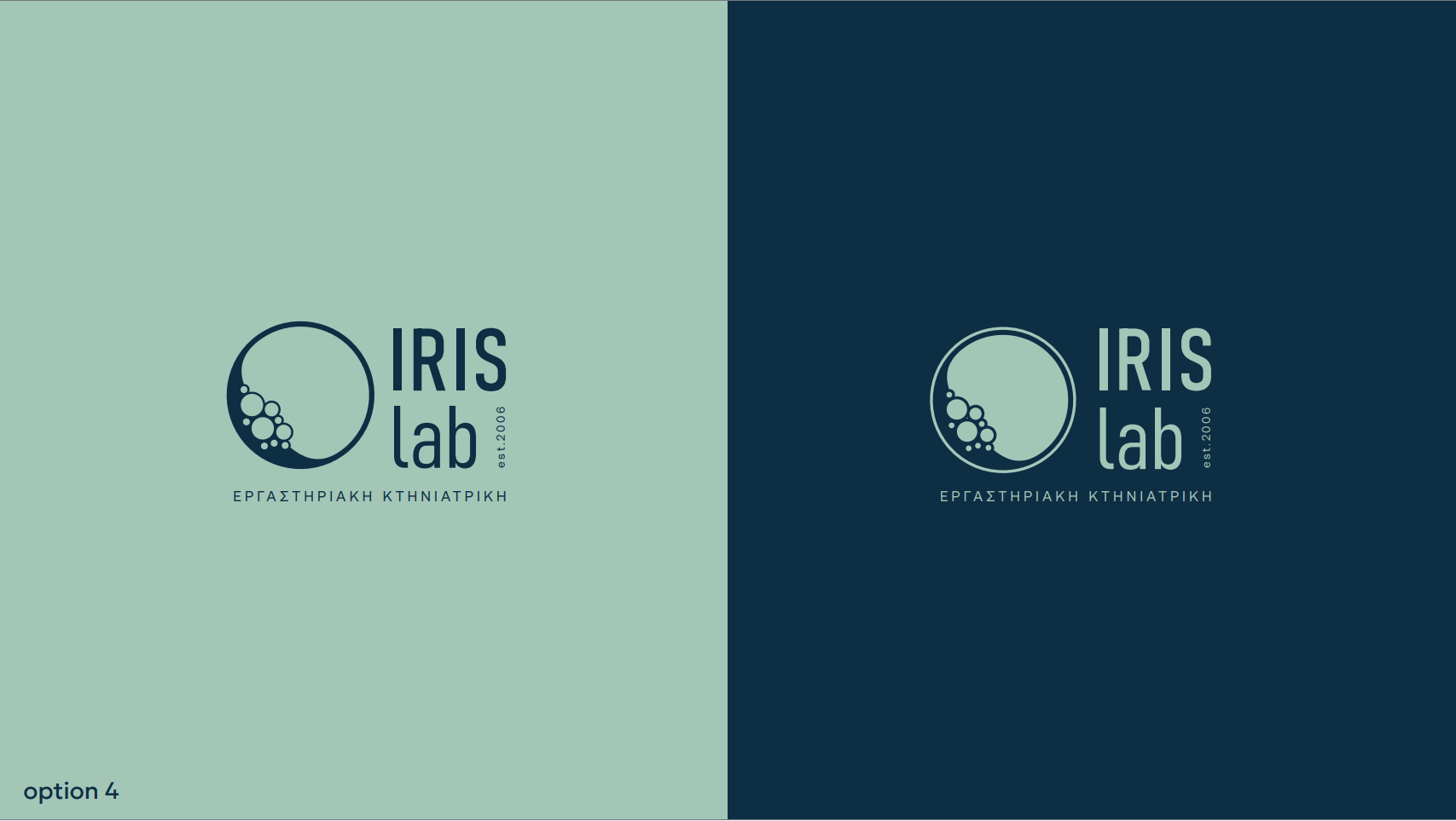
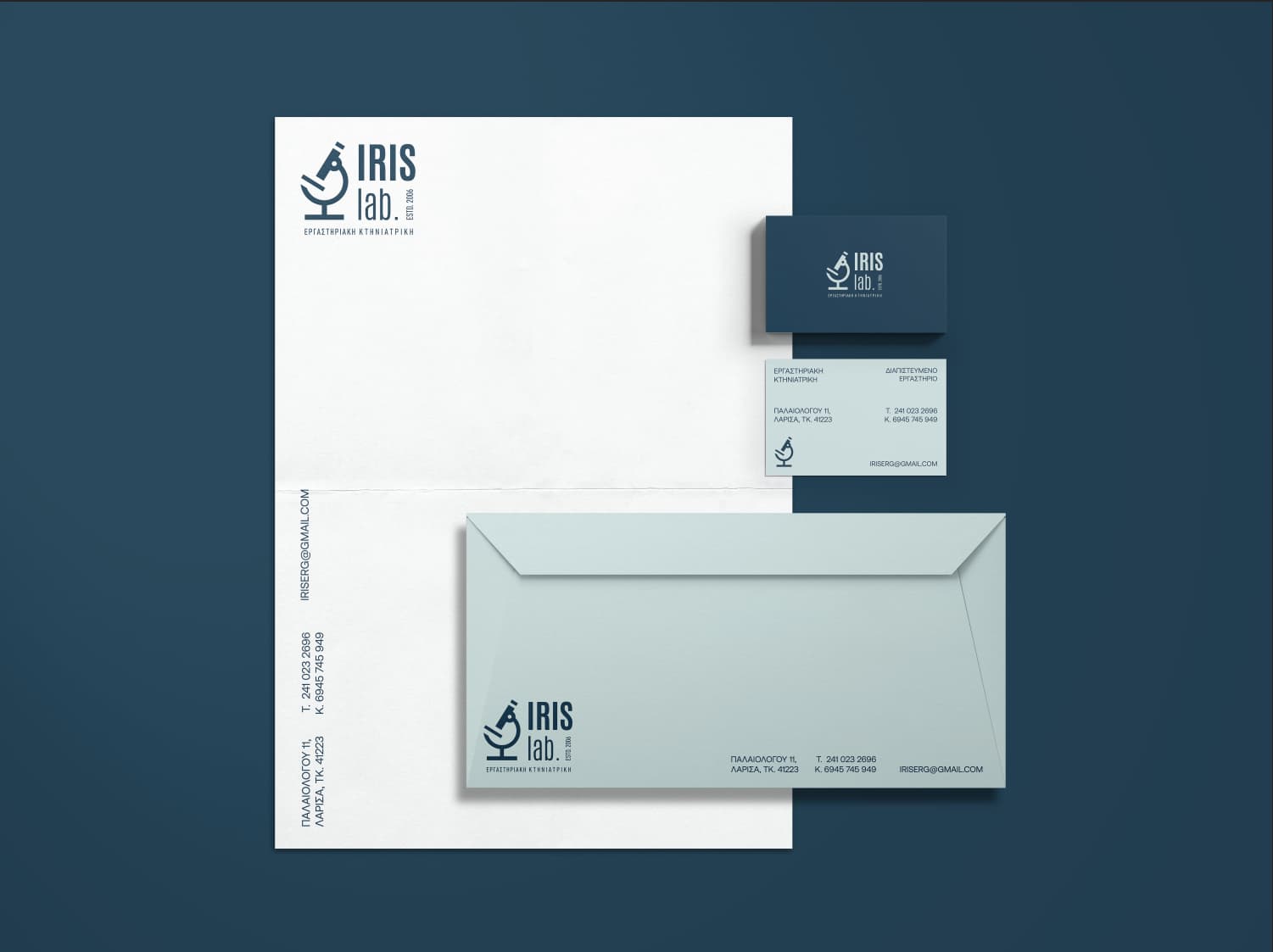
I would keep the microscope (other than option4) not only because it keeps something existing but also because it transports analysis instead of creation in option4.
The microscope which replaces the letter R is not as recognizable as such and the R is not really legible which leaves us with option 1.
I agree with @Smurf, so I won’t repeat what he already stated. Instead, I’ll add some of my own thoughts.
Long ago, during my university design classes, when I was learning to differentiate between good and not-so-good design, I remember realizing how much bad design existed everywhere I went. I remember thinking I would have a fantastic career as a designer since I could help fix all the ugliness and counterproductive design I saw.
After graduating and working in the field, I soon understood why so much bad design existed and that fixing it was more complex than I had anticipated.
I found that bad design exists for a variety of reasons. One of the most common is that those making the decisions like the bad design they use.
Let’s take your client’s business card, for example. It’s one of the worst business cards I’ve seen. Anyone using a business card like that is obviously visually tone-deaf. Worse still, this person doesn’t realize how it communicates negative messages to his customers, or he never would have used it.
He assumes he can make appropriate design evaluations based on his sense of what he likes and doesn’t like. He doesn’t understand good design or realize how his business card makes his company look amateurish and incompetent. He probably knows he could be better at design but also assumes he can spot good design when he sees it. However, he fails to recognize that he’s completely unable to do so.
You can’t fix this person’s deficiencies.
All you can do is recognize the symptoms, proceed cautiously, set up tight contractual parameters for working with people like this, and then walk away with the deposit when you reach an impasse.
I’ve worked with clients for over 40 years. I would have turned down this job. Anyone using a business card this awful will not understand why what I design for them will work better. I don’t need the aggravation and headaches associated with tone-deaf clients. In addition, I wouldn’t want to jeopardize the relationship I had with a friend who wanted me to help his friend.
For what it’s worth, I think your logo designs are heading in the right direction, even though your client can’t see it. I agree with @Joe that the first one is best. However, I’m unsure why you’ve made the typography so complicated and placed the period (or full stop) after the word lab. Even so, I like it. However, I probably wouldn’t have stylized the microscope to the degree you did. I’ve found that most people drawn to the hard sciences, which I assume this client is (a micro-biologist), don’t understand decisions made primarily for aesthetic reasons — they focus on realism and tend to dislike anything that strays from it.
What? Your dog will pee on command into a cup. How do you manage that?
You do nice work. It is crazy the client didn’t like any of the options, but there is no accounting for taste as they say. You might have to lick your wounds and give the client what they want with the side benefit of the original work being a nice piece for your portfolio.
which option looks like a rooster? I guess the first one?
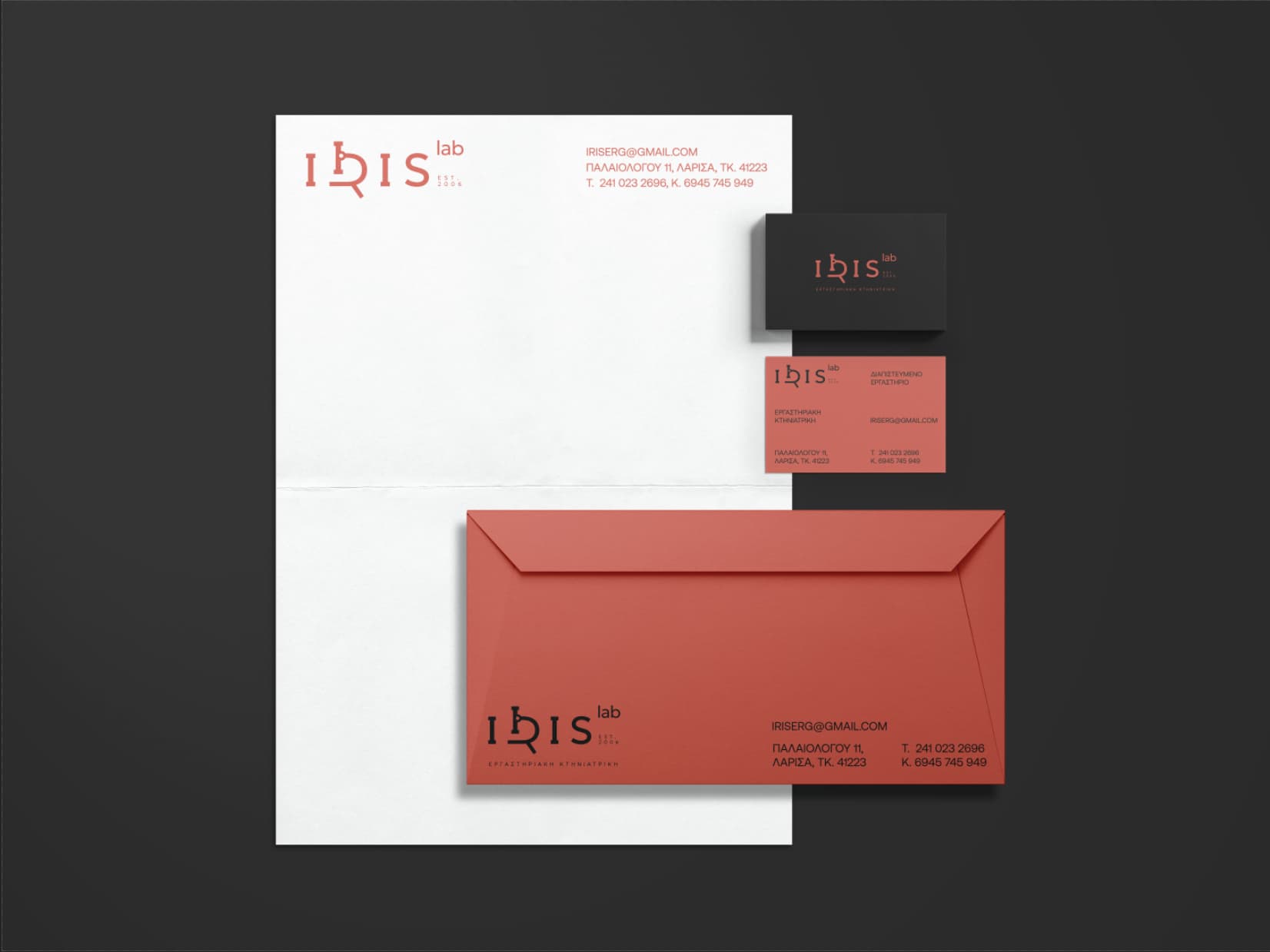
As for the client, its not about 50, its around 200 usd, including logo, business card, envelope, letterrhead.
I don’t want to dump him, he is a very good friend of my best friend, and I want to get paid for my time.
I m open to fix some things, like making the microscope more obvious.
But making 20 drafts to find a solution, it’s a no go for me, because I sense that he can’t be satisfied.
I like the last option the best — probably because it has the logo I think works best. The color schemes you’ve used on all of them are very nice. Have you checked to see if all these colors of paper stock are available?
Why is all the printing on the back of the envelope? Is that common in Greece?
About the colors of the envelope they are available (pretty close options, and I would probably adjust a bit the color to the color of the envelope). To be honest I don’t believe my client will procceed to something more than a business card.