Okay, I’m a bit shy as I’m doing this for the first time, but I would really appreciate some feedback on the logo for the project I’m currently working on
My client plans to open an online shop for fitness equipment in the UK market, my job is to create a brand identity system.
So I described target audience and distinguished the direction of what I want to achieve. Target market is ~25-40 year old active, brave, disciplined, goal-oriented men and women mainly from the UK.
They need to keep feeling motivated and encouraged in order to achieve their goals. In order to hit target audience, the brand needs to be motivating and encouraging. Just as important is being trustworthy and stylish enough to be able to grab attention. To create a sense of these qualities, we need the brand to look bold, fresh and modern.
I came with 3 concepts, but I want your opinion about the one, which I think hits the best.
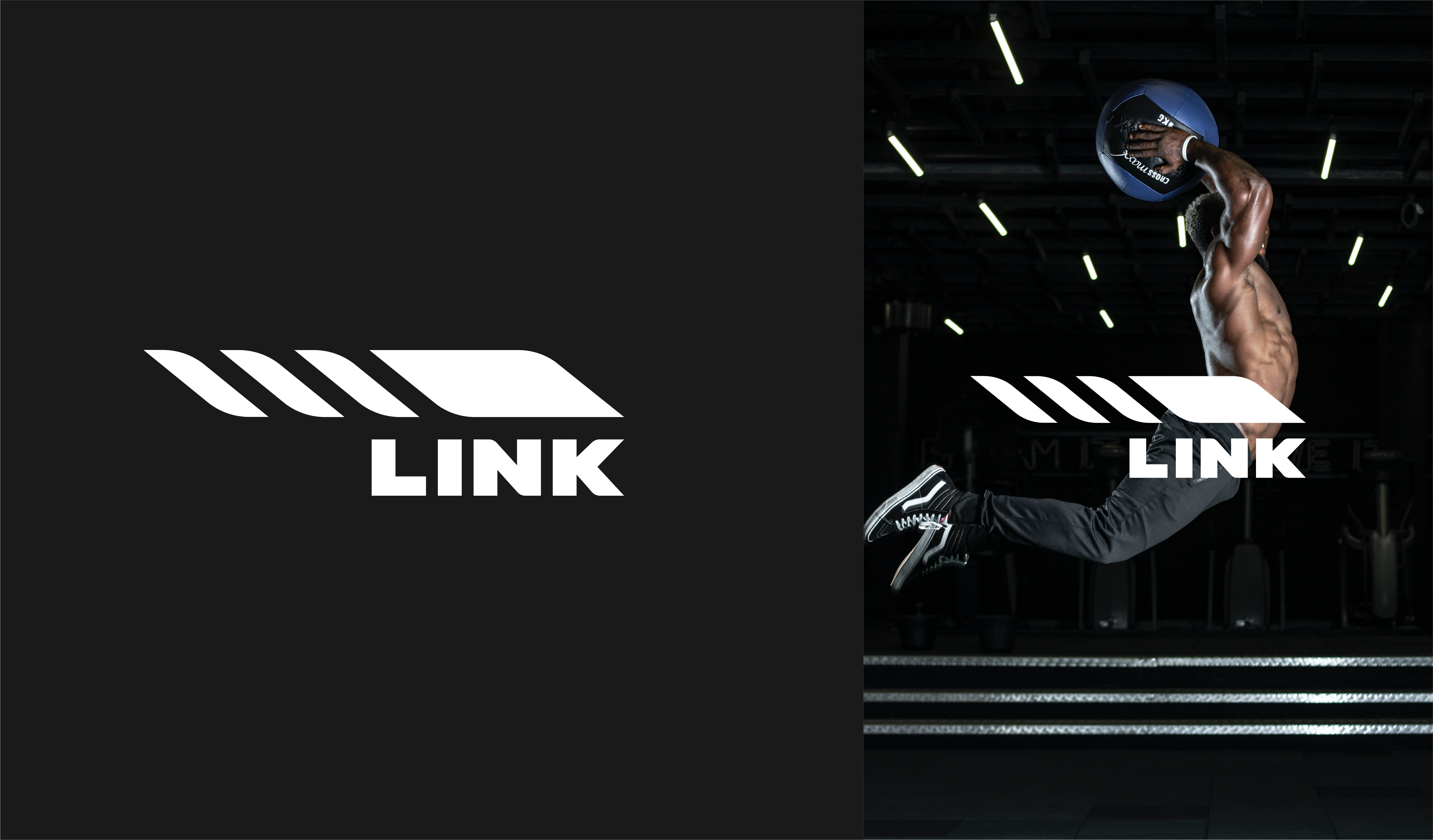
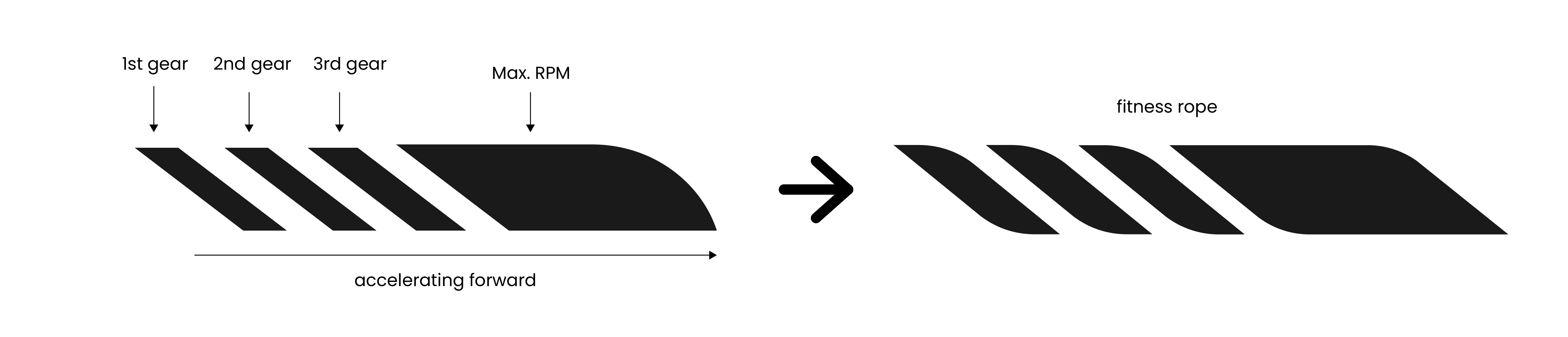
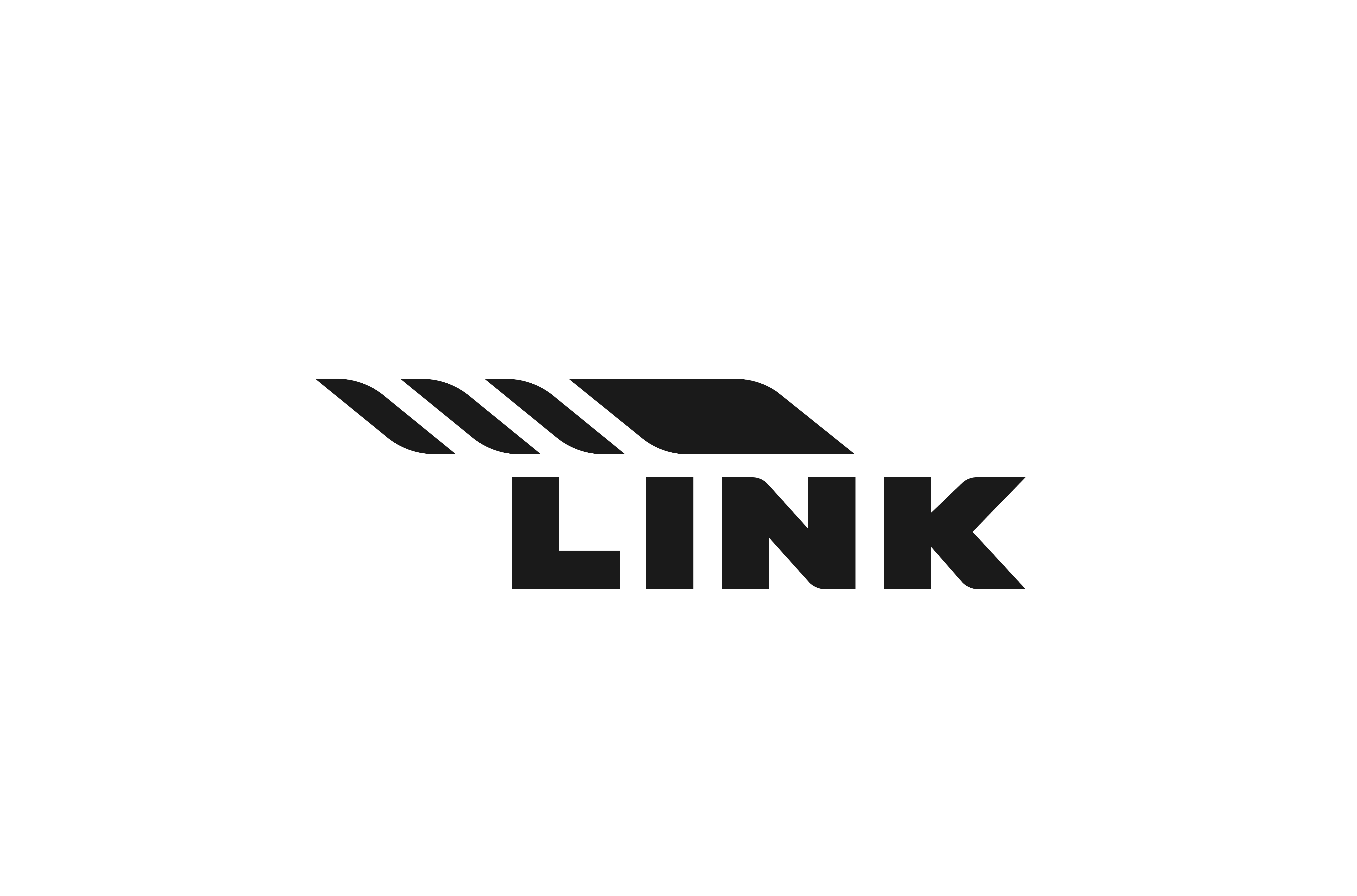
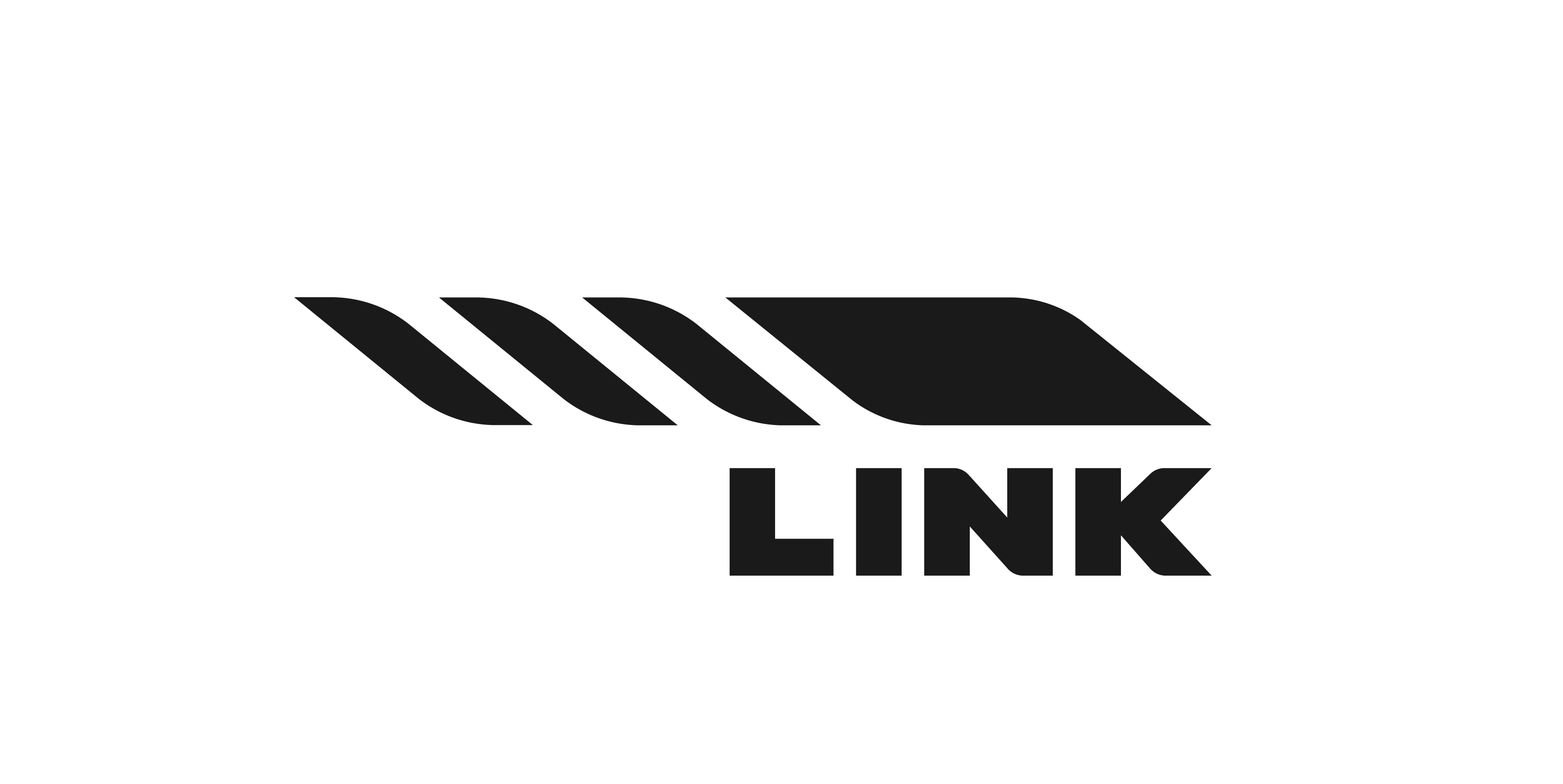
The logomark embodies speed, encouraging viewer to keep moving. After a certain number of adjustments, the initial idea of accelerating, which represents brand’s aim to motivate and encourage to take action, the latest result has taken a form of a shape of fitness rope.
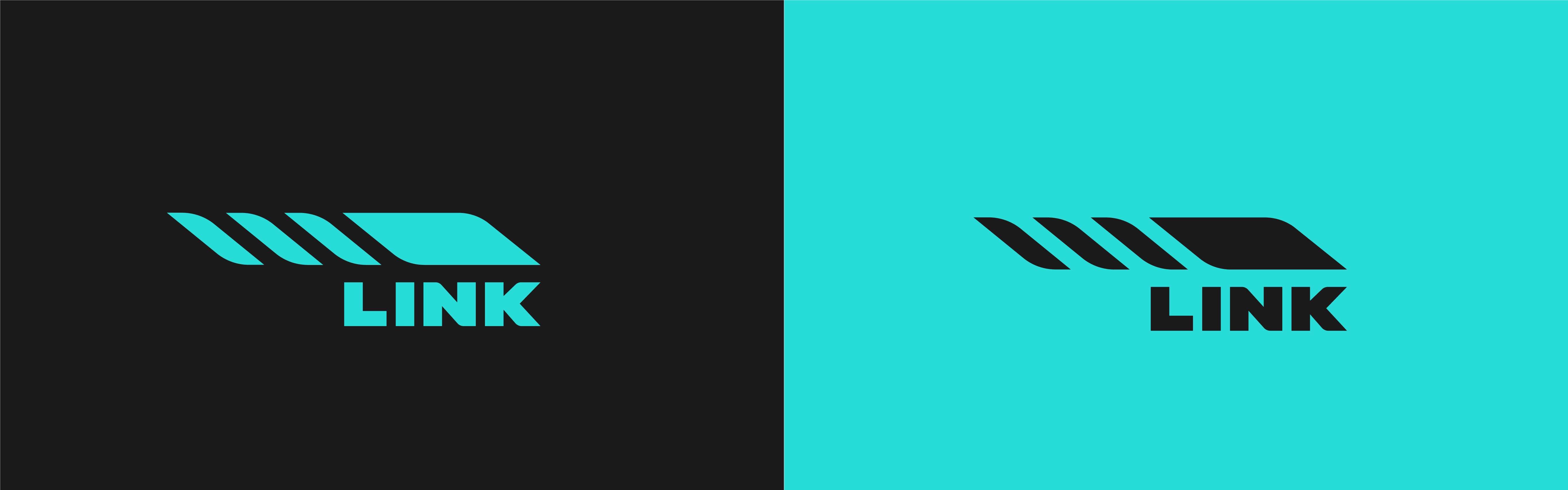
Provided turquise color promotes action, movement, attention, focus and concentration. Direct competitors the client showed mostly use red-orange colors. Although, it’s just a suggested color, not the final one.
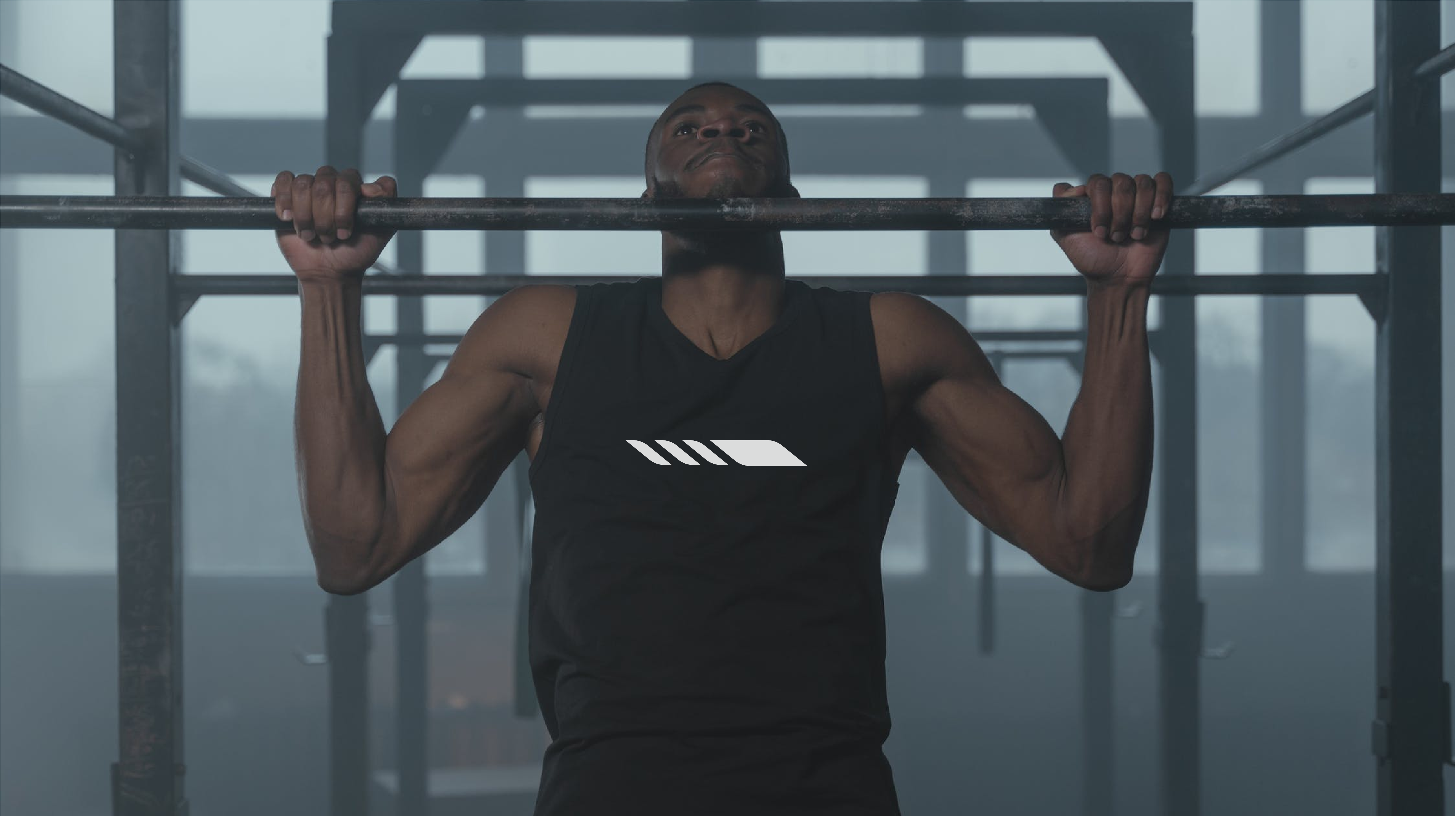
is the intention to show a guy who looks like he’s struggling to reach the chin-up bar?
If so, spot on.
Not enough contrast even with the black on the dark-ish turquoise. Kinda subdues the whole look.
If turquoise, even a lighter one is predominant in the clothing line, will it appeal to your entire demographic?
Until now, I had never heard of fitness ropes (I’m not a gym sort of person). Even so, the mark implies speed, tension, effort, movement, effort, etc. One might even interpret the diagonal segments in the logo as links.
Haha. I got this feeling about the photo too, but left it the way it is, as it is still good photo to represent logo on a t-shirt once, in an early project stage. But it is a good demonstration why not to use such ambiguous photos in cummunication, worth mentioning it in the brand book.
About the turquoise color - it will be used for physical assets too so I want to avoid color mismatch as much as possible, can’t make it brighter.
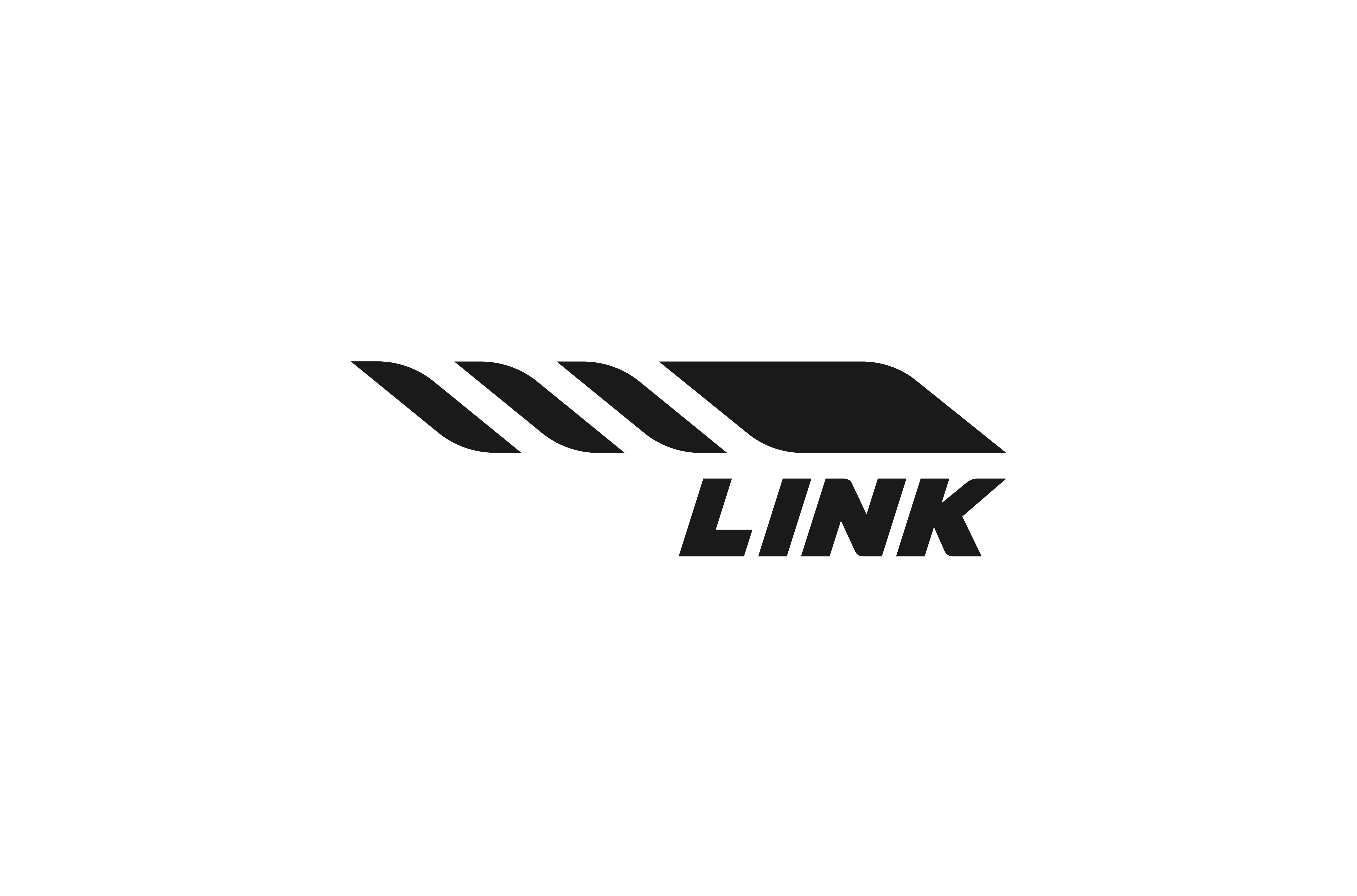
For apparel I wouldn’t recommend to use logo in turquoise, only b&w.
Yeah I liked it right away too. It’s strong and nicely executed.
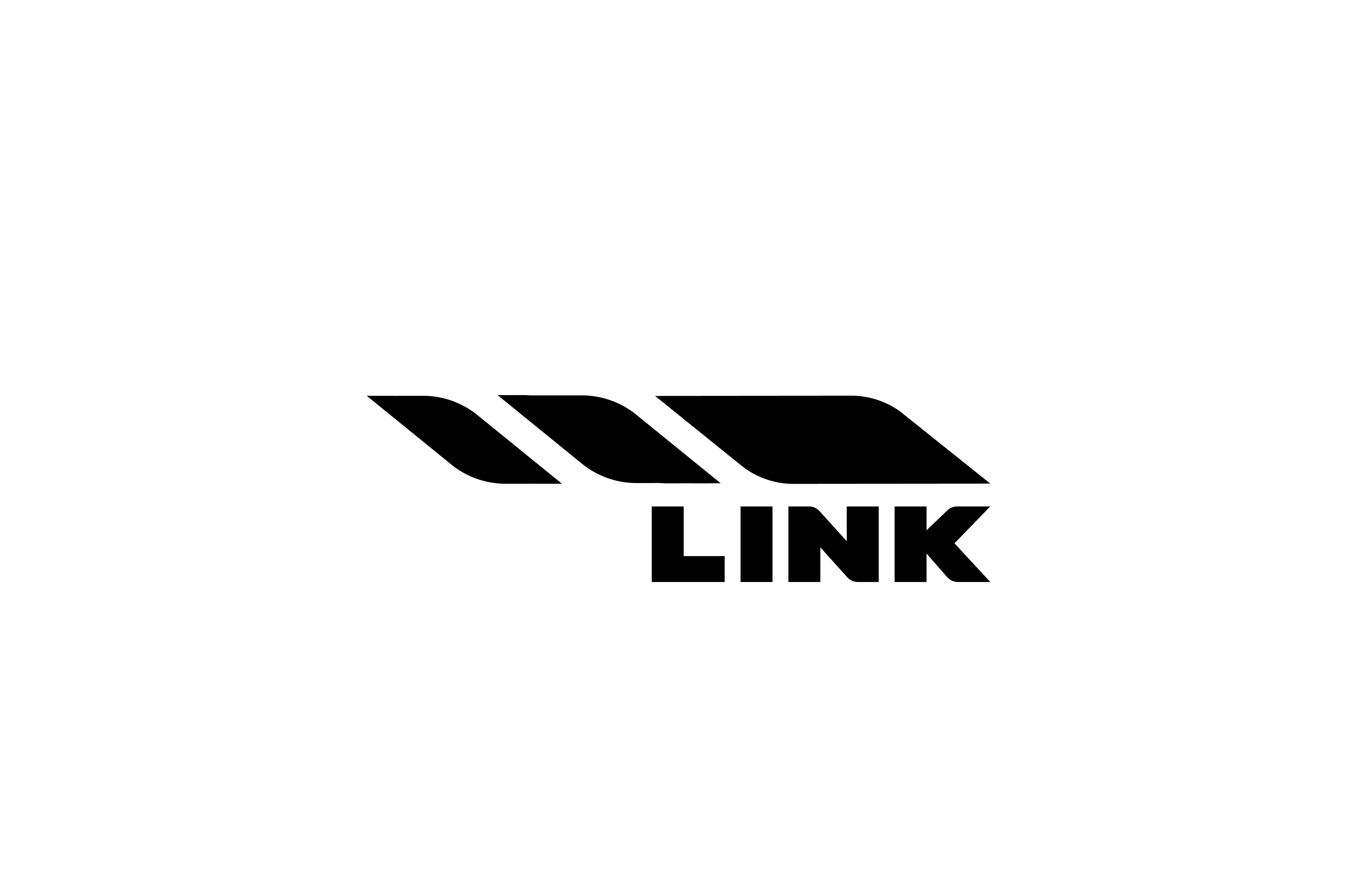
It works just fine the way it is, but if it were mine, I’d still be looking for other ways to make the type/graphic lockup tighter in some way. It may be possible to find a better structural relationship there, perhaps with the type on top, for instance, I don’t know.
Thanks. I’ve tried different typeface and different compositions, so far it’s the best what I’ve found. Looking forward to see what the client will say.
The only reservation I had was the one I think HotButton might be seeing. I didn’t mention it because of mixed feelings, not having a suggestion on how to fix it, and not being sure whether or not it’s even an issue.
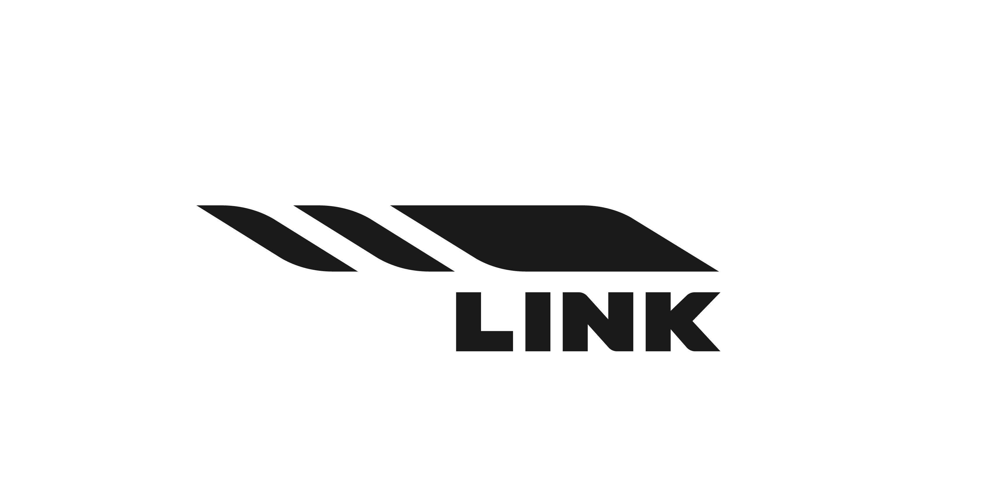
Here’s an explanation (which may or may not be what HotButton is seeing): the main mark (rope) has curves that suggest a twisting, tense, pulling motion, which is appropriate and really quite nice in that it’s so minimally implied, yet still there.
However, the typography lacks any curves and has none of those qualities. There’s also the matter of the geometric relationship between the primary mark and the wordmark. The wordmark is half as wide as the main mark, which is a nice relationship. However, there’s no obvious simple half, quarter, or third relationship between the three segments you’re calling gears and the solid portion of the logo.
Again, though, I don’t see these as big problems. On the other hand, subtly tweaking a letter or two in the wordmark to add a resonating curve or two might be doable, as long as those tweaks didn’t draw attention to themselves (the diagonal strokes in the N and K might lend themselves to this). You could also try repositioning the wordmark in some way, but I’m sure you’ve already exhausted those possibilities.
Anyway, I’m not sure any of this is a significant problem, but since HotButton mentioned something similar, I thought it might warrant a mention. Even as it is, though, I think it’s really a nice-looking and appropriate logo.
Looks fine, but we lost the rope There is an issue with a favicon, indeed. You can see the shape, but balance in the square frame is terrible. “LINK” works better in a favicon.
Also, I’m surprised of a difference between black and white logo. Black contains way bigger gaps between elements than white. Tbh I was sketching and editing the logo in white on grey surface (in Illustrator out of artboard boundaries).
My question: do you see that as a big issue? And if yes, how do i fix it? Perhaps making two versions of the logo to match it visually could work? But is it appropriate?
I particularly think there’s a disconnect between the icon and the text, ironic given the name.
It still looks like a battery not fully charged.
Someone else said it looks like a cigarette.
All valid points, and ignored in favor of responses that where favorable.
If you were selling just fitness ropes or classes including fitness ropes then great.
But this is more rounded in chin ups,in weights etc
I think you have lost sight of the goal. The client might be happy but if I were you I wouldn’t be happy with what you’ve produced.
The
You’ve unconsciously used another brand. You are not connecting text and icon, and the overall brand is rolled into one device,a rope.
Which you’ve given an I’ll conceived notion of 1st, 2nd, 3rd gear and maxrpm.
Car terminology.
No need for sorry, I appreciate the feedback.
But, I want to disagree. I don’t see nothing like Adidas here, except the fact about three (totally different) stripes, that are only a part of LINK logo, not the whole. The idea of Adidas stripes is also completely different. While creating this logo I was thinking about Nike as an inspiration (because of the tension Nike logo has and the movement it represents), but definately not Adidas.
I agree with the battery, but because of diagonal and curves it has, seems more like charging battery rather than not fully charged. And wouldn’t be bad.
Cigarette? My friend said it looks like a spermatozoon, but he does not reach the target audience. Unless I will hear more connotations like that, only the I will reconsider the whole idea.
A certain disconnection between the typeface and logomark is valid point - I will keep working on that.
About the statement that logo suitable only for selling ropes I totally disagree. It’s just a symbol, an accidentaly occured reference, you don’t need to fit the whole product catalog in the logo
You can disagree as much as you like, but you came here for advice and I’m telling you that logo is too alike Adidas logo, whether you agree or not.
And Adidas are notorious for suing everyone for using 3 stripes.
You see a charging battery - I see a draining battery - others will see a not fully charged battery.. whatever, it’s negative to some people.
That’s even worse.
No - you don’t need to fit the entire catalogue in the logo - that’s why nobody else is using fitness equipment as a logo.
Under Armour, Nike, Adidas, Torro, Le Croc, Lotto, prince, Babalat, arena, Asics, Skechers, Kangol, karimoor - and so on…
I think you’re a mile off what it should actually be. As I said if the client is happy with it then so be it.
But personally if this was my effort I’d be starting over and not showing this to a client.
Yes I came for advice but it’s hard to evaluate credibility of your statement, when I can’t find anything in common with Adidas. The same goes for cigarette and spermatozood. There was an example in other topic, when head of landing bird looked like a wing and it looked like bird flying up. So there was obvious confusion. In this case I see people having wide imagination. And it’s kinda good. More contraversy - more aweresness.
Your statement that other brands don’t show products in their logos doesn’t prove my logo not credible. It doesn’t look like a rope at a first glance. But in 5 seconds it start to become a rope, a cigarette, a spermatozood, adidas
I never would have associated this logo with the adidas logo. Despite the fact that @Smurf2 has.
I will say you could argue much in the same way about the Adidas logo. It looks like buildings falling over. It looks like fingers reaching out for help. It looks like a crosswalk. It looks like falling dominos. Which to me are also negative for a sports/athletic brand.
Could it be overanalyzed and over tweaked. Sure. But I think it actually works quite well. Simple, memorable. Works in one color.
It looks remarkably similar… how do you not see it?
Don’t come crying here when your client gets a cease and desist order and comes back to you about this.