I am making a logo for a client who wants to build a business where she uses her experience to help people and companies be the best version of themself. She does this through conversation and counseling.
It was important that the logo would appeal to businesses as well as normal everyday people.
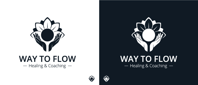
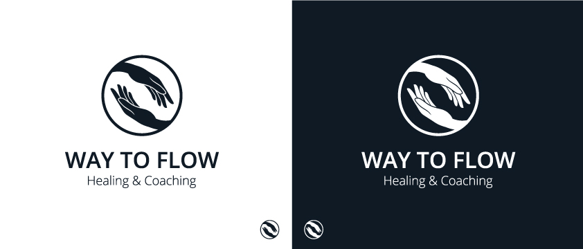
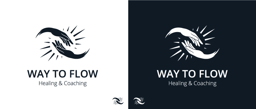
The name of her business is ''Way to flow" and we are still working with the text under it, so don’t look too much at that.
Some quick words that she gave me to work with:
Hands, sun, star, flower, plant, flow.
What do you all think? What can i do better? have i missed anything? are there something that you see that i dont?
also. which of the 3 do you think is best?
One thing to be aware of is that thin white lines will tend to fill in when printed or when reduced to smaller sizes. Dot gain (ink soaking in and spreading slightly) on uncoated paper will be especially problematic with those thin lines. Registration might also be an issue when reproduced in CMYK — get one of the colors just a fraction of a dot out of register and those fine, thin white lines will looked like you’ve colored it one of the process colors.
I like number 1 and 3 the best. 2 seems very generic like i’ve seen it before. In all of them you lose the thin details in the icons at small sizes and I don’t see hands anymore. Design 1 I don’t think it needs the lines where the tagline goes. Overall nice designs
Even your own use of the logo very small exposes their weaknesses. All definition gets lost and the hands just look like swooshes.
Also, watch your kerning. Needs a bit of work
I know you said not to look at the strapline, but if it (or similar) does stick, change the ampersand to ‘and’. An ampersand has specific uses and, generally speaking, is not an either/or substitute for the full word. Ironically had it been part of the main name (Way & Flow), that would have been an OK use.
The choice of font feels a little bit lazy. There are so many more beautiful, elegant sans-serif fonts out there than Open Sans. This just feels a bit first-choice from the drop-down menu and quite utility to me. Even the equally obvious Gill has a softer elegance than this and given the subject, something a bit more humanist might be better. Mr Eaves is also another more open, humanist sans.
Finally, although you say the name is a given, it just feels a bit cheesy to use a corny pun on a cliché. Just feels a little too ‘A cut above, hairdressers’ sort of name.
didn’t even know what Reiki was. but i see what you mean.
I have read up on it now and I dont think she would mind being associated with Reiki. But i wilI definitely remember to mention it to her.
Thanks!
I like these logos a lot! I would personally remember the 1st logos better because the bottom too seem like logos others have already done before. Either way, great stuff!