Concept : This is my first iteration of the logo for a local startup called “Rebait”.
Purpose or Goal : Rebait is a local business that finds both junk and treasures at the bottom of the local rivers and either recycles or repurposes them, selling products for less than half their origional price.
The logo needs to have the values present in the design: recycle, hooks, & underwater theme
Format : Intended for combination of digital and print ise.
Audience : The ideal customer is local to Eastern Washington, primarily the tricities area. Target age is 20-60+, for the fishing community.
Your Experience Level : I’m a beginning graphic designer, so I feel there’s much for me to learn.
Nature of Job: Family favor, probono addition to a design portfolio.
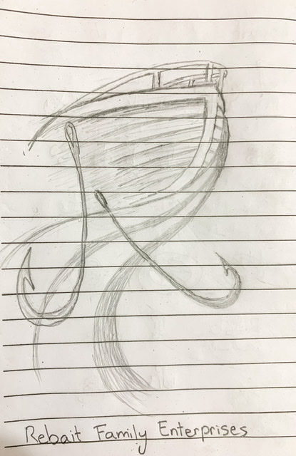
Do you have any sketches of your initial ideas? I’m asking because it looks like you just jumped right to the computer and are trying to figure it out as you go.
While I think hooks/anchors/etc. could work, I think those are some obvious choices that some quick sketches may help you get past. If you have no sketches, you should. It’s hugely beneficial to quickly coming up with ideas.
I’m having a little trouble imagining anything I’d want to buy that had sat underwater for any amount of time. Granted, magnet fishing can be fun but…
And ReBAIT suggests going fishin’, not recycled wet stuff.
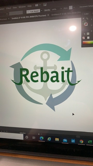
I think it’s a bit too complicated with too many ideas squeezed into the composition. The overlapping elements impair legibility. How would it work in just black and white (no grays). The fish hooks are a bit awkward in how they protrude from the letters in unnatural ways.
And as Craig mentioned, it looks as though you’ve just jumped into it on your computer rather than sketching out a few dozen concepts on paper where it’s easier to plow through multiple ideas without getting hung up on details.
I hate to be a downer, but to me, this one needs to go back to the drawing board. There might be an idea in there somewhere with the fish hooks, but you haven’t found it yet.
A logo just doesn’t need to represent everything the company does. It just needs to be memorable, look good and convey the right sense of being appropriate.
Thank you all for your feedback! You’re absolutely right @CraigB, I skipped the sketching step of brainstorming. I’m going to go back to the drawing board to allow more ideas to manifest. I’ll go for simpler logos as @Just-B pointed out, keeping black and white in mind as unlayered 2D design.
Imagine going metal detecting underwater. They’ve found lures and hooks worth $50-70 on the market, anchors from modern boats, old coins, and even intact fishing poles and they all clean up rather well.
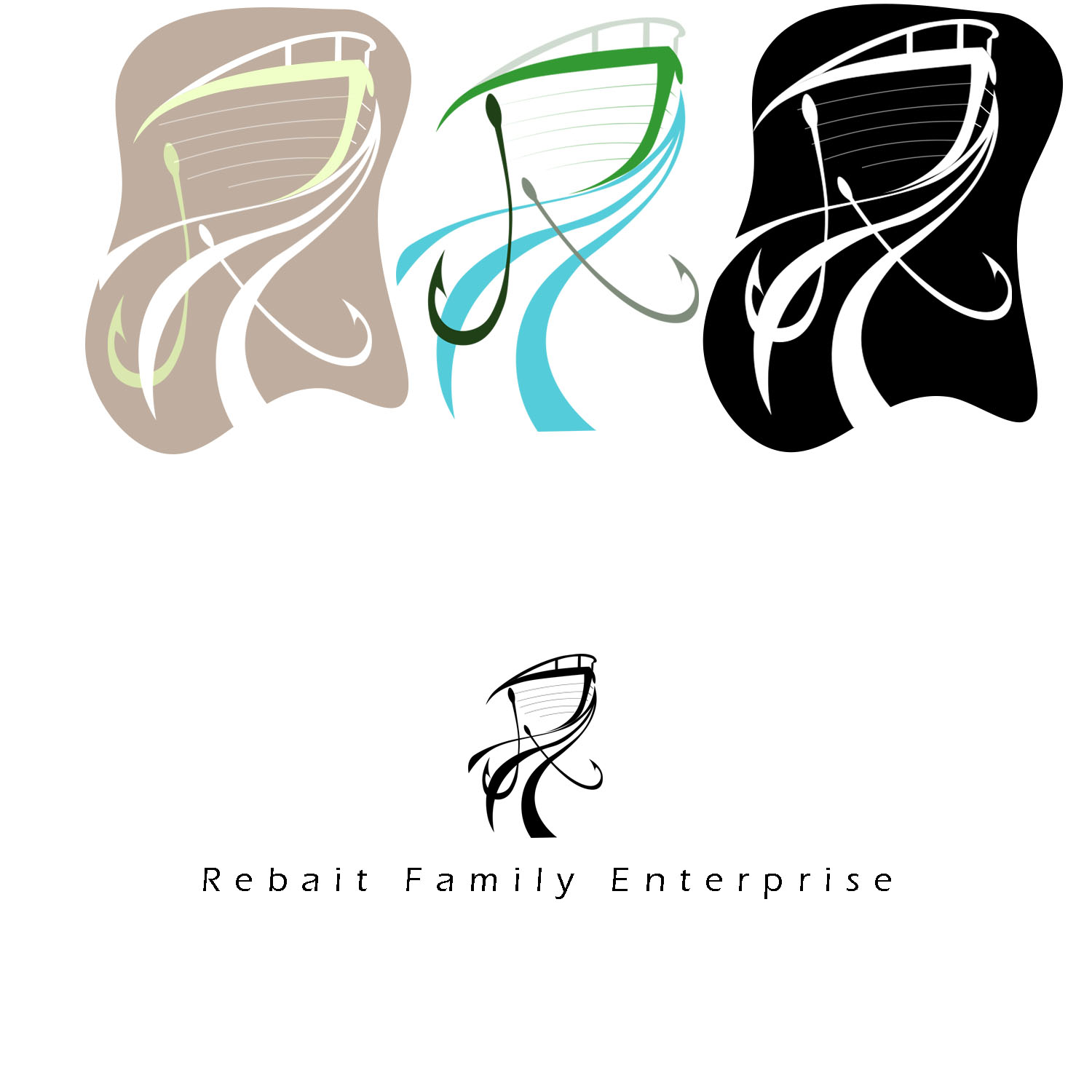
I can see where you are going with the R. I personally might come down a bit with the wave though. At first I thought you are working something new like a salon. All I saw was a head with a swish of hair. After my eyes focused I then saw the boat and lures etc.
I agree with RKK. Definitely far more, ‘because she’s worth it’ than small scale marine salvage. Practically, some of those lines will never reproduce at small sizes. Far too over-complicated.
Also, that name is off-putting. It tells you nothing about the company. What does family enterprises mean? All it tells you is that it’s a small, family-run business, but it doesn’t tell you what they do.
Focus on exacactly what they do and, I’m afraid, I’d go back to the drawing board.
Yes, and this logo has classic symptoms of amateur approach. A typical mistake is jamming every idea you have into one graphic, with a visual stunt for each one. It never works. Consider this: The very best logo designs cleverly present ONE metaphor, and all other good and viable logo designs (most logos), present ZERO. It’s not a rule that your design has to be a circus performer, or symbolize every aspect of the business. You’ll be very, very fortunate to conceive and execute ONE metaphor effectively. The very moment your work involves efforts to pull off more than ONE, you’re off track and destined for a sub-pro, amateur-looking result.
Thank you everyone for all the constructive feedback!!! I can’t tell you how much more I’m learning from you guys.
Iteration number three after more sketching and typography research: (I would show my sketches, but they are not anything to write home about; I sketch quickly and messily)
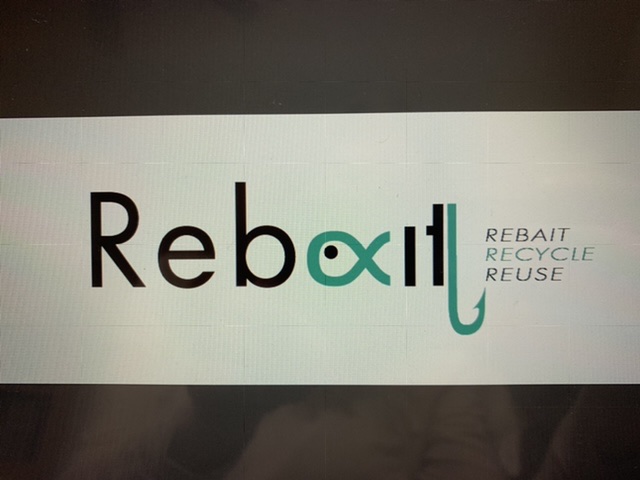
Just taking your last idea (which I’m not sure is the best idea possible), I think you’re using the wrong typeface. Instead of Futura (I think), which has geometrically flavored Art Deco overtones that seem somewhat opposed to things pulled from the bottom of a lake or river, I’d choose a different typeface — perhaps something a bit more traditional like Baskerville Semi-bold or similar. A slab serif might also work.
I’d resist the temptation to crowd too many ideas into the logo, which has been mentioned before but that you seem insistent on doing. The fish just isn’t working — it makes a weird-shaped critter and introduces an x into the word where the caudal fin intersects with the body.
Making a hook out of the t might work, but for some reason, you’ve doubled the stroke on the t instead of just allowing the t itself to be the hook.
The kerning in your type is way, way, way off. You really should pay a great deal more attention to how the letters are spaced and making that spacing look uniform.
Even though your swirling water logo had some compositional flaws and was, again, cramming too many ideas into one composition, I really did like the lyrical nature of it all. Your latest logo seems to be a complete departure from that, which isn’t necessarily bad, but you’ve sort of thrown the baby out with the bath water.
Rebaxit?
Ok, I think I figured out this place sells reclaimed fishing tackle and boat parts and maybe even sunglasses. Like I said magnet fishing can be fun sometimes. Just like going for a swim in the stump dump down at the lake when the water is low, with a snorkel and face mask…and a pair of pliers So you are trying to appeal to fishermen and the like to come buy this “junk?”
Think more like one. Silly x-fish and fish hooks isn’t the draw here. You were probably more on target with the boat idea.