Actually, it’s a banner for https://logousb.com/ Maybe I should change colors or font..
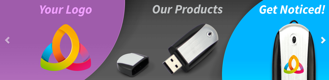
The concept isn’t terrible, but the execution could use some work. The 3 sections don’t balance well optically. The left, “Your Logo” section looks too large.
More importantly though, IMO, is the false advertising this constitutes. No process I’ve ever seen for printing on objects could reproduce that logo as depicted. The heavily saturated RGB and gradient colors are very likely a misrepresentation of what’s actually possible.
Even all that notwithstanding, the logo itself, while flashy and eye-catching, isn’t pleasing to the eye or relate-able, nor does it improve the appearance of the object, or fit harmoniously on its shape. The background color you’ve chosen for the “Your Logo” section doesn’t do it any favors either.
It’s not necessarily a simple task, but I’d try to come up with a logo example that’s closer to real-world and looks more realistic and complimentary when superimposed on the product.
Like HotButton said, the concept isn’t bad. I’ll even go one step further and say that I like it.
However, HotButton totally nailed the imperfections, so I won’t repeat what he said.
In addition, the name of the company isn’t mentioned anywhere in the ad. Maybe this is intentional, but it’s an awfully large departure from the norm to advertise a product or service without attaching a name to it.
Ok, thank you, guy. I’ll try to make another logo as you recommend!
The sample logo you’ve chosen is a commonly used Celtic imagery as well as a Christian symbol for the Trinity. I’m not saying there is anything wrong with using it as your sample logo, I’m just pointing that out.
Are you actually able to print that logo to look like that mockup?
My new pet peeve is that any designer who designs a logo with a gradient should also create a version that has those gradient bleeds pulled and a die line placed. If you can’t do it, don’t tell your printer/sign guy to do it.
Then you just have to hope the cutter hits those reverses dead on…