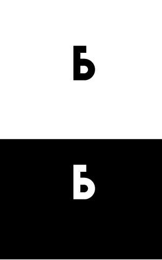
Have been fixing up some logos I made during the 50 logo challenge over lockdown.
Concept: The “b” is supposed to be similar to a music note Purpose or Goal: Scalable logo for a music streaming app called “Bass Music” My Experience Level: Hobbiest Nature of Job: Practice
People familiar with musical notation might see a structural problem. An upright stem always originates from the right side of the head. If the stem points downward from the head, it always originates from the left side.
In other words, lowercase d’s and p’s are similar to musical notes, but b’s and q’s are backwards.
For those unfamiliar with musical notation, this might seem like a minor issue where artistic license overrules convention. But for those who read music, it might look like a mistake in the same sense that a backward letter would look wrong.
Aside from that, I like it. I don’t think it’s too simple, like you suggested. The way you’ve presented it is simple, but in actual use, that simplicity would help make it more legible against whatever might be surrounding it or behind it. When used as an app icon, the mark itself or its background could be dressed up a bit, but as the basic logo, simple is good.
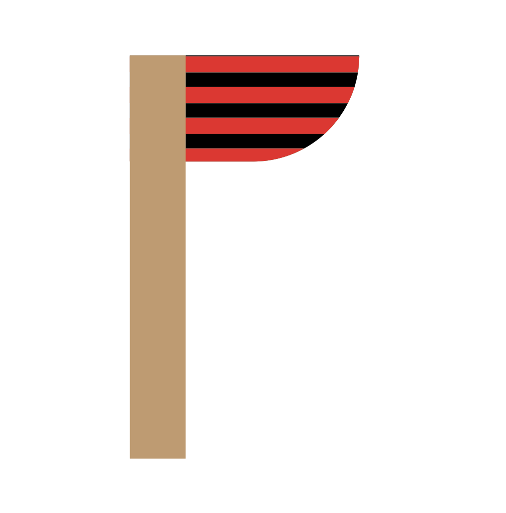
To add on top of what Just B had to say if you do keep the flag at the top I think it may be a cool option to try curving the outside bottom corner of wherever the flag ends up.
I included an example of what I mean, however, due to the community rules I changed the colors to show mine is a flag haha!