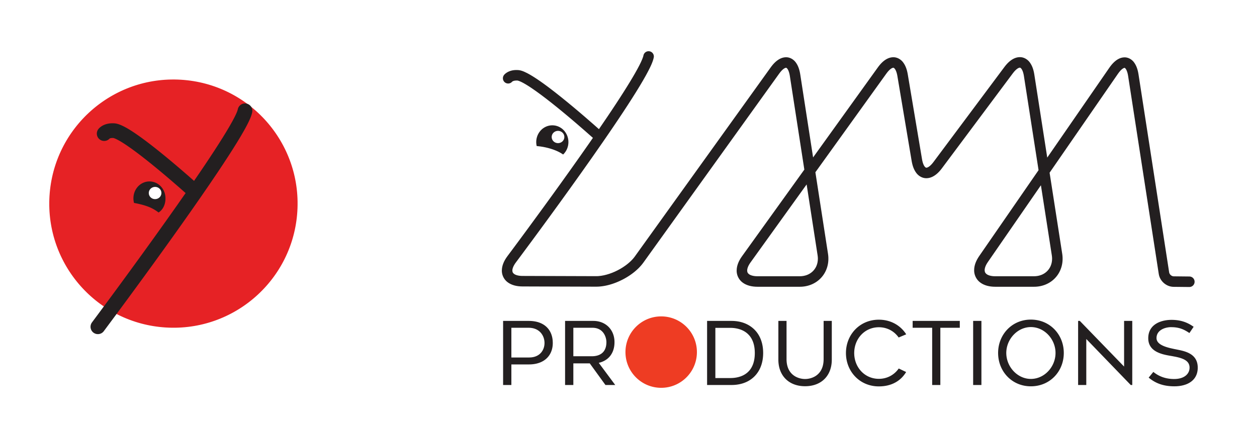
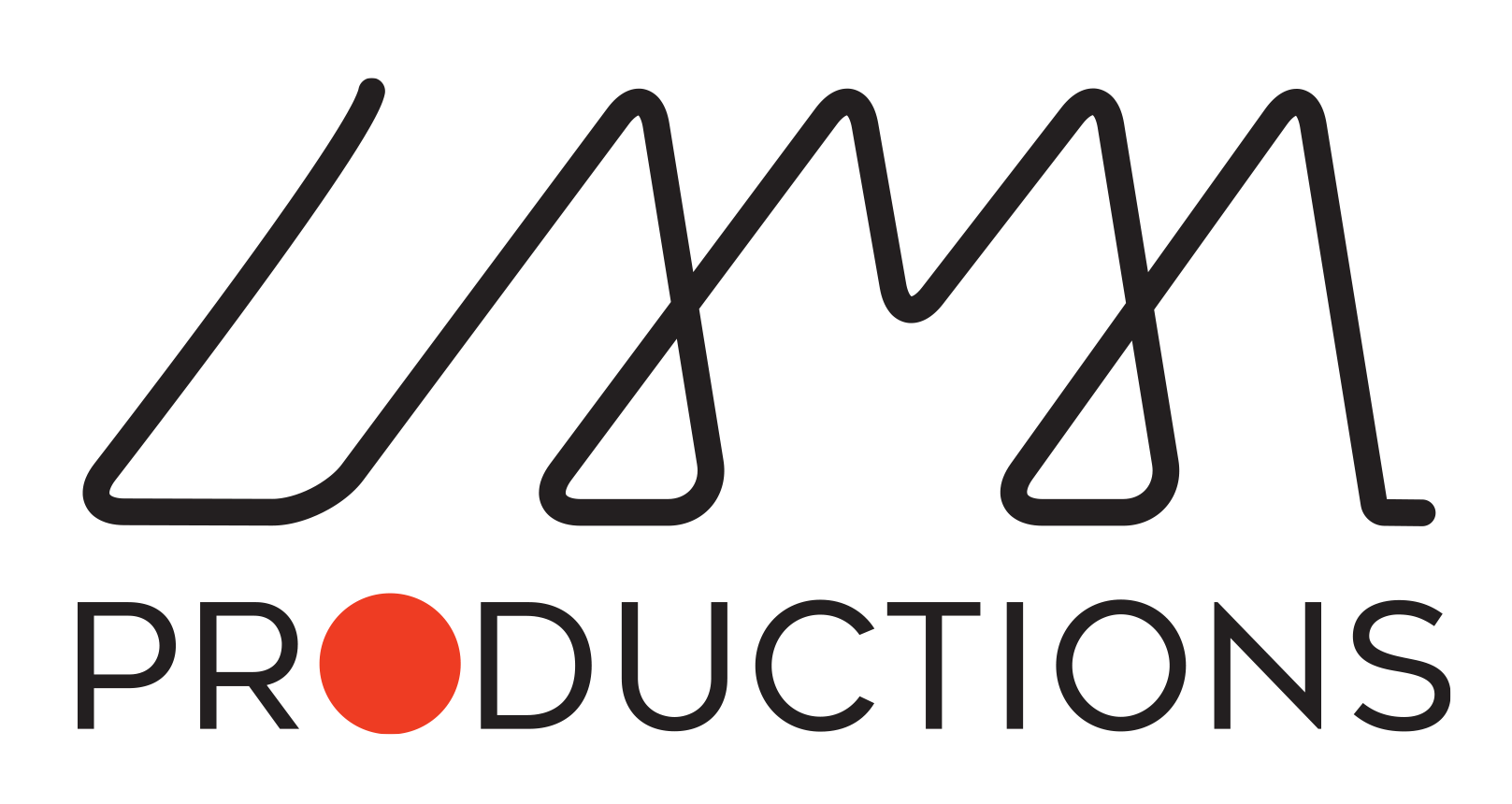
this is the logo that I’m trying to create for my new Film/Video Production company Lama Productions. We are doing a bit of everything at the moment, from corporate jobs, short documentaries and music videos, mostly for online content.
I’m not a graphic artist and although I use many programmes in CC professionally I only have a basic understanding of InDesign (that I’ve used for this logo).
The name La-Ma comes from the initial of the two founders and as there is an assonance to llama I thought it would be nice to have a llama in our logo but… the jury is out, really not sure about that, so your comments would be appreciated. Also, I’m not aiming for cute or funny with the llama and I’m afraid it reduces readability, but without it the logo might be too plain. The red dot is a hint to the rec button.
The llama on the red dot would be an icon type reduction of the main logo, left and right are two separate logos.
The logo would be used mainly on our website, at the end of videos and on business cards.
Your wordmark is totally illegible.
It doesn’t help that it starts with a Y (is llama pronounced yama, I’ve always wondered?)
I get the llama head, but llamas don’t have humps.
The red dot llama is difficult to suss out without the wordmark.
If the name is LaMa, you may want to spell it that way. Otherwise it comes off as a mispelling.
InDesign, while serviceable, isn’t the right tool for logo creation - and in fact can introduce production oddities to files (not in your particular case, those oddities are related to gradients and transparencies.) Illustrator would be a better choice.
Sorry mate, Printdriver is totally right - unfortunately this logotype is illegible. I never would have known that it said “Lama” without someone telling me.
If this logo is important to you, perhaps it might be best to get someone who specializes in branding to design it for you?
Unfortunately, your design is plagued by problems such as a partly illegible wordmark, thin lines and a general unsuitability for the intended use (as a logo).
Good logos look like this:
The best piece of advice i can give you is to hire someone who knows how to design a logo that will serve you well.
Thanks for your comment (and for the following ones reinforcing yours): do you think that getting rid of the llama head would make for a better design/improve readability?
No. Beside the first character looking nothing like L, those loop-back’s between the A’s and the M instantly read as lowercase y’s with a lowercase v in between, fouling any chance of a successful read.
One of the big differences between design experience and inexperience is the ability to identify and abandon a concept that won’t work. Typically, the amateur will harbor an emotional attachment to their weak idea and spend more time and effort than it’s worth, trying to force it to work. To make your brand strong, you’ll have to give up on this scribble only you can read and set its name in real type. That’s just the reality.
I would not have looked at the first logo you posted and read it as “lama.” Unfortunately, I can’t give you an unbiased opinion on the legibility of the second logo since I already know what it’s supposed to say at this point. I would strongly recommend that you show a broad sample of people just the “lama” type and see if they can read it with no clues. This should be a telling exercise. My suspicion is that it won’t be legible.
Aside from that, the relation of lama to productions seems very static and the red O is throwing the balance off – even though I get why you did it.
I’ll be blunt because your business needs professional-quality visual branding if you expect to convey those qualities through your branding.
There’s little point in me suggesting improvements or explaining what’s wrong with them. They are so fundamentally flawed that all I can suggest is scrapping them and, as @Jakub_Trybowski recommended, hiring a professional to design them for you.
I think the poster is attached to this particular design, because it is for their own business therefore they are not treating it like somebody else’s brief. You can ask them to move on from it and discard it but what is the point, if the point is to give constructive feedback here.
@teolives maybe you could seperate the letters entirely to have it read more legible instead of having them joined. I think you could have introduced a llama to the design, but not as you have it here, as it was confusing and hard to read. Play around a little longer with your characters and see if you can figure out something a bit more refined.