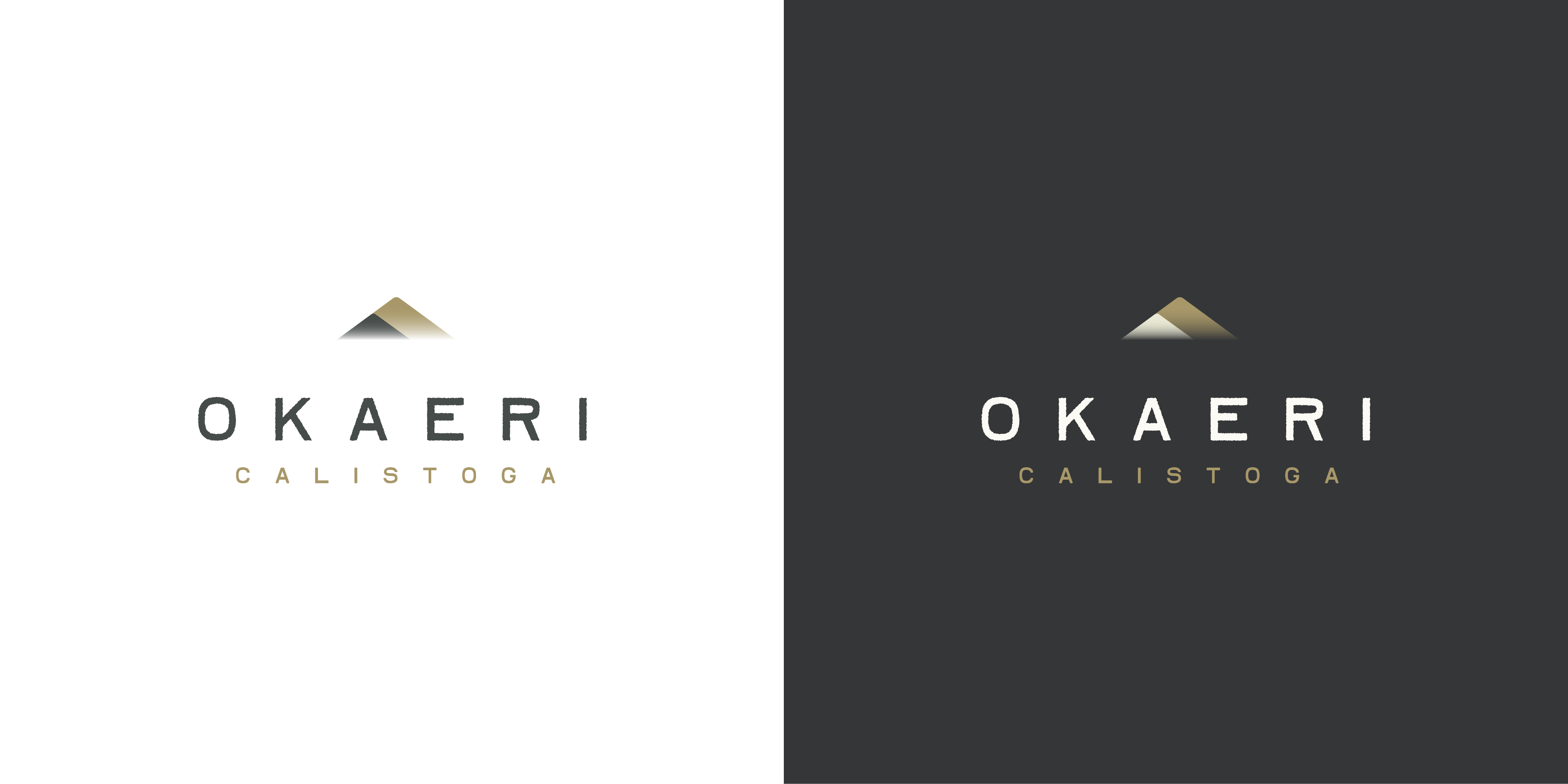
I’m currently working on branding for a bed and breakfast in Napa Valley catering mostly to older, educated professionals. The logo features two superimposed triangles to represent the roofline of the building and the mountains of Napa Valley. The type is open and clean to create a sense of quiet and relaxation. As the inn has a mix of Western and Japanese elements, the logo is heavily inspired by contemporary Japanese graphic design without relying on cliches.
I am old. I’m having a hard time reading the second line. The two gradient triangles might look okay sitting on a blank background, but how will they look if the logo sits on a colour (or dark) background?
At any rate, gradients in a logo do not always work well. Seldom, really.
To me the feel is off for a b&b. It says high-end luxury watch than it does, ‘Come stay with us relax and let us take your stress away’ – by spending huge amounts of money you earn to built that stress up.
Also, as eriskay says, I’d lose the gradient. They always look gratuitous. If something is not needed, get rid. If it is not serving a purpose, what’s the point?
I like how clean and minimal it is, the loose tracking makes it feel very luxurious and your choice of typeface is unique enough to add some character.
If you wanted a bit of criticism, the only thing I would say is that the bronze color doesn’t suggest food to me (I think it would suit a white wine though), but feel free to disregard this , I think you did really well
Without overthinking it (as you already would have, I trust), I think it’s quite nice, especially the reverse version. I like the font choice. Of course I have no way of gauging the character of the B & B, but if it’s generally an upscale setting, this can work, provided the surrounding messaging is effective.
If, conversely, I were to overthink it some, I might suggest a tighter lockup and some adjustments to relative proportions, but it’s yours to fine tune.
When I click on the larger version the word OKAERI has rough edges, which I believe is unnecessary. Especially since at smaller sizes it isn’t very perceptible. The only other thing I would consider looking at is that it looks as if the two overlapping triangle shapes gradients are not equal. What I mean by that is that the larger triangles gradient ends just barely above where the smaller triangle’s gradient ends. That also seems unnecessary.
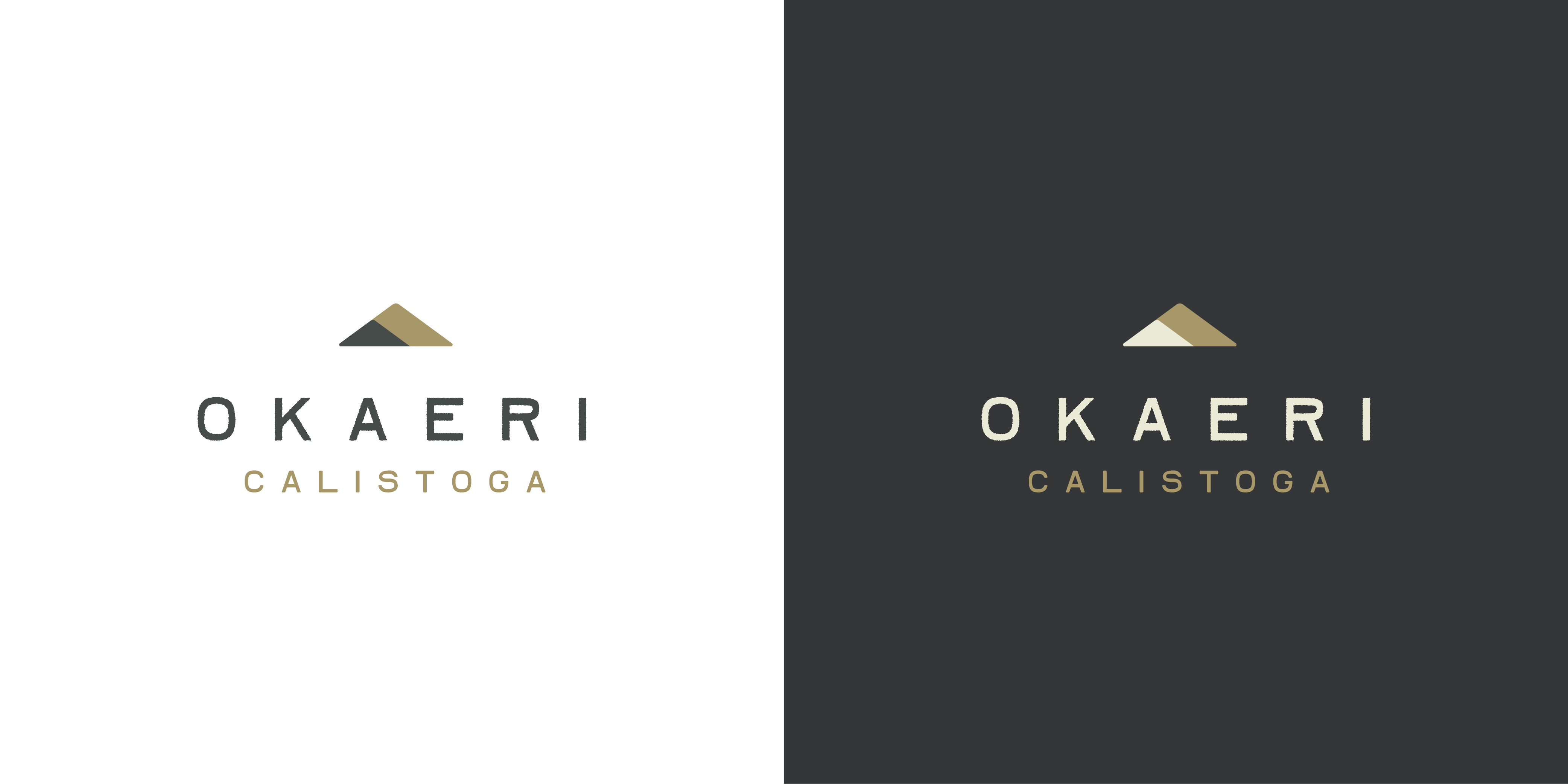
I would also add that the triangles seem perhaps a little far from the text. I might look at moving them to be closer to the word OKAERI where the distance between OKAERI and the triangles matches the height of the word OKAERI.
I find the minimalistic look really appealing, it gives a nice clean aesthetic that really strikes well with goal of making this a mixture between western and eastern aesthetics. Overall I think you nailed it.
Thanks everyone for the kind words and critique! I’ll address most of your points here:
The gradient reflects the morning fog on the valley floor, but I’ve been wary of it from the start. While it may not be necessary, the purpose was to create a feeling of breathiness and relaxation. Without the gradient, the logo is a little more solid. There’s an optical illusion where it looks like the smaller triangle is jutting out of the bottom so I’ll have to resolve that somehow.
The proportions do need some adjustment. I left it loose and airy to portray relaxation, perhaps at the expense of composition and readability. Since the city of Calistoga is an important selling point, it makes sense to increase its proportion in the logo.
The typeface choice was deliberately referencing a trend I adore in Japanese design, which is a slightly rough, playful, hand-drawn quality. Napa Valley is a luxury destination, but it’s also a community of artisans and farmers, so it’s a more intimate, casual kind of luxury. As for the color of the larger triangle, it’s meant to represent the golden color of the hillsides in the summer, which is peak tourist season. I envision multiple colorways for different wayfinding and signage purposes (spa, dining room, etc.). I’ll do a deeper dive into full branding as we get closer to opening.
I’ve made some quick adjustments here, but I’m going to sit on it for a few days and come back with fresh eyes to make further refinements.
I liked the gradients for exactly the reasons you mentioned — a misty morning with the fog setting in around the hills. I think there obviously needs to be a flat version, but if it were me, I’d keep the gradients as an option.
I didn’t notice the slightly ragged edges on the letters. I understand your reasoning for having them. But the irregularities are so subtle that when I looked closer, they looked more like the results of a mistake than something done intentionally — sort of like the wavy edges we used to get on old rubdown type.
I’m familiar with the Napa and Sonoma valleys. They’re California’s wine country, where combinations of rustic tradition and high-end appeal seem to be the norm. It’s a seemingly contradictory combination, but it works.