Logo for photo editor

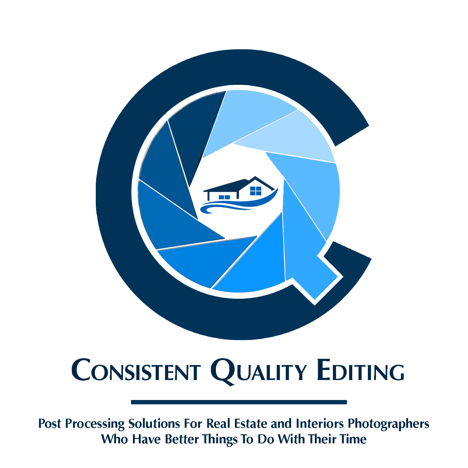
Here are some variations of the above without the “e.” The first two suggesting the Q with either a white or dark line. The last four have variations in the tail of the Q. Hopefuly they deal with the distraction, or lack of balance issue.


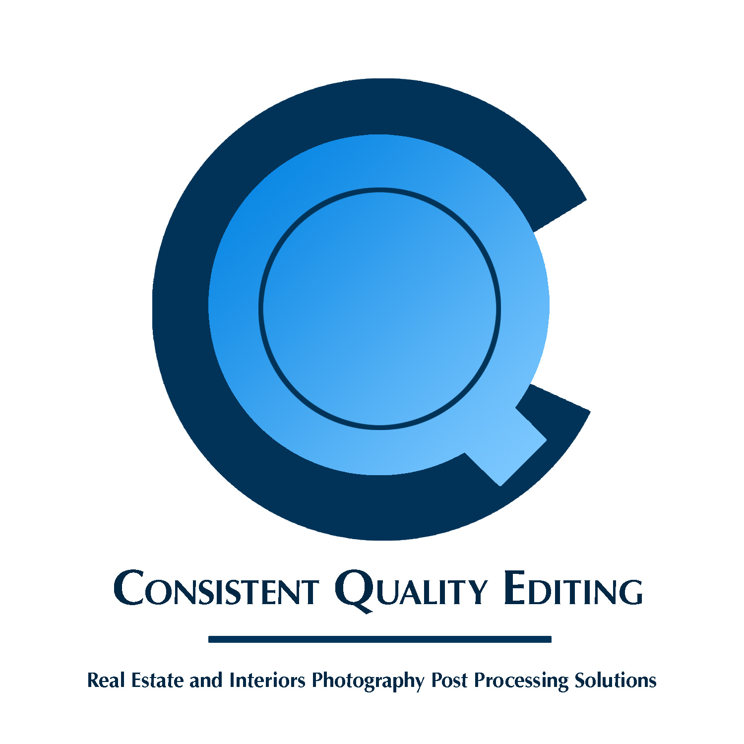
It’s not your eyes or too much coffee; the circles aren’t concentric and alignment is likely off because I’m just spitballing this in Photoshop where I’m more familiar and can work faster. Anything that reaches final stages will be redone in Illustrator by someone who uses it everyday. These are just to test out general ideas and hopefully have some kind of working sketch for reference.

Here’s what busy “run and gun” real estate photographers who are trying to balance work and family are looking for. They get home and have to spend a good chunk of their evening or possibly till early a.m. editing the days multiple shoots to make morning deadlines so they can do it all over again. They want a personal/family life so they think about sending out their RAW’s to some editing companay in India or the Philipines - but they’re hesistant based on past experiences or what other R.E. photographers are saying. The big three things they’re looking for: quality of results - no brainer. They also want consistency. A common complaint is that these editing companies often put someone good on your account at first, but then the consistentcy disapears because you never know who is going to work on your photos on a given day. The last thing they look for is timeliness, because the general turnaound time to deliver finished photos to an agent, ready for an MLS listing, is 24 hours after the shoot. They want to be able to upload their RAW’s, and then have more time to squeeze in more shoots or have more family/personal time, know that their photos will look good and consistent from job to job, will be delivered to them on time, and that they’ll have to do a minimum of final processing before sending the final images to their clients.

I want to convey all of that, which I can do, because it’s me that’s being hired and not some large team of people they’ll never speak directly to. I don’t just have experience with editing, but shooting the same things they do. There’re no language barriers, they can talk directly to me instead of through an intermediary, etc… I want to be considered “their guy” who’s willing to work with them to give them exactly what the want and need instead of just the company they send their work off to and hope they won’t have to spend time to partially redo the post work. These last things would seem harder to convey visually. I’m trying to visually get across being solid and dependable, in a contemporary, but serious, way as opposed to using visual elements that would make me look like an old established bank or law office.

Thank you all again for your time and opinions.

You mentioned in your first post that the name was still being decided. Is that still the case? When I see your logo it’s vague as to what type of business this is. Maybe consider being more direct with your company name then as a tag include the “Quality & Consistency” and rather than “timelessness” (which makes me thing of classic or eternal) I would go with “fast” or “speedy” or something like that.
I also agree with others in that “editing” should be “photo editing” or maybe “photo enhancing”…?

I’m open to a different name, but for reasons mentioned I figured I’d go with what I have. As long as it’s not too long or hard to remember. But I am open.

I also gave it another crack and tried to make it more visually obvious by including an element in the center of the aperture blades with the hope to make what my services are more obvious on just a visual level. I added a composite of various potential elements. The Cintiq tablet is pretty obvious, even if the detail of the house being worked on will show small. Too much detail? The house with a circle/lens on tripod legs is obvious as well, but looks kind of meh? There’s also a house interior, but it also looks (to me) like an empty dollhouse. For now I just went with the house, because that’s what these photographers shoot and I figure I don’t have to spell it out so that it’s excessively obvious. To me it also looks like simpler, but still with more heft than just a simple line. I like the blue wavy lines as well and to me they kind of go with the movement of aperture blades. Mostly, it just seems (to me) to fit in the space without being lost or dominating/distracting from the rest of the image - like the dreaded e.

In this most recent try I also added two lines of text as something of a tagline to be more descriptive. The second line may be too much? I was fine with just the first, but added the second for now anyway. Obviously, it can go.

I hope I’m not breaking the rule about other people’s work, but the composite showing what other companies in this industry have as far as a logo isn’t being added with any intention of getting criticism on the work, but just to show how other companies are visually marketing themselves. If it’s wrong for me to do I comletely understand if a mod removes it, or tells me I need to do so. If so, it’s gone as soon as I read the word.

Posting this here to remind new designers yet again that clip art should not, and usually cannot by license be used in logos. That multi-roofed house thing shows up on no less than 6 crap-stock sites on the first page of a goggle search, which usually means it has no provenance, and is so common that even if you could use it for a logo, so could everyone elseScreen Shot 2021-01-22 at 11.45.05 AM

The other thing is, if it says “for personal use only” that means for your scrapbook pages. The minute you use it for a business, that is Commercial Use and not allowed.

Pay particular attention if a warning is given that “This image may be subject to copyright.” A simple 30-second due diligence says these are probably not appropriate for any usage.

If I can weigh in my two cents, I think you need to first solidify your name before you put together your logo. You’re doing a nice job of fleshing out the designs, but I’m not sure the bones are going to take you where you want to go. Or, I guess a less unique metaphor, your car is running fine, but I’m not sure you’re on the right track.

I say this because, while the nested C/Q with the aperture has some nice potential, I noticed I’m starting to see a photography logo than anything else - and if you’re trying to market to photographers, you might be looking more like a competitor than a potential partner. It may be a common trope, but it’s worth noting that in your references, each one with an explicit camera reference has either a word-reference to editing or a strong visual indicator of creative services (examples: ProGraffix is word based, and “Graffix” and “We Edit” both indicate that they’re manipulators, not photographers. Photo Editing India has the multi-color elements, which is a common shorthand for creative endeavors.) The simpler logos aren’t referencing cameras at all.

Again, I think you’re doing a good job on the execution, but I think you need to review and solidify your foundational concepts. For instance, jump back to your name - you’re running with Consistent Quality Editing, and your logo is using the C and Q - is there a word you can use, or image you can invoke, to convey both consistency and quality to your target audience (eg Real Estate Photographers) and thus leave you free to more easily include or convey the editing portion of your identity? I can’t exactly answer these questions for you, but I think asking them can help you find the direction you want. I will say I do approve of the color choice - blue is a good color to convey reliability.

1 Like

Again, thanks for the valuable insight.

Just to reiterate. So far this is all just spit ballin’. I’m not intending to use readily available clip art in the final design, but I’m extremely busy with an international move that’s happening in less than 10 days (just spent my entire day at the Immigration office getting everything in order, then banks) and I’m not the greatest at drawing, so I’m taking short cuts at the moment to see what might work, but it’ll eventually be something that may be similar to, or inspired by, but not just copy/paste.

Coming up with a visual that suggests photo editing is a lot more difficult than one that suggests photography. At least it is for me.

I think with my move so close and so much still to do beforehand, I’ll probably take a step away from this and let all of this advice sink in and give me food for thought, esp. about coming up with an entirely new business name.

I think this is where the reference logo from “Fix The Photo” is the strongest. Their “hand logo” suggest “touch up” and the way the hands are framing a rectangle indicates that it’s about images. The simplicity of the visual makes it by far the most memorable from the pack. Also, their name makes it clear that it’s a service for photographers, not a competitor.

So, what can be your metaphor?

May I suggest “magic”?

Often the touch up of images is called “adding some Photoshop magic” and I’ve heard photo editors referred to as “photo wizards”. And then there’s of course also the “magic wand” tool in Photoshop, pictured above, which is one of the most used go-to tools for photo editing. Anyway, that metaphor might be too cheesy for you, but it’s just an idea.

1 Like

Simple is better

What you did here is by miles the best in terms of the logo.

Here’s what I’d fix.

  1. The stem of the Q and the triangle - it looks like a bent cursor
  2. If the triangle here was the starting point to look like computer cursor it would be better
  3. then create the photo lense around the image of the mouse cursor.

This would give the shape of a Q for Quality.
Gives a computer cursor which a baby to a pensioner would understand as digital.
Make a better looking Q for quality.

The thickness of the C around is offputting, make it a circle - and cut out the angles for the endings.
Making it Consistent in both a C as it looks inconsistent.

image

Lastly - the typography is terrible.

Get a nice rounded font to make it consistent with the roundness of the logo.
The text is too small in comparison to the logo size.

Having what looks like a Bold letter first is not working and never will.

You could even use the letters from the rounded font to make the logo.
For example, using the C from the Font and the Q from the font as basic shapes to work from.

That’s not a bad idea - most good designs start out with a handful of sketches, and then you eliminate the weaker ones and refine the better ones until you get something you’re after. I like OVOAO’s suggestion of referencing the Magic Wand tool - it’s something that they might be familiar with, and even if they’re not it says something good. Trying to keep with photography and consistency/quality, you could consider “Resolution”, “Focus”, or even “Goldenhour”, since they’re all terms a photographer would be familiar with and associate with quality.

And it’s not just you, photography is a lot easier to communicate visually than editing, in large part because more people recognize the tools for what they are. That being said, I really like Smurf2’s observation of the cursor shape in your aperture Q - the cursor is such a universal communicator of computer work. If you decide to keep the name Consistent Quality Editing, I think that’s a very good direction to take that concept.

Personal matters and being separated from my computer over several international borders have kept me from working on this, or pretty much anything. Gave me time to think about your comments though.

Thanks to all for your excellent past criticisms and suggestions.

Rethought the name. Had an initial idea for ‘My Editing Guy,’ as in when we all at some point have to call “the guy” to take care of something we can’t, or don’t want to do ourselves, and also to suggest a personal, almost possessive, connection between photographer and editor. Few others, like “fixedpix,” but that sounded too derivative of Fix the Photo, and it never really grabbed me. Have to take domain name availably into account as well. I notice a lot of the competition have very vague sounding names that don’t mean anything (to me); such as omorfiamanila.

I was listening to a podcast by an industry leader on the subject of photo editing outsourcing services for real estate photographers and he mentioned how he doesn’t currently use one himself, but he’s open to it and would like to have an “ace in his hole” should he need it. I thought that was catchy and offered possibilities as far as visuals and the phrase has a positive significance whether someone has ever picked up a deck of cards or not.

I kind of like “Goldenhour” as well, but thought I’d stick with my first thoughts because it was very easy for me to visualize, whereas Goldenhour sounds like it has potential, but didn’t put any instant ideas in my head. Perhaps for someone else to work on should AITHE not pass the smell test.

I’d appreciate if anyone would chime in to give their thoughts on the following:

The name “Ace in The Hole Editing.” It’s long, but doesn’t seem too long. Adding anything more descriptive would seem to just lengthen the name and resulting URL.

I liked the suggestion made by OVOAO (and reinforced by Kaegro) to incorporate “magic” in the form of the PS magic wand tool that is well known and suggests editing more than photography. I like the directness, suggestion of magic, tie in with playing cards (“pick a card, any card”) and with the name AITHE, and the fact that it’s a well-known (and loved) tool.

The following design concepts. Again, I’m just spit balling. Things I just threw together fairly quickly using PS. I’d sketch first if I could, but I can’t, so I didn’t. My goal was to keep things simple, though on a few I did add in some extra elements, such as a line of magic wands to separate text instead of just a plain ole solid line. The rounded fonts are sort of placeholders, as well as their locations in the designs, weight, kerning, etc. I’ve used the same darker blue color in all, but I’ve alternated between using two different lighter blues which makes some designs slightly more contrasty than others.

I’m mostly interested in knowing if any of these images have any elements that have merit as base ideas that I can pass along as a suggested concept to someone else for them to work on. Or should I just scrap this altogether, perhaps keep the name, and just give that to someone else to work with and go with the best looking idea suggested by them?

Also suggestions on shape. I chose a square canvass because this will likely only be used with a webpage header since it is an outsourcing business and clients are on different continents, so for now no print.


It’s been a while, so without rereading everything, I will keep this succinct.

In my opinion.

The name really doesn’t work.

The logo really doesn’t work.

And Photoshop really isn’t the correct software to create logos in. Use illustrator.

Honestly, I’d suggest working with a branding designer. Design really isn’t your forte.

Sorry if that sounds harsh, but there are enough iterations and variations in this thread above, to be evidence enough. There is a point when you need to know when to cut your losses and consult an expert.

Good luck.

1 Like

After your first attempts, you seemed to be getting a bit better at this. Your latest attempts, however, suffer from the very same problems as your first: too complicated, too many ideas and miscellaneous details crammed into each logo, lousy typography, poor color combinations, and no relationship to either real estate or photography. This logo seems more like something to do with a shady gambling operation than photo editing.

I’m sorry, but you seemingly have no aptitude for graphic design, just like I have no talent for auto mechanics or playing basketball. We all have our strong and weak points, and your strong point is not graphic design.

Whatever logo you use will represent your business. It will be one of the first things your potential customers see. They will make initial judgments regarding your business based on how professional you make those first impressions. Getting it wrong will result in a loss of business. It’s too important to leave up to an amateur. You’d be far better off with no logo at all than to use the ones you’ve designed. I’m sorry, but you need to hire a pro to do this for you if you want it done right.

Nope - they aren’t good enough - nowhere near anything professional look.

Why not just
ACE
Photo Editing Services

Your marketing can then have a tagline - We are the ACE In The Hole etc.

Just make the ACE
Use the C to create a camera lense

And a nice bit of type underneath
ACE
Photo Editing Services

Current iterations
The wand - and the Club symbol - it looks like a magician’s logo.

Actually if you do a the

ACE with the C as the camera lense

You can give it pixelising from vector to dots to show editing.

Sorta like this

I like that you are taking a direction that is less literal, but always be careful to make your brand “childish idiot proof”. Once you pronounce “Ace” like “Ass”, all the logos will get a whole new meaning… :grinning_face_with_smiling_eyes:

Cordially yours,

A Childish Idiot

1 Like

kinda like that maybe, but yer gonna saddle the OP with the idea that a 22 color logo is ok?
You say you have Pantone callouts for all those? Woo. It’ll still get printed in process on press, and on profile in digital. Unless for the digital you really want to pay high 3-figures to low 4-figures to match all 22 of them (assuming the tiny bits are the same colors as the big ones)

Obv for a style not colour.