I asked a friend who is an artist, but not a professional designer, to take a crack at designing a logo for a photography editing service. Strictly for a web page which will be targeted at real estate photographers who are looking to free up their time to squeeze one or two more shoots in (more $) during the day, and/or free up their time at night so they can have more personal time instead of editing in front of the computer till midnight or later in order to fulfill promised 24 hr. turnaround time to their clients.
The business name is still being finalized so the text and intials are just placeholders, but all options are only two words. My only request was that it be kept relatively simple.
He did a few slight variations on the same theme, and though this is my favorite of the group.Instead of being detailed with my own thoughts I thought I’d post it here for some professional opinions/suggestions before offering my thoughts.
Thanks for taking the time to provide a little feedback, and hope everyone has a prosperous and healthy 2021.
I’m sorry but the Crit Pit rules prohibit asking for a critique of someone else’s work. I’m half tempted to make an exception for this one, but I can’t — sorry.
After your first attempt, you seemed to be getting a bit better at this. Now, with these latest attempts, you’ve reverted to the same mistakes as in your first ideas: too complicated, too many ideas, no relationship to real estate, to relationship to photo editing, the colors lack contrast, the typography is not good, and the whole thing comes across as more related to gambling than photo editing.
I’m sorry, but honestly, these aren’t working or even coming close to working. If you want a good logo to represent your business, you’ll need to hire a professional or, at the very least, someone who has some aptitude for design because, I’m sorry again, but you do not.
You opened this so we could tell the photo editor to find a real graphic designer, right?
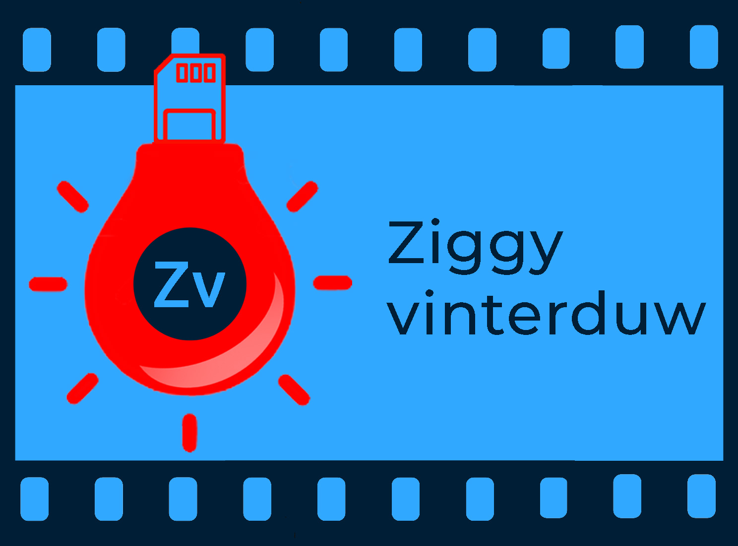
Since there are about 8 concepts in here and absolutely none of them having to do with real estate photography (unless that’s a building with a garage in front and not a camera SD card?)
Bigswifty contacted me to say that he had worked on the logo jointly with a friend, which satisfied the requirement that it not be a criticism of someone else’s work.
Thanks for reopening. I didn’t do the sketching, but I did communicate some ideas I wanted to get across and offered some suggestions for elements as well as took over in PS (friend who helped is a painter who works in oils, acrylics, etc.). I’m only working in PS because I’m faster/more familiar than AI, and everything is in draft/idea stage at this point.
The name of the business (still being decided upon) will clearly convey this service is for real estate photographers. This is only for a webpage header, not print. It will targeted solely toward real estate and perhaps other interior photograpers (though with higher paying gigs and more discerning clients, probably not as much as the ‘run and gun’ type of photographers I’m targetting).
The bulb represents post-processing, which even younger photographers are aware of even if they have no analog/darkroom experience. The film strip should be obvious to anyone who’s at all familiar with a camera, and also acts as a frame. The SD card represents the contemporary/digital.
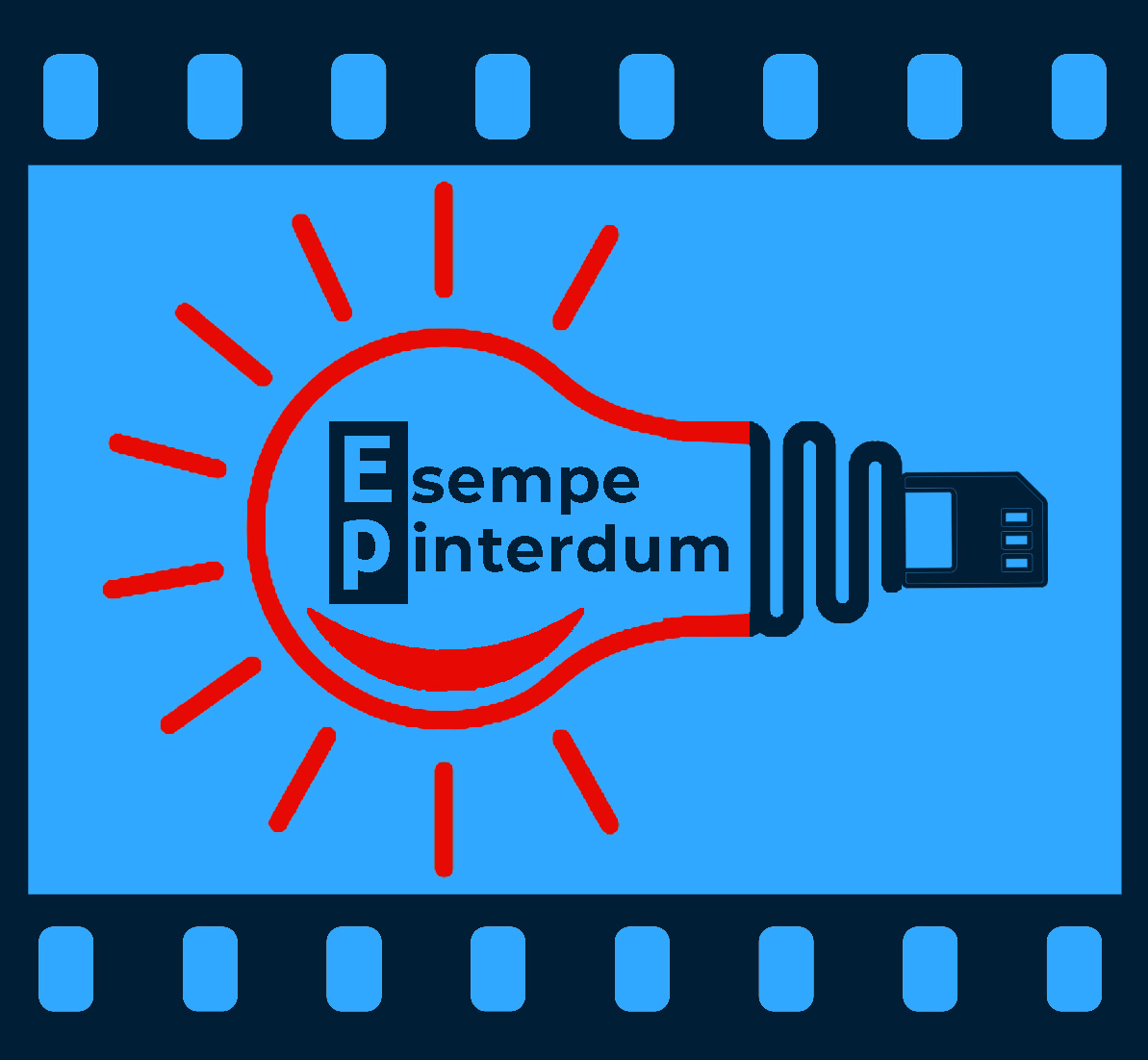
I changed some elements a bit, toned down the bright red and made it an outline, but tried to keep it all simple by using only three colors.
I appreciate all constructive criticism and suggestions - no matter how brutal.
Sorry to say, but you need to go back to the drawing board. You or your painter friend or whoever is trying to do too much. You have the type, the lightbulb, the rays, the SD card, and the film strip . . . that’s too many components being crammed together (at least you didn’t include an aperture or tripod). The visual weight is off. The color palette is off. The type needs work. I’m old enough to understand the role of red light in developing, but that’s not where my mind went initially. I thought red light / red light district. Think about your target market and what will make them respond and then simplify, simplify, simplify.
I’m going to be brutally honest — these aren’t working. They’re conceptually and fundamentally flawed. They won’t work as logos — sorry.
Instead, they’re illustrations of objects superimposed, combined and piece together in scattered layouts that don’t hang together as a simple, unified element, like a logo should.
The colors are, um, really bad. The colors fight each other and the value (the degree of lightness or darkness) is skewed way off into the dark end, making the contrast between elements totally dependent upon color differences rather than tonal values.
The use of negative space is completely ignored as a design element, as though it wasn’t even considered.
Why an old-fashioned incandescent light bulb? Why a strip of film? The composition might be taken to suggest that this photographer is behind the times and working as though it’s still 1985. The SD card counters that a bit, but unless this photographer is still working with 35mm film, I’d omit any reference to it. In addition, a lightbulb is usually a cliché to avoid.
The whole thing just has too many ideas awkwardly configured into layout that just doesn’t work as a logo. I’m very sorry, but it’s so far off that making suggestions on how to make it better is pointless. Very few good logos contain more than one concept, and that concept is typically abstract and suggestive of desirable qualities rather than a direct illustration of various objects.
Sorry, I still do darkroom work for silkscreening and it never occurred to me that was a red safelight. Maybe a little more so after you made it horizontal, but only after I read your second post. A realtor who takes photos is gonna get that? Not every person who takes photos these days knows how a darkroom works.
The logo isn’t meant to define you as a person. It’s meant to draw in potential clients. It has to appeal to them. SD cards, safelights and sprocketed film are way off the mark here.
Thank you all for the criticism. Obviously it’s time to rethink. Probably will go with a designer, though this whole thing is just for a side business since COVID wiped out all my regular clients (whose own clients are international tourists). No point in being penny wise and pound foolish.
An interesting (or not) thing about the color palette is that it’s virtually the same as a well known, large company. Guess it’s in the use.
Thanks again and I’ll continue to read the forum for the enlightening comments on everybody’s work.
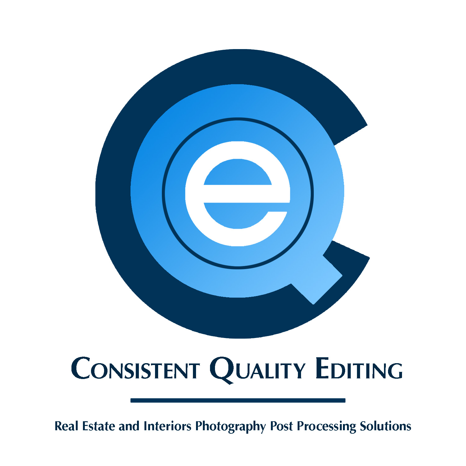
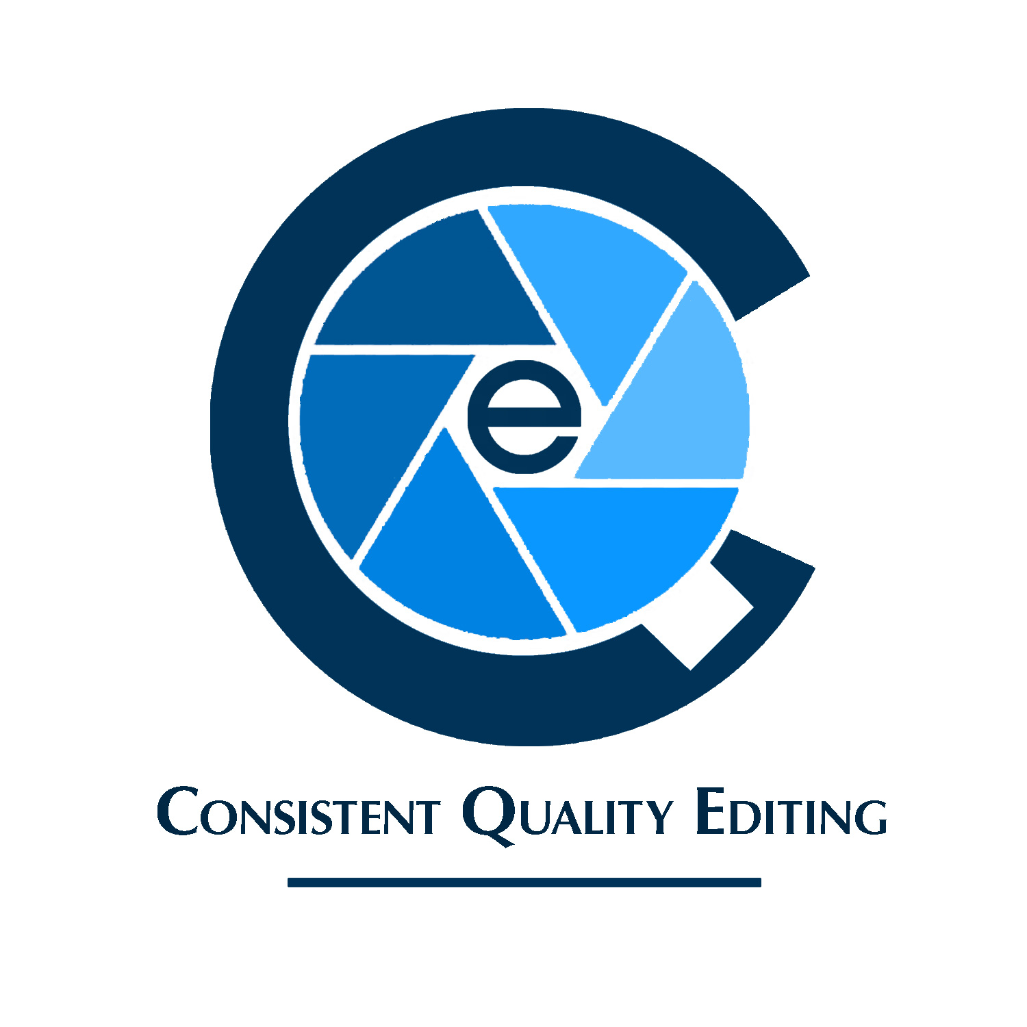
Spent some simplifying and came up with something different, if not exactly original. Hopefully it’s at least a little bit better. I’m in talks with a local graphic designer who is considering buying some of my larger equiment I can’t take with me on my move, so we’re hopefully going to do a partial trade for his services. Thought I’d run this by the forum to see if this is something I can present as a style I’m interested in (as opposed to the trite aperture inside a home clip art type imagery), a viable idea to be further worked on, or if like above, it’s best left to the digital scrap heap, never to be mentioned again. To reiterate, it’s only for a website header and the monogram for a favicon as well.
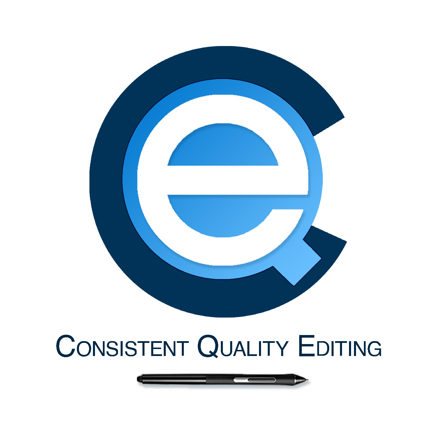
I noticed how all three letters in the business name are round and decided to superimpose them on top of each other. I took the blues from the failed attempts above and used shades and tints of those colors to tone things down a bit. I also used a tiny bit of drop shadow on the e so it popped a bit, but did a completely flat version as well. Used Helvetica because it comes close to replicating the shape of the letters in the monogram - though I’m open to font suggestions, weights, capitalization options, etc, if only to suggest to the graphic designer. Thinking of Ovoao’s comment, I used the Wacom pen in place of an underline to emphasize the photo editing nature of the business. Not sure if it’s cheesy, or if it even matters because there are far bigger problems. Guess I’ll find out.
Did another version where instead of text on one line I stacked the three words on top of each other. Some of those versions have the pen standing up on the right with a dot at the bottom to suggest an exclamation point, some don’t, but I think of all of them I prefer these for the simplicity.
That’s a huge improvement over the first attempt. Out of the two recent idea, I like the first one best because there’s a more harmonious width relationship between the concentric circles.
However, I’m definitely not a fan of the typography beneath the logo nor, especially, the stylus. Did you design both them and the logo above them? There seems to be two completely different thought processes from two separate people at work here.
Much, much better. I would suggest, as Just B says, changing the type and completely losing the sylus. If you think a bit harder, I think you will find a way to incorporate the idea of photo editing into that construction of glyphs. The shapes are already suggesting things as it is.
Also, lose the drop shadow from the e. It serves nothing other that to clutter. Think about how it would reproduce in black. The e is fine, but you need a version that differentiates the other two.
The other thing that jarrs for me is how the tail of the Q sits in the C. There’s some real tension there, which needs resolving.
Finally, the proportion of the e to the a needs rethinking too, in my opinion. It’s too large, realtivly, so that it obscures the structure of the Q. It needs to feel that it is sitting (visually, if not actually) in the counter of the Q.
The Stylus looks like clip art. Clip art is not generally usable in a logo. Often says so in the licensing language of the stock site. If the stock site doesn’t have such language, I’ve learned to suspect the resource.
The name of the company, the initials are CQE. All I see is a very emphasized E. The Q and C didn’t even register (I haven’t finished my first coffee for the day though, so that’s my excuse and sticking to it.)
Even though I said it was “a huge improvement over the first attempt,” it’s only a huge improvement relative to the first one.
The logo itself is, at least, more corporate and clean, but as PrintDriver mentioned, it really does emphasize the E. Then again, maybe the E for editing is the most important letter, but it still comes across as completely dominating the mark.
What this logo doesn’t do is suggest anything about editing photos. I’m guessing this is why you inserted the stylus at the bottom, which still doesn’t really say photos. Even the name, Consistent Quality Editing, doesn’t suggest photos. If anything, it suggests copy (text) editing, not photography.
A thousand thank yous to everyone. Your opinions are an enormous help.
Here’s the deal with the name. There’s a podcast for real estate photographers, and one episode featured the hosts asking questions from their listeners to the guest, who is head of marketing for a big editing company in the Philipines. The three big concerns repeated by everyone (according to the hosts) had to deal with Quality and Consistency of results and Timeliness.
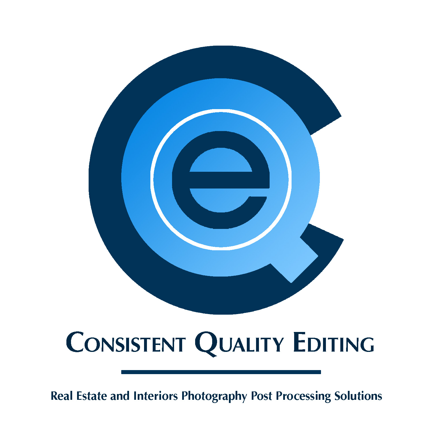
Made some more changes taking your suggestions into account. First thing I did was change the typography on all of the below. I like it better than what I had before, but I’m more interested in what others think right now. I got rid of the stylus and replaced it with a simple underline. Also ditched the slight drop shadow on the e. I also put some descriptive text below, but don’t know if it’s too much. I’ll be directly marketing to real estate photographers so they’ll know what I’m contacting them about. Not sure if I adequately addressed the situation with the tail of the Q. My brain also doesn’t function all that great in pre-coffee in the morning.
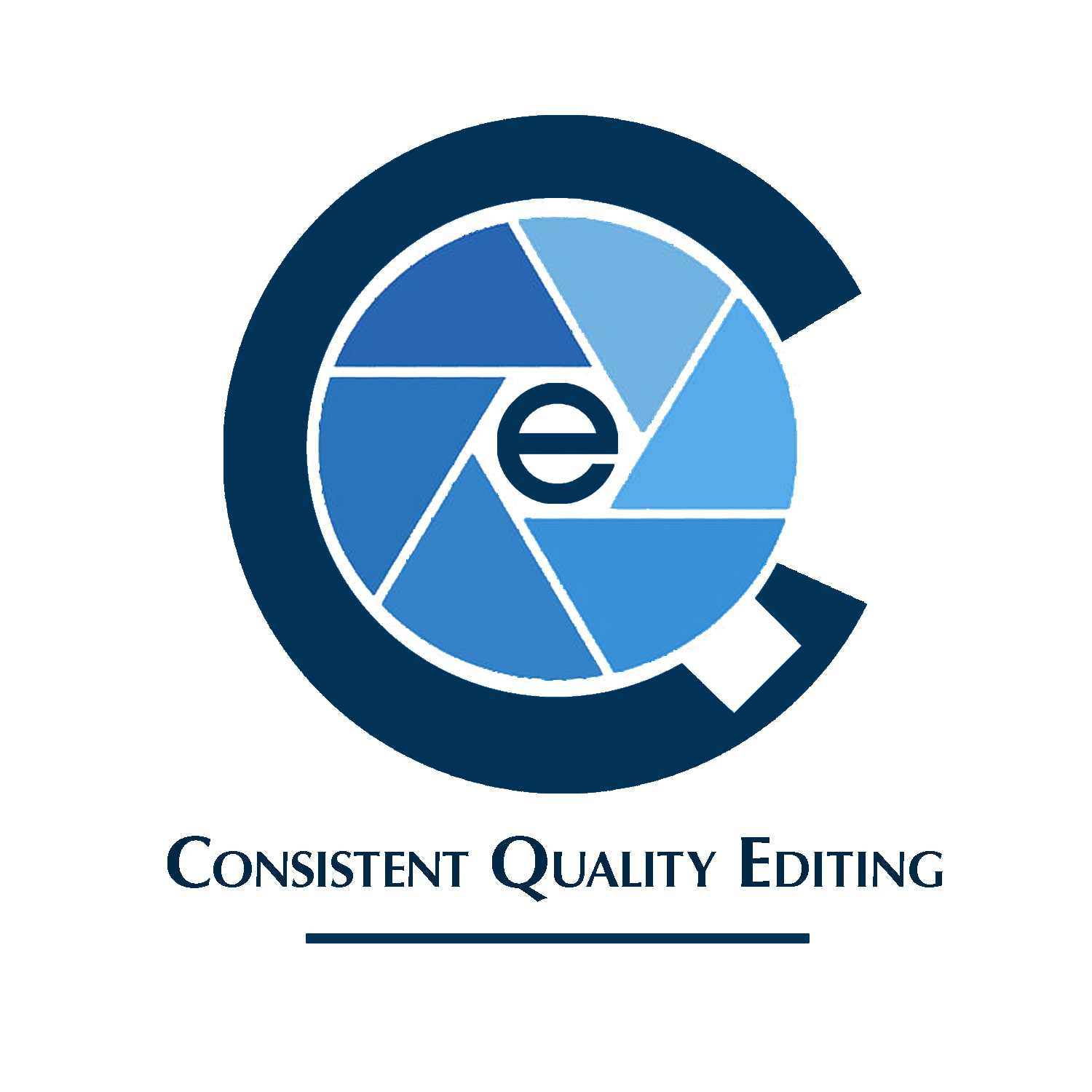
Keeping pretty much the same design as before I made the “e” smaller so (hopefully) it’s not so dominant.
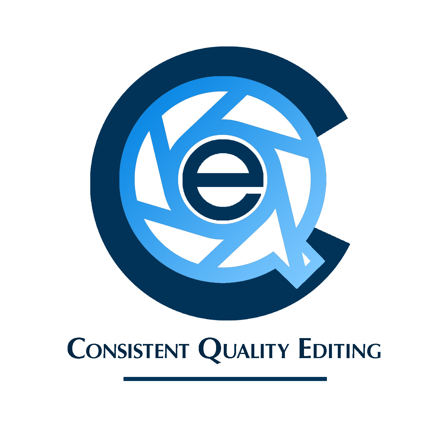
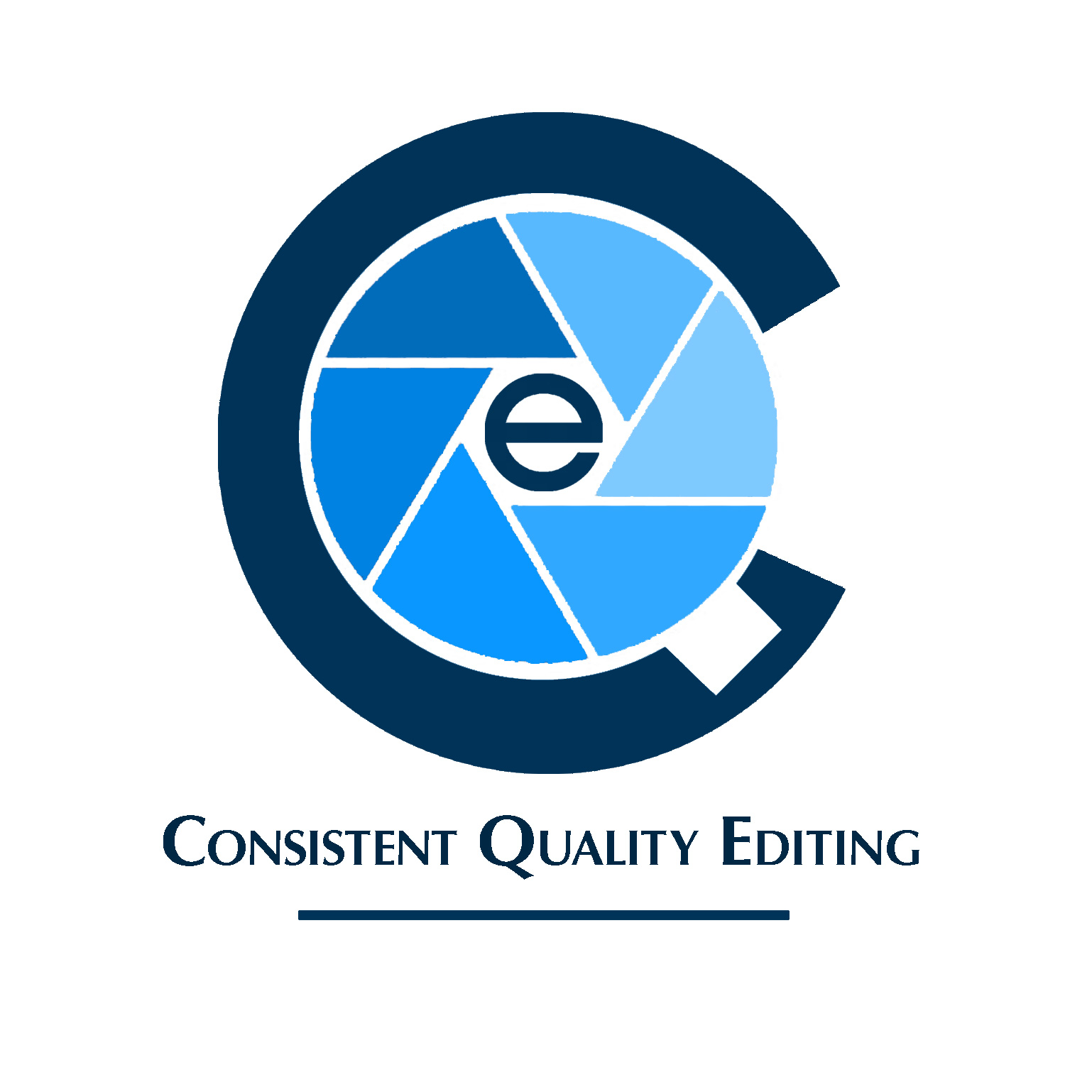
The next two I decided to try out aperture blades, even though it’s kind of overdone and not really generally too my liking, though I don’t mind as much here. Maybe it’s the lack of the additional house visual that’s so common. (Most interiors photographers either use a (imo) cheesy aperture or camera and house icon, or the other option is stylized type of their name). On the second I extended the aperture blade into the tail of the Q. Also took out the descriptive text, since hopefully this gets the point across visually instead.
Ever since the nested CQe concept was introduced, I’ve been skeptical about that ‘e’. That e is such an focal draw that it’s really all I see. It’s rare that a company’s product claims that much of a logo’s oxygen.
Here’s a goofy example of what I mean:
If my company specialized in producing and delivering gravel, let’s say, and my name was Doug, and I named the firm Dug by Doug Gravel Specialties, my brand mark wouldn’t showcase the G of gravel right at its center. My overarching brand presence would of course be the Dug by Doug concept, probably very often without the Gravel Specialties, outside of signage and letterhead. But even where Gravel Specialties was to be included, it would always be secondary to the primary brand concept.
Now IMO, Consistent Quality is not a great branding concept (perhaps only about as good as ‘Dug by Doug’), because it’s more of a description than a name. And, it may seem like the thing that’s being described — editing — should not be excluded, but if this was my project, I’d do anything I could to get that ‘e’ out of the center of my design.