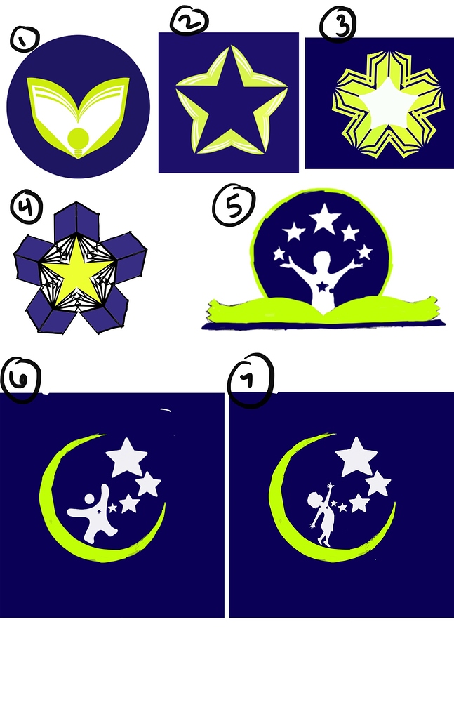
Hello!
I posted a few weeks ago with a logo idea and received some helpful feedback that led me back to the drawing board. I have some other concepts that I would love feedback on and would like to know which, if any, are best/viable design concepts to further explore. Trying to obtain some degree of symbolism, but worry about coming across too cliche or contrived. Clearly I am drawn to this color combo, but interested in feedback on color choice if you feel this color palette is not the best at capturing the feel I am going for.
*these are in draft form and some are sketches and therefore not yet fine tuned.
Would love suggestions for font type to compliment the logo you like best as well!
Thank you for ANY input!
Here is the background-
- Concept : a logo
- Purpose or Goal : Developing a logo for a new business venture, a private school for children with special needs and different learning styles, called Illumination Academy. Playing around with ideas and concepts. Wish to portray unique, fun, caring, inspirational, dedication etc
- Format : Will mainly be used digital, In website, and likely some t shirts and business cards
- Audience : Parents of children with special needs or parents that don’t feel the schools are able to meet their child’s learning needs, professionals that work with children
- Your Experience Level : I have minimal experience, if any. I am a therapist though I have been doing art as a hobby for decades
- Nature of Job: self directed project for my new business, brainstorming concepts and determining what design direction to go
