The logo is for a graphic design company that i am starting with a friend of mine.
We’ll mainly be focusing on making custom build websites, for medium large companies.
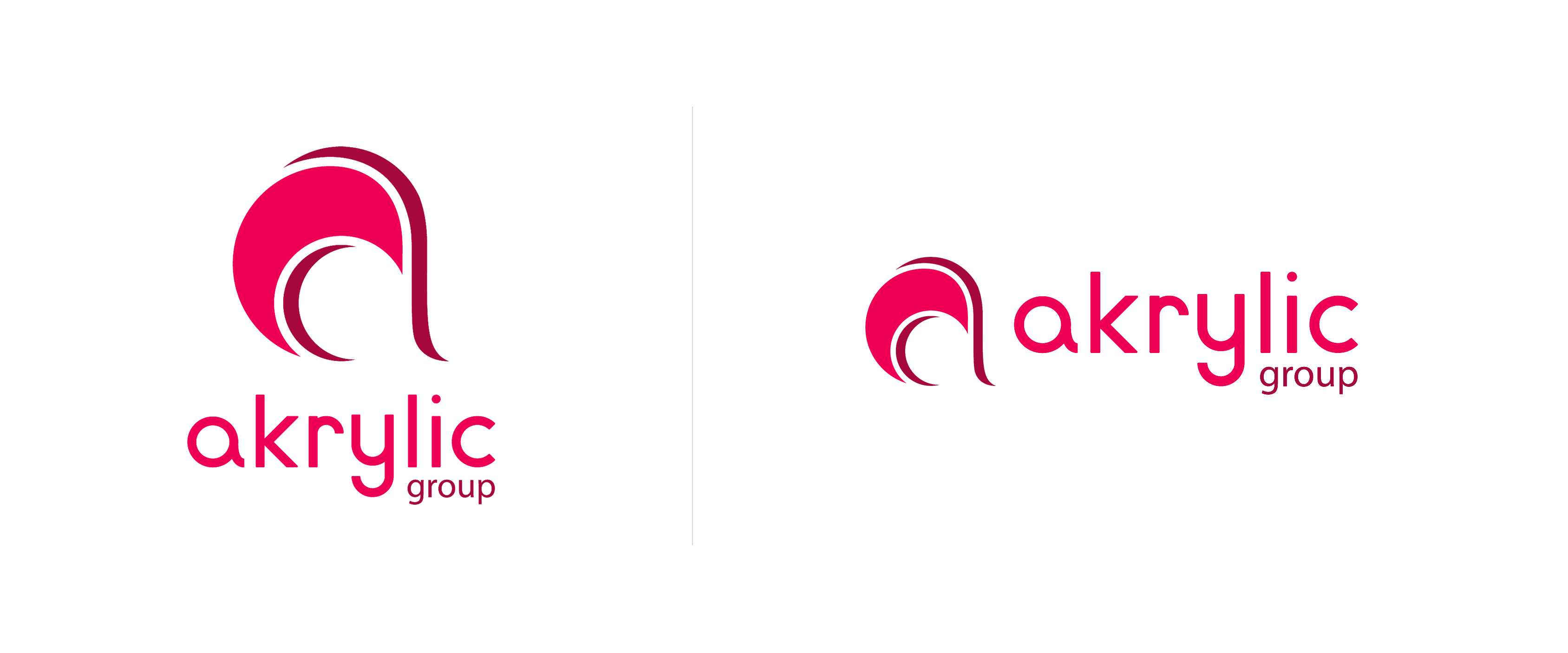
Both logos above are the finished design. the placement of the icon and the text is dependent on there the logo is placed. (sometimes it might only be the icon, if there is no room for the text)
Hmmm. The execution is certainly credible, and although I like the icon quite a bit, I’d be hard-pressed to ascertain what it might symbolize. Something about that typeface ruins its it for me though. The shape of the name seems spindly or weak. Could just be that lowercase a.
It’s simple, clean, easily reproducible, would work across a variety of mediums, and would work in black and white.
That said, this could be improved.
I find the mark a bit awkward. It’s like you were going for a stylized “a” with the darker color and then added lighter color as a fill-in. I don’t think the two are working together.
Regarding the type, you have to be very careful when mixing sans serif fonts. This paring is not working. Use the same font for group as you use for akrylic. Also, the y appears to be shifted up a couple of points. That needs to be fixed.
Like HotButton said, it’s certain credible, and I agree with Steve_O about it being clean, reproducible, etc.
However, I’m not a fan of the typeface you’ve chosen. It’s just a bit too quirky. I’m also not a fan of that hot pinkish-red color in this particular context. It immediately reminded me of women’s fingernail polish, which is probably not the association you had in mind.
I think the problem I saw with the color was that both the icon and the text were the pinkish red. If the type were black or dark gray, I might not see the color as an issue.
As for the typeface, if it were me, I’d pick a straight-forward neutral sans-serif. A problem with pairing a quirky font with the icon is that the unusual nature of the typeface competes with the icon.
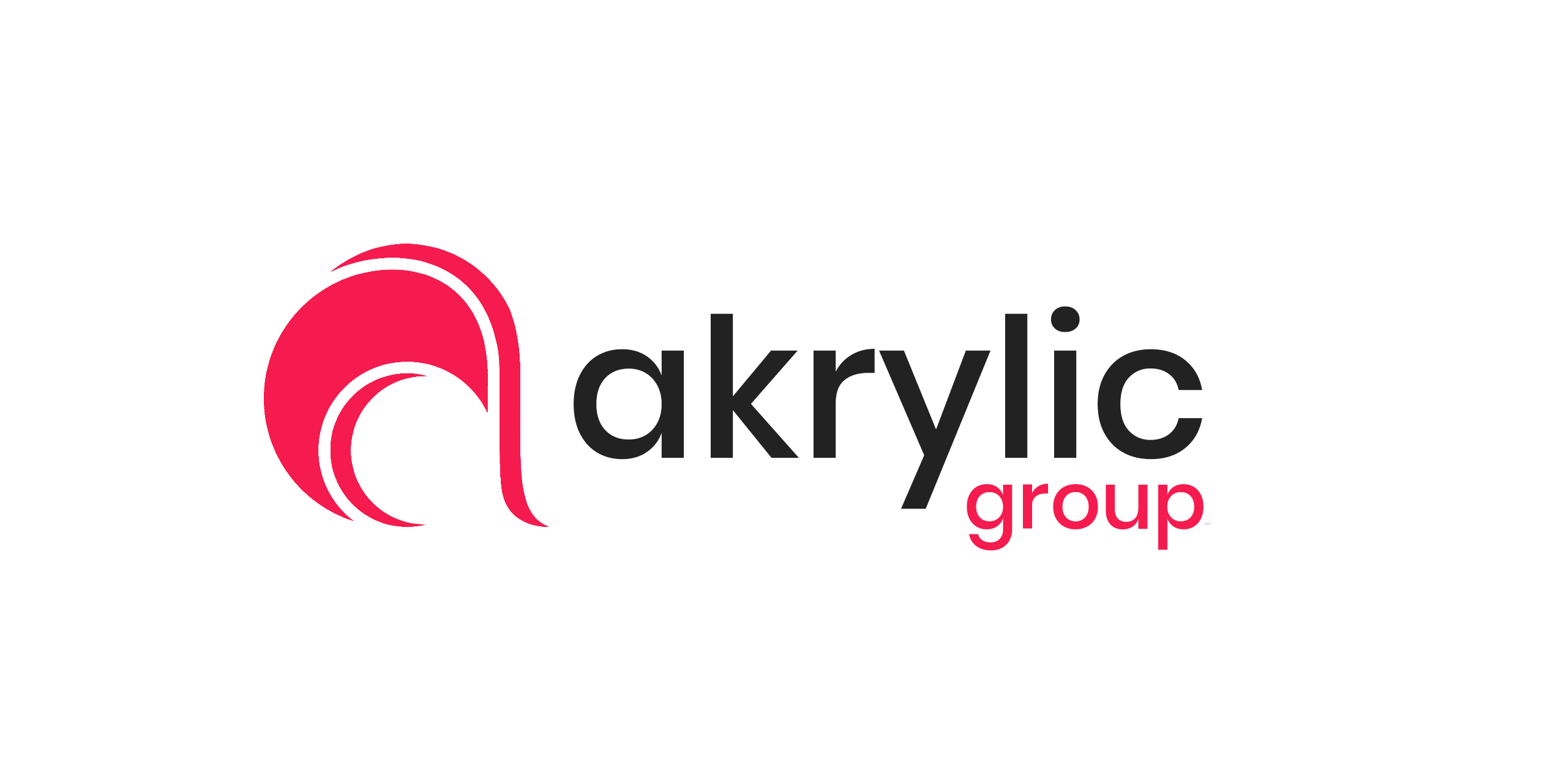
I gave ‘‘Group’’ the same color as the icon because I think it gives a nice balance.
not sure if the ‘‘g’’ should be in caps. it feels weird to make the ‘‘g’’ in caps then the ‘‘a’’ is not.
I prefer the second design you posted. The first design was problematic with the y and the g as they appeared to be different fonts. At least with this one the tails are completely different.