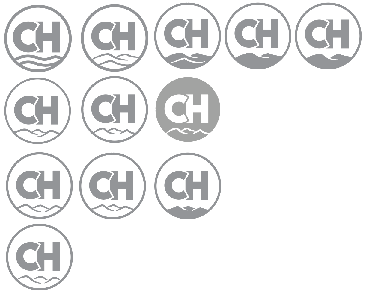
Maybe they thought it looked more like a mountain than a hill. Making them more pronounced, as they suggested, might make them look more mountainous, though. Compositionally, they shouldn’t all be the same height since hills and mountains, by nature, are irregular
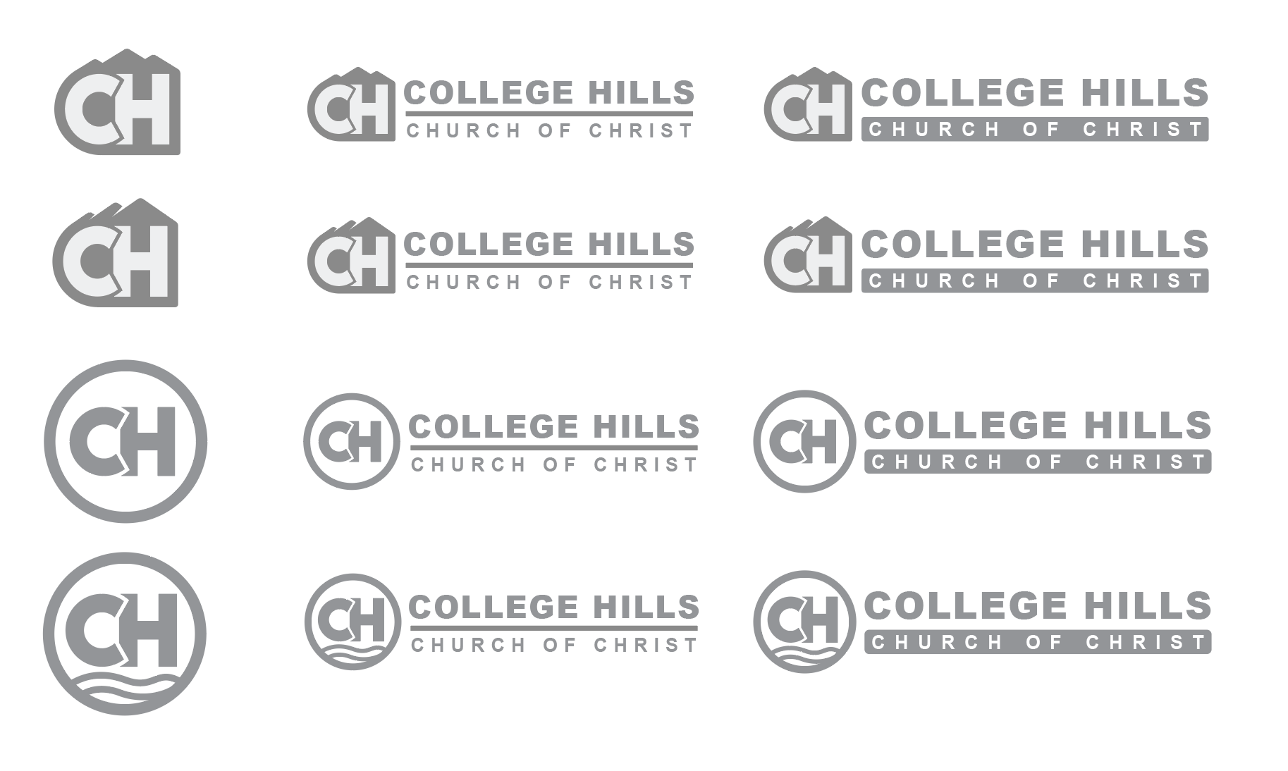
I agree the rhythmic look of your low hills make them look more like waves. I’m not so sure that I agree with you that your examples of them looking more like hills aren’t working — I think there are some possibilities there. What concerns me, however, are the thin lines that will muddy up and fill in when reproduced at smaller sizes.
To me, religious logos should look a bit more traditional and softer. Using bulky, geometric, sans-serif letterforms runs counter to that notion. Then again, there are some cultural dissimilarities between Tennessee and Utah that might negate my concerns. There’s also the value of brand equity. If they’ve been using the overlapping letters for years and the congregation identifies with them and associates them with the church, I’d think twice about abandoning them. From a practical standpoint, I am a little concerned with the lines separating the overlapping letters filling in at small sizes, but if this hasn’t been an issue in the past, maybe it’s okay.
Integrating the cross more smoothly into the monogram might risk making the cross look more like a lowercase t than a cross. I don’t think that would necessarily be the case, but something to be aware of if you explore the option further.
Just a possibility, but I think they might have found a bogus brand consultant. I don’t dislike Arial, as some designers do, but I’d never suggest using Arial as a logo typeface. It’s likely the most generic typeface on the planet due to its ubiquity. Maybe eliminating the need to install a new typeface on everyone’s computer was part of the brand “expert”'s logic, but for the logo itself, I’d definitely change it to something just a little more distinctive.
Yup! Been there, done that. Sometimes it’s inevitable because of the clients involved. Other times, it’s the result of the designer failing to take control as the expert and letting the client fill the power vacuum. I don’t know which one is applicable here, but based on everything you’ve written, the roles have definitely been reversed.
All things considered, I like the following design the best out of all you’ve shown us. But I am concerned about those fine lines turning into pixel mush at small sizes.