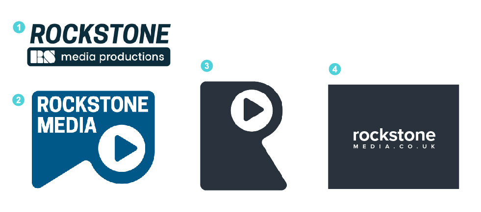
Hello. I’m new to this forum. I was wondering if I could ask for any advice / opinions on a logo I am designing for a media company, mainly video work, but also graphic design and web. I designed the letter R (3) around a golden ratio concept, with a play button. I am wondering if it looks a bit weird? I cant seem to incorporate both logo and font very well. My attempt at (2) which pushes the letter R on to its side but play button remains in position. I’ve always wondered if there was a forum for design stuff so I am glad I have signed up to this one. Any advice would be well received. Many Thanks.
-
will have production issues due to thin strokes in R and S.
-
It looks ok
-
Looks ok - but no company name
-
Looks ok - can it be more like a clapper board?
All say media type company to me - but don’t really say graphic design/web.
In terms of idea - it’s unique I don’t see much else like it.
Wish the R was a bit more dynamic looking
2 Likes
The golden ratio is a ratio and not a be all, end all solution to problems in communication. Certainly it can be referenced and designed around. I’m a bit limited on time right now to give a full round of feedback but I would consider (4) the best attempt at designing a logo. Although this would not work at the smallest sizes there is room to play.
The idea is there it is up to you however to find that niche spot in which you can make the design most effective. If you have to struggle too hard for an idea to work, it may be that you didn’t spend enough time ideating (could be many factors, maybe you have a 3 hours time crunch).
2 Likes
Thank you that’s really helpful as my first feedback on this forum and quick too! I see what you mean about thin lines. Number three was going to b a favicon logo so no name was put on that one. I would definitely like the R to be more dynamic as it seems a bit flat so that’s’ a good place to start and then maybe I can incorporate the text font underneath the R? Thank you for your reply!
Thank you that’s really helpful! I know what you mean about Golden Ratio it was a bit of an experiment to try and achieve a balance. Although the theory has been applied it still cant save the logo from missing something. Maybe to make the R more dynamic like Smurf2 mentions. Thank you for taking the time to reply - after months away from an office where you can quickly ask peoples opinion this forum is working well for me so far!
Looking at this again - and in the research came across the game company Rockstar logo - if that was posted here it would be slated.
I could be wrong, but these look like you sat down at the computer and started hammering out ideas rather than taking the time to research, brainstorm, and sketch. Apologies if I’m wrong. I’d avoid the play button — it’s a major cliche. I agree with you, the logo based on the golden ratio looks off — aside from the cliche aspect — it’s not working. I think you need to slow down and get back to the drawing board on this one.
1 Like
I’m not a gamer at all, so I was not familiar with this company or their logo. It probably would get slated — and rightfully so. It doesn’t look like a particularly strong logo in my opinion.
Thanks Steve! Again, very helpful advice and you’ve made me rethink bout the play button, it is generic on media logos, so I will most likely park that and like you say get back to the drawing board. In retrospact I think this logo came out of the golden ratio / circles method as opposed to a brainstorming / ideas session. Your comments have helped me realise this! ![]()
1 Like