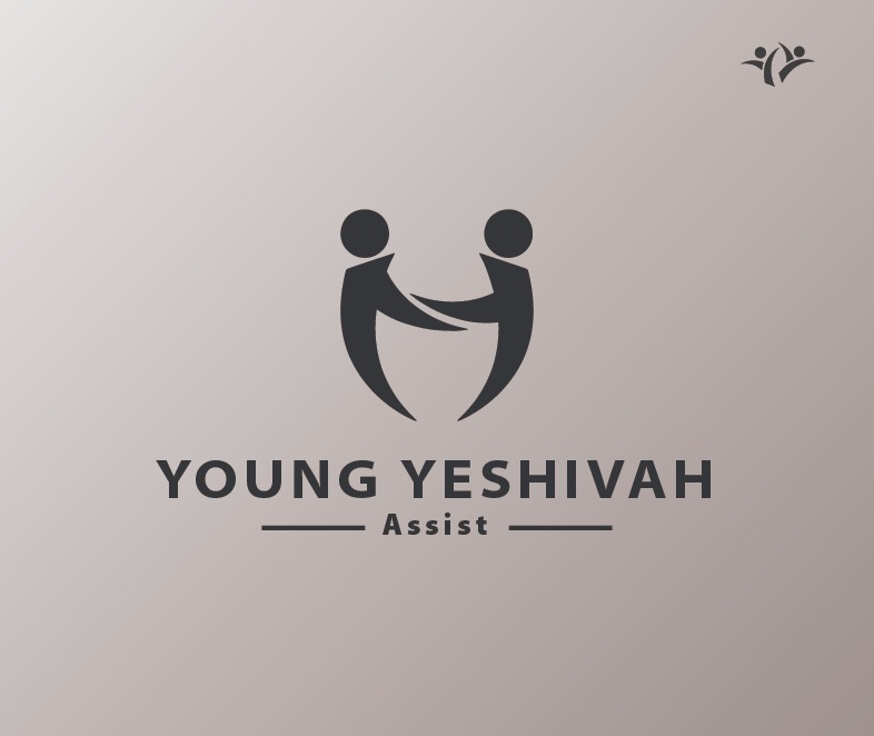
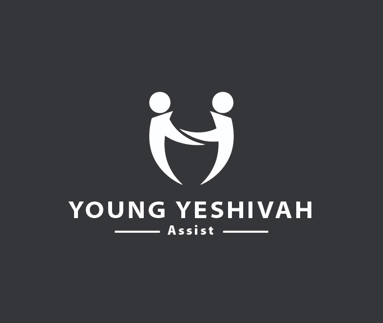
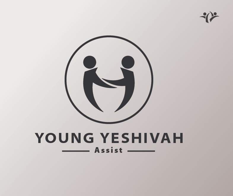
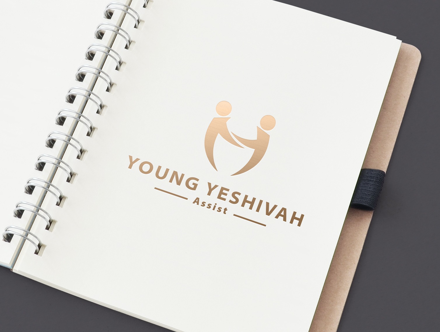
This is a logo for a non profit assist program.
The logo was taken from the original logo (on the top - right side).
All the elements were take. Head, hands and body. !
Please be gentle.
Thanks
This is a logo for a non profit assist program.
The logo was taken from the original logo (on the top - right side).
All the elements were take. Head, hands and body. !
Please be gentle.
Thanks
I’ve just seen too many logos made from swooshy, pointy people-like shapes with round heads. If this were the first time I’d seen this sort of thing, I’d be inclined to like it more, but there must be thousands or tens of thousands of these kinds of logos in use.
Is this an actual project for a client? If so, what were the client’s reasons for needing a new logo? Was part of the problem to take the existing logo and keep the same basic style for the new one? Personally, I would have proposed something that took a different direction.
I keep trying to read a Y or two in the logo (the initials), but it’s not there, but was there in the old logo.
I understand from your description that Young Yeshivah is an assist program, but the word assist can mean almost anything. Is Assist an actual part of the name? If so, why is it smaller than the rest of the name? If it’s not part of the name, it seems superfluous or, even, confusing given the lack of context to what kind of assist or assistance or assisting the organization does or is in need of. Perhaps a more descriptive tagline would better communicate what Young Yeshivah is and does.
The logo is simple, which is good. I would recommend against drawing a circle around the logo, as you’ve done in the last example. It doesn’t add anything but additional clutter.
one Y
but the upper ys meet?